BIG REVEAL 'AFTER' PHOTOS AT THE END OF THE POST!
The 'Before'
When we bought The Pink House, the areas requiring the most work were the bathroom and the basement. The bathroom was finally finished early last year, so it was time for The Pink House's biggest project - the basement - to get underway.
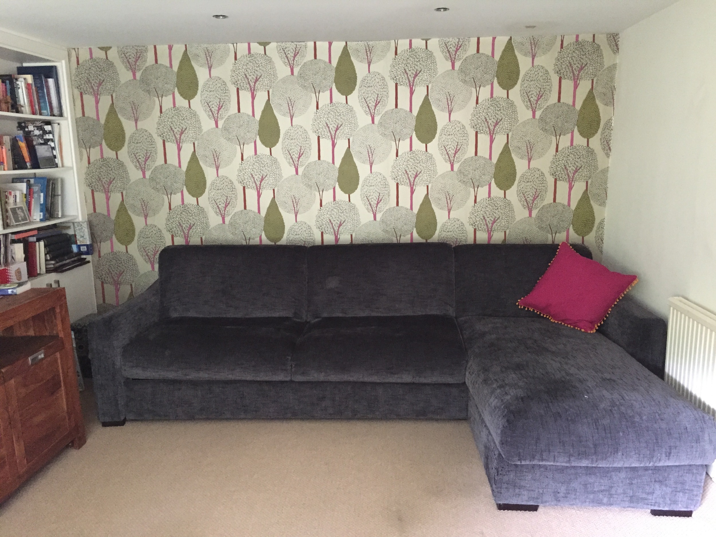
Before the renovation, which began last summer, The Pink House's basement or garden room was used as a kids' playroom, with a large sofa bed for guests to sleep on. There was a threadbare carpet, dirty beige walls (apart from one wall, upon which I chucked up some feature wallpaper by Harlequin) and a random selection of furniture, most of which I hated. Here's what it looked like:
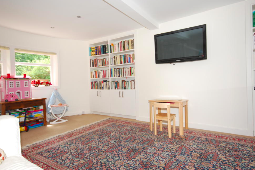
The Pink House basement: Before = a hotch-potch playroom
Here's the room when we bought The Pink House
The Plan
What I wanted to do was:
a) make this room, and the adjoining hallway, look fabulous, and
b) make the space work as hard as possible
The Pink House Husband and I agonised for months over b), but in the end decided the best combo of uses for the garden room, (henceforth known as The Den), was as a home office/grown-up sitting room/guest room (the kids' playroom was moved to the former office, on the first floor). Although The Den faces south over the garden, the windows are relatively small and low, meaning the room doesn't get that much natural light. Here's why we decided on the room's new usages:
- Home Office: by putting the desk in the window we figured we could make the most of the daylight, and make use of the room during the day. Because the window is set so low, despite it being south facing you wouldn't get sun in your eyes when sitting at the desk
- Grown-up Den: by using the room for evening movies and post-dinner drinks its low ceilings would help create an after-dark snuggle-up situation
- Guest Room: by installing a luxe sofa bed, guests could sleep over in comfort in a beautifully decorated room on their own floor, with the shower room just across the hall acting as an en suite
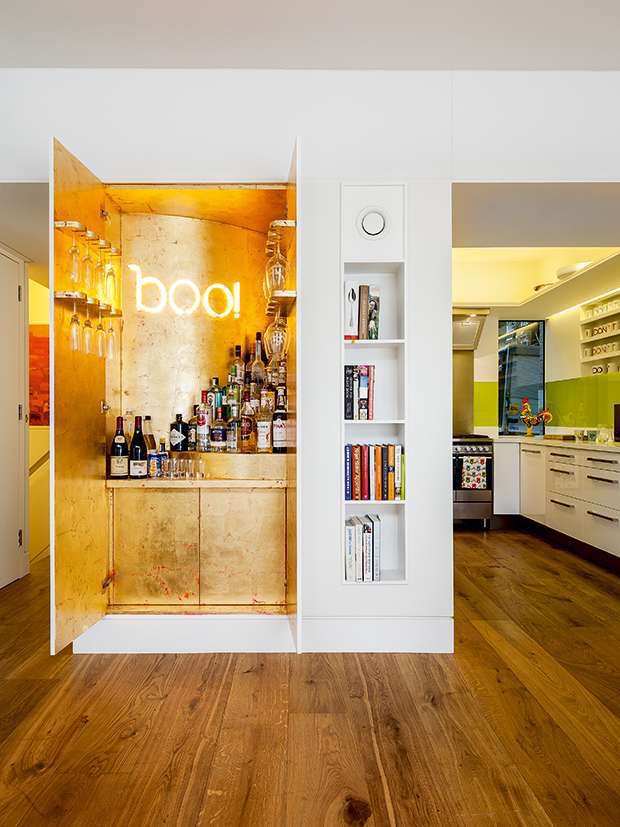
As for a), I had fairly good idea of how I wanted the space to look; essentially I wanted to turn it into a miniature version of a Kit Kemp-designed Firmdale hotel room, full of colour and pattern, and with fabric walls. I also knew I wanted a bar/cocktail cabinet of some sort. When I came across this picture on Pinterest and nearly passed out with lust, I knew I needed some form of gold and neon in the room, too:
Design: MATT Architecture
I had also decided upon parquet floor, to give the low-ceilinged room a bit of status, and because I have a thing for parquet. I'd done some research and discovered it was possible to install an engineered parquet floor on top of the concrete that was under The Den's threadbare carpet.
Renovations Begin
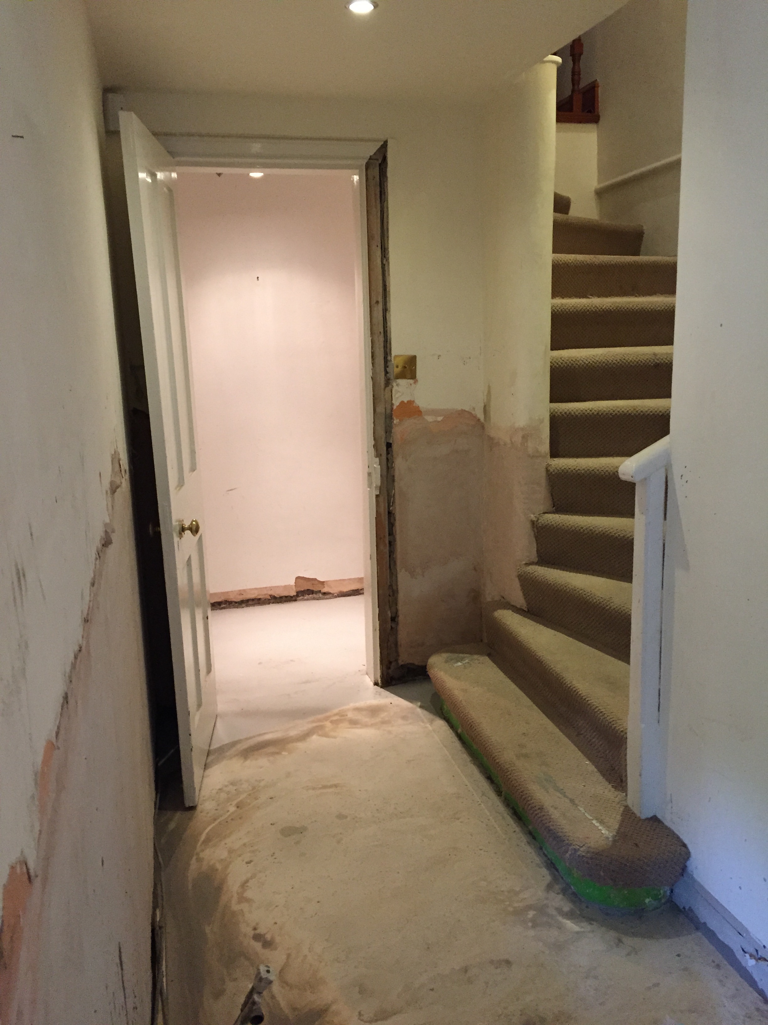
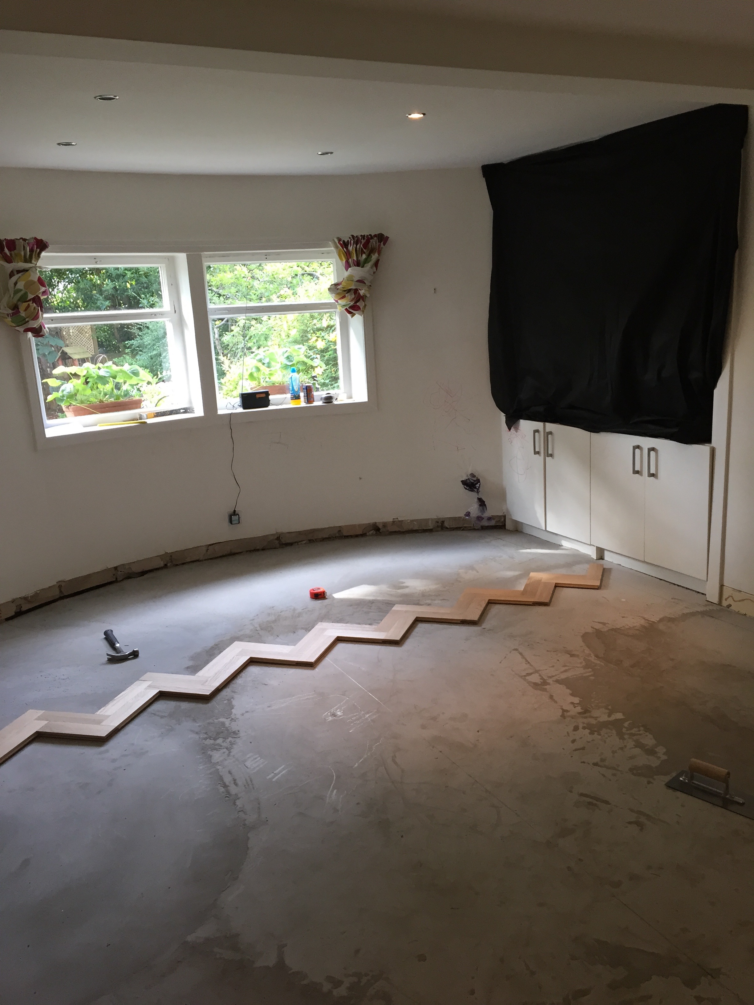
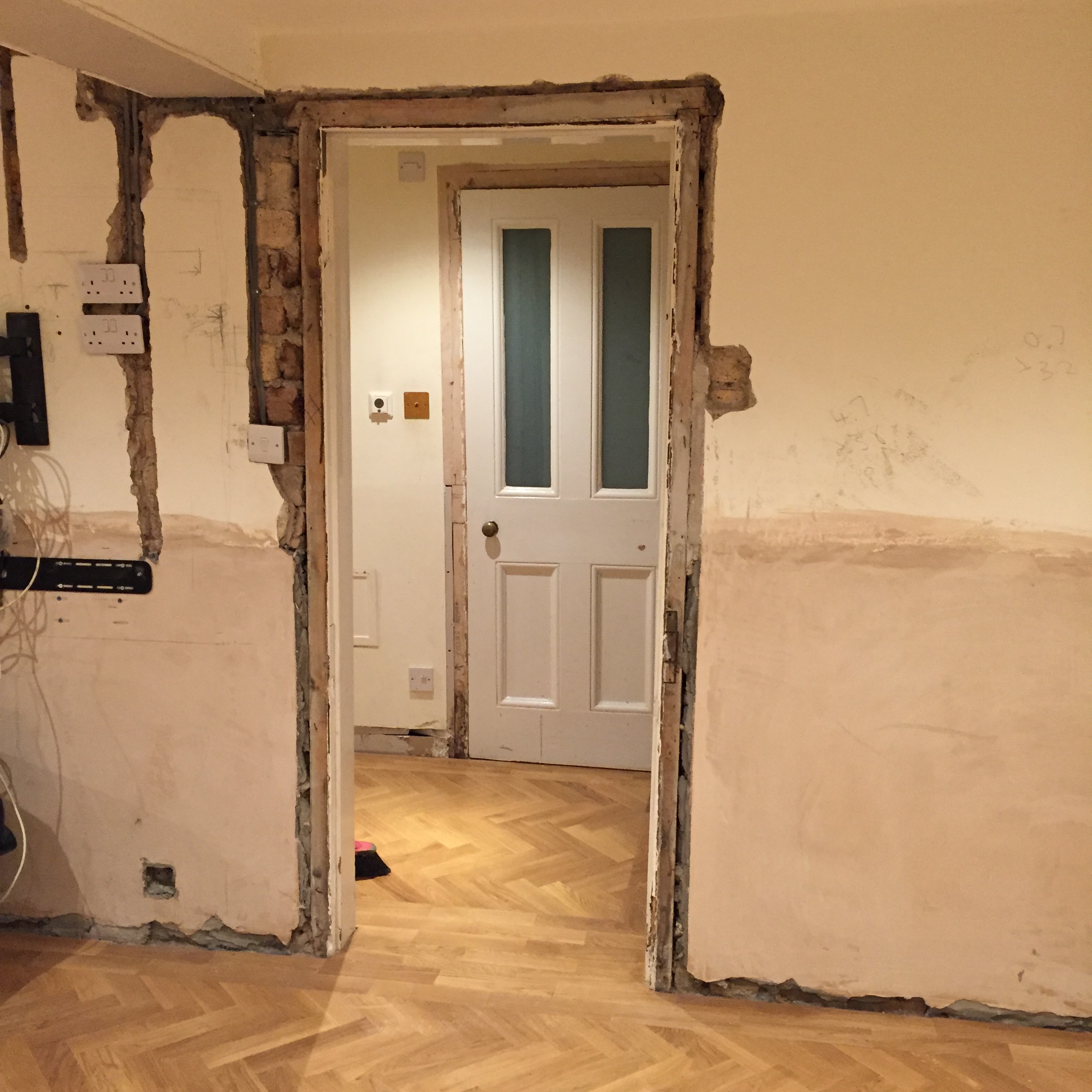
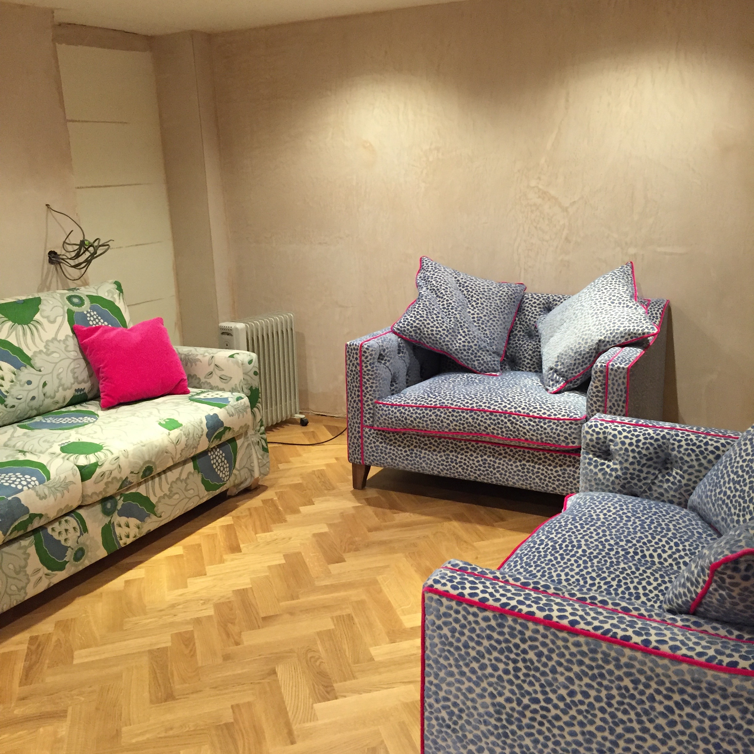
So we set to work. And there was a lot to do to transform this dark, dingy, unloved room into something spectacular. We stripped the room right back to its bare bones, damp proofed it (we didn't want water ruining our new floor), replastered, rewired, screed the floor so it was level, replaced the windows, back door and skirting, and added some new shelving and a bespoke cocktail cabinet. Here are a few photos of the rather lengthy process:
The Inspiration
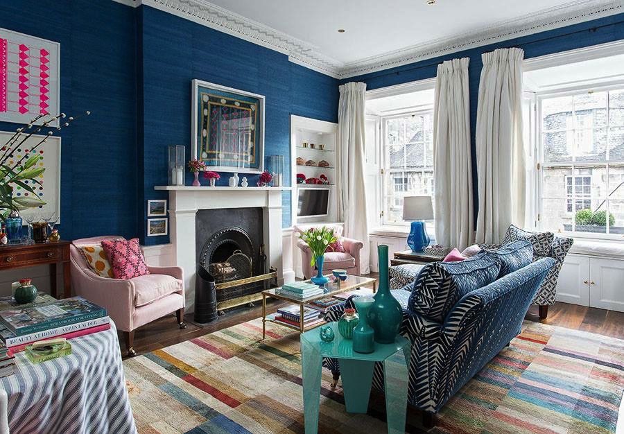
But how to choose the room's layout, design and decor? I needed a starting point, and scoured Pinterest and interior magazines looking for inspiration. And then, in 25 Beautiful Homes, I found this room:
Design: Jessica Buckley Interiors/Photo: Douglas Gibb
I loved everything about this sitting room, including the key colour combo of blue and pink, the mash-up of patterns, the brass-and-glass coffee table and especially the wallpaper: delicious blueberry Juicy Jute grasscloth by Phillip Jeffries. Just LOOK at it! And it feels amazing too.
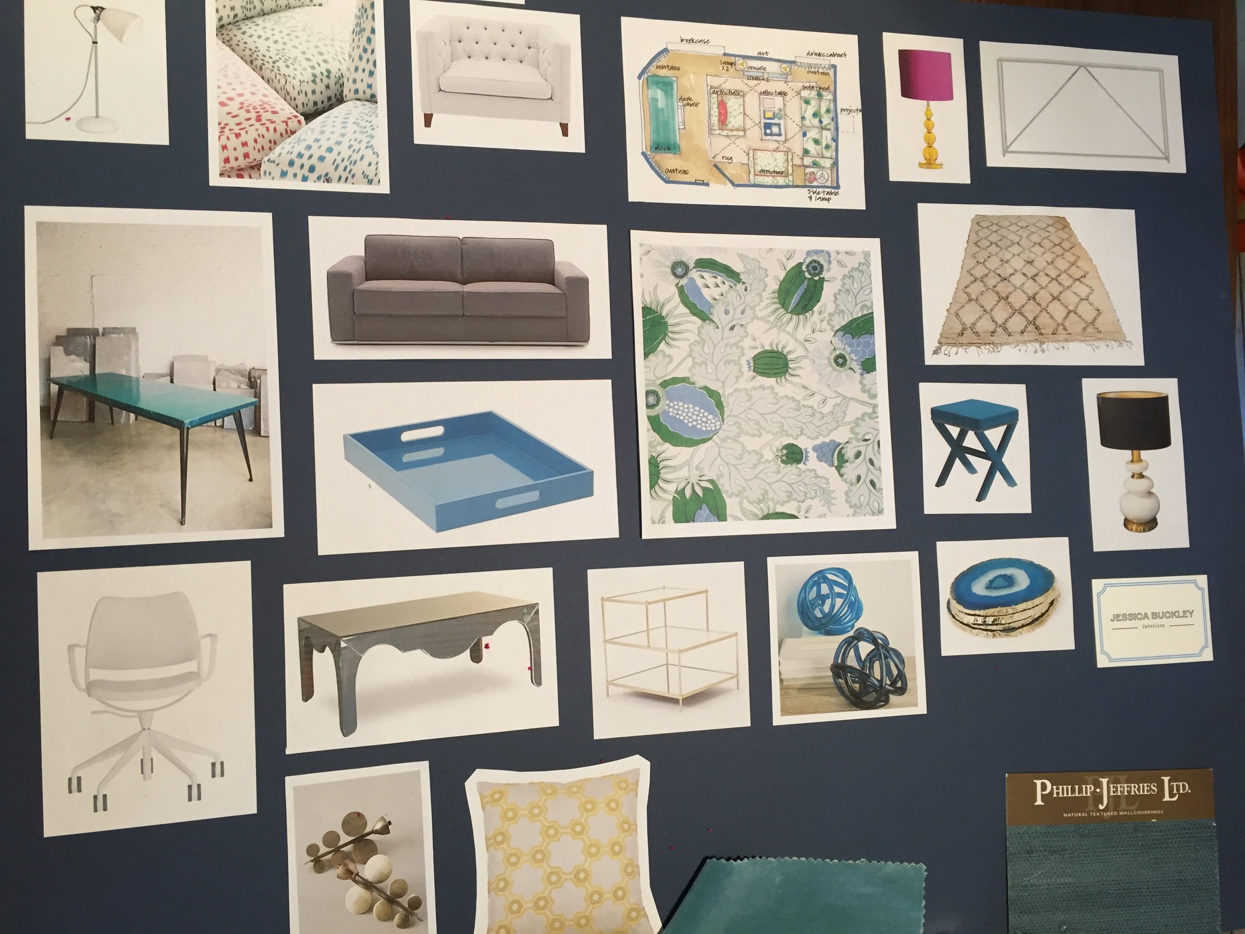
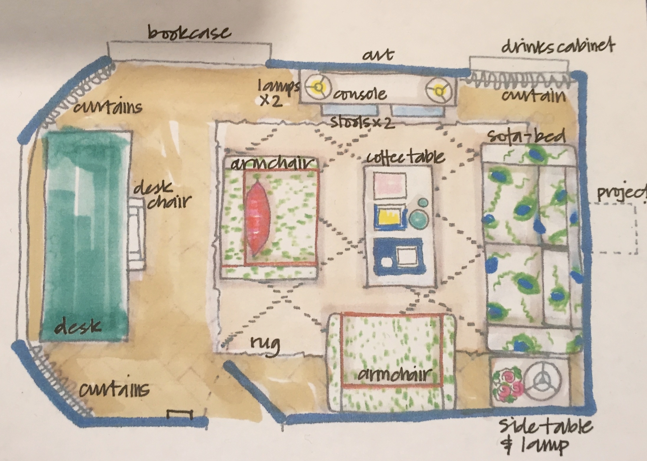
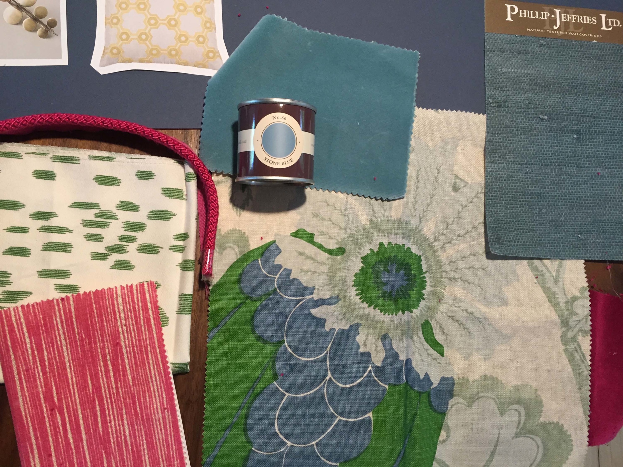
But perhaps the most exciting thing about this room was its owner - Jessica - and its owner's location. Turned out that not only was Jessica an interior designer (Jessica Buckley Interiors), but she lived in Edinburgh like me! And as soon as I met lovely Jess (who has become a good friend), I knew I wanted her to help maximise the room's potential (and get me a trade discount on the pretty pricey grasscloth!). So we had a long chat about what I wanted to achieve with the room, which she TOTALLY got. And, after some to-and-froing, she came up with this mood board and scale drawing and these samples:
We made a few changes to these initial plans, largely because we scrapped the idea of a TV projector after we were quoted an eye-watering amount of money. Instead, we decided on a wall-mounted TV on the wall behind the door (although we re-hung the door so it opened the other way in the end) - this meant a re-jig of the layout so the sofa bed goes on the wall where the console table is on the plan above, and the armchair in the middle of the room in the plan moves against the wall opposite the window. This layout also makes it easier for the sofa to open into a bed without having to move the armchairs.
Fabrics
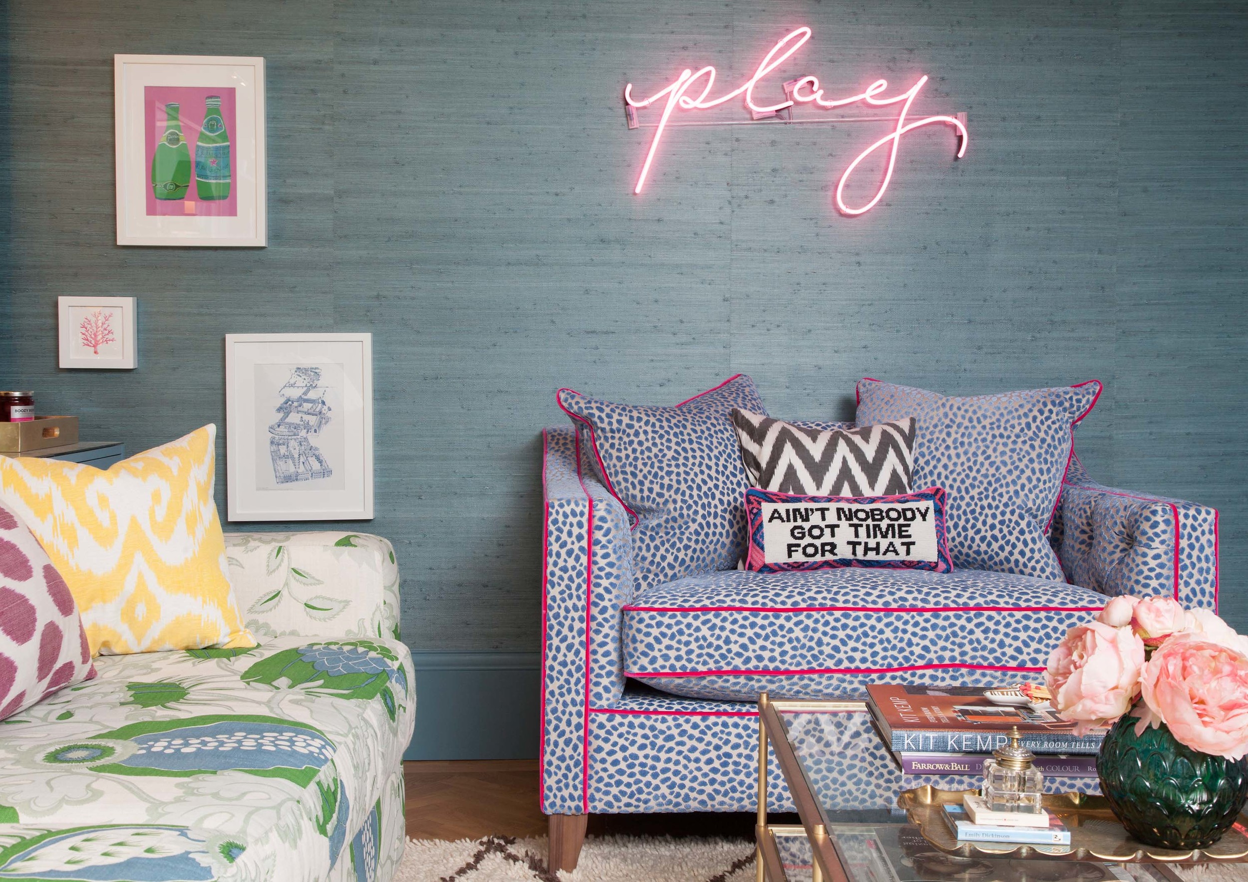
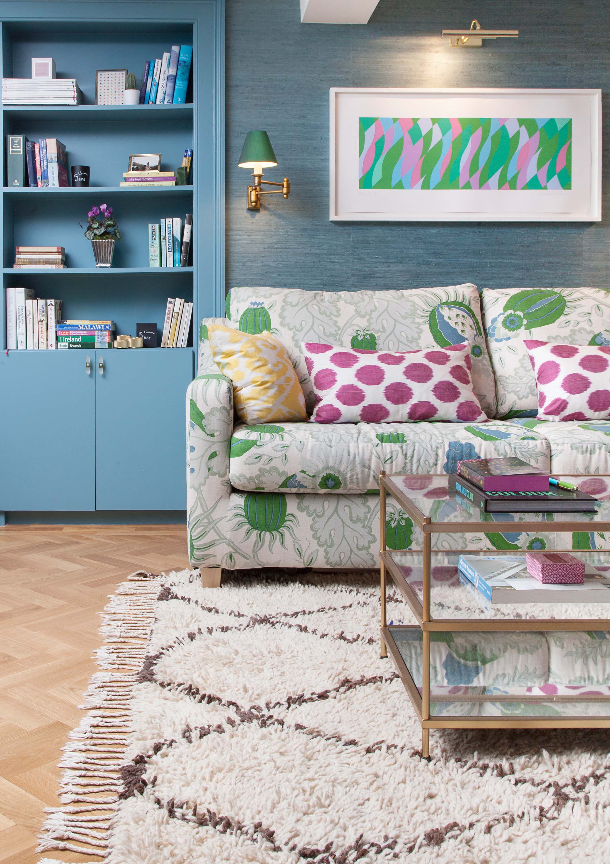
I loved Jess's idea of using the striking blue-and-green Christopher Farr Carnival fabric (a Kit Kemp favourite!) on the sofa bed (which we bought from John Lewis) and for the full length curtains, edged with a teal velvet (and with proper posh drawcords). The armchairs are Sofas & Stuff snugglers which fit two people who like each other, or, alternately, no children at all (a lock on The Den door keeps the grubby Pink House Dwellers at bay).
Jess demonstrated the beauty of combining a large pattern, like the Carnival fabric, with a smaller one in a sympathetic colourway - in the end we went for Samoa Velvets Tupai on the snugglers - I love the luxurious blue velvet leopard print. Adding velvet Designers Guild piping in Fuchsia to the snugglers added a perfect touch of pink and made the armchairs extra special, and extra bonkers.
Floor: tick! Soft furnishings: tick! Heating and electricity? Not so much
Walls
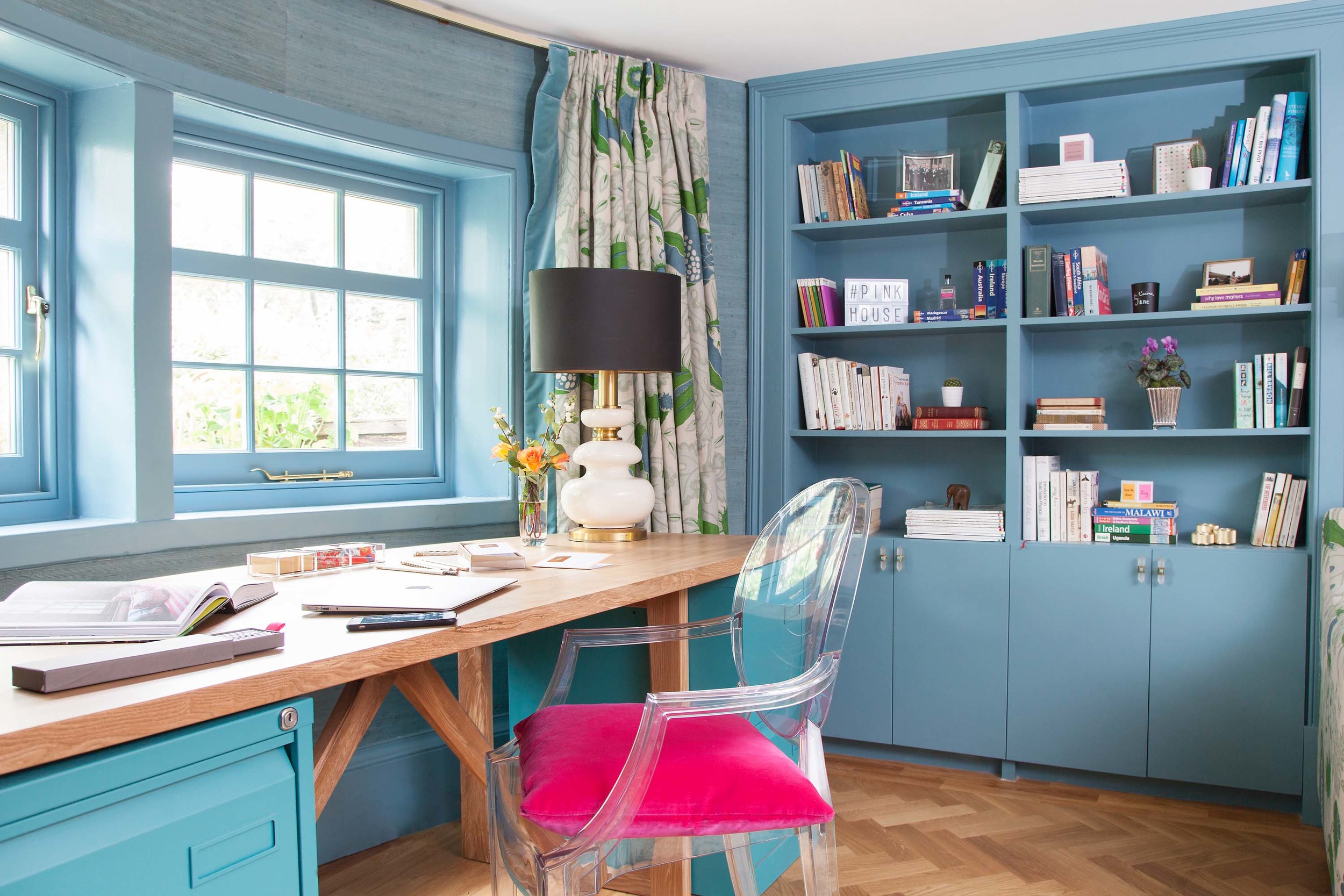
As for the grasscloth - although I'd fallen in love with the blueberry blue of Jess's sitting room, she convinced me that a softer teal would work well in my low-ceilinged room, and that matching the shade on the woodwork using Farrow & Ball's Stone Blue would stop things looking messy in a relatively small space. I was sold. The windows, back door, skirting, and all the shelving was painted in Stone Blue. I also continued the Stone Blue into the newly restored woodwork in the basement hallway - doors, skirting and all, to help link the spaces.
For the cocktail cabinet I chose imitation gold leaf (much cheaper than real gold and I couldn't see the difference) to line the back of the cabinet, which was then lacquered for protection.
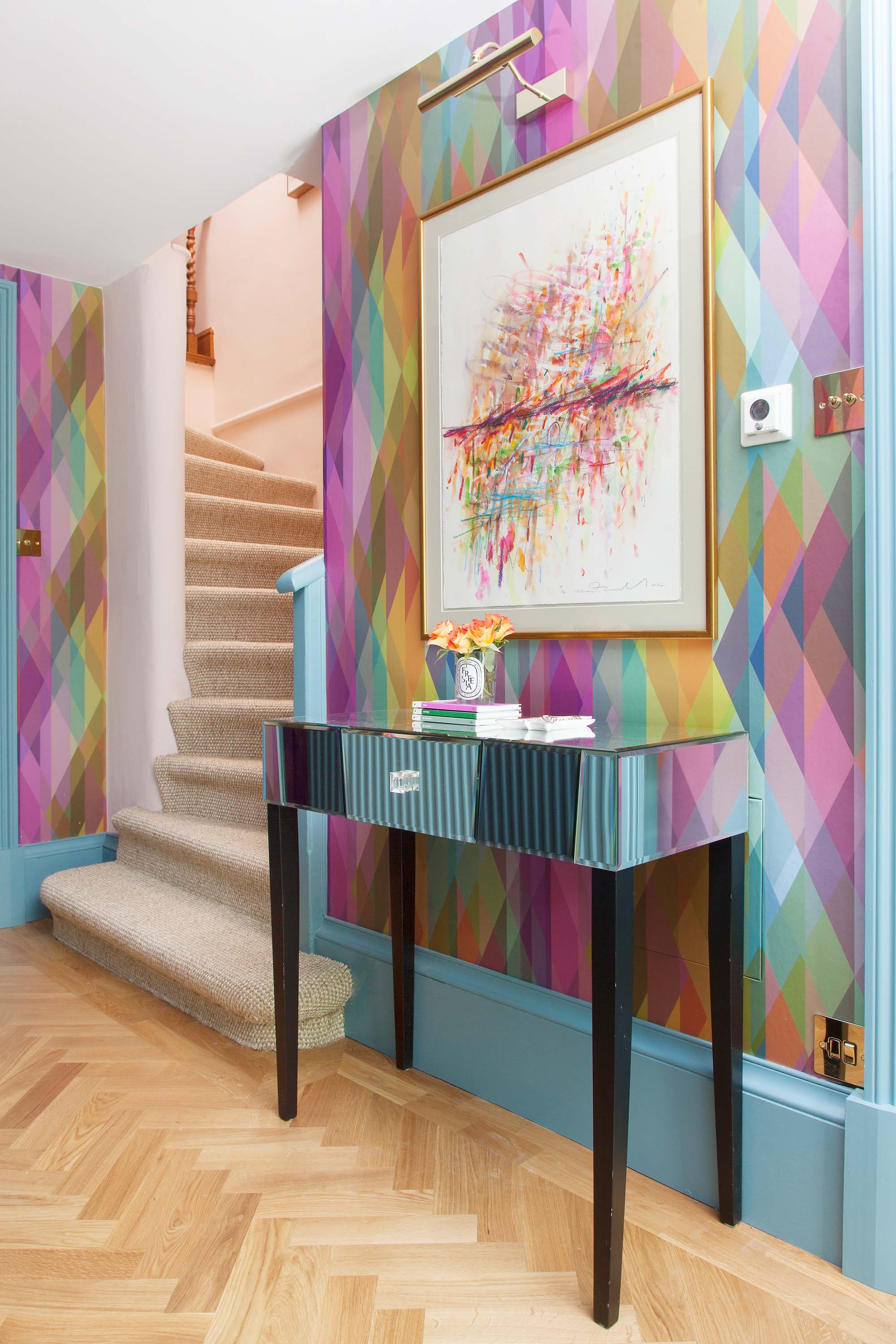
In the basement hallway I saw an opportunity to use a wallpaper I'd seen and fallen in love with - Cole & Son's Prism. The hallway seemed a great place to use this glorious kaleidoscope of colour, as I thought it would make visitors feel like they were falling down a fabulous rabbit hole, before landing in the magical Den, 'Drink Me' in hand...
Lighting
The lighting was important to get right. I wanted lights that lit the desk during the day time when the room functioned as an office; lights that made the room warm and welcoming during dark evenings; and lights that worked when the room was used as a bedroom, and our guests were in bed. The solution was:
a) recessed ceiling spotlights on a dimmer switch
b) a trio of wall-mounted lights behind the sofa bed - a brass picture light and two Jim Lawrence Hanson wall lamps with rainforest green silk shades - that could be operated from two different switches: by the door AND behind the sofa bed (reachable when you're in bed)
c) side lights, including a vintage French mid-century lamp Jess found at The Old Cinema (see a small image of it on the mood board above), and which I swiftly purchased online; when I saw its porcelain curves it was love at first sight. This lamp is now on the desk (which we had made bespoke to fit the curve of the wall)
d) a pink neon light, spelling 'play' in my own handwriting. I was inspired by Tracey Emin's handwritten neon art, and Specialized Signs handcrafted the glass tubing to form the word exactly as I had written it
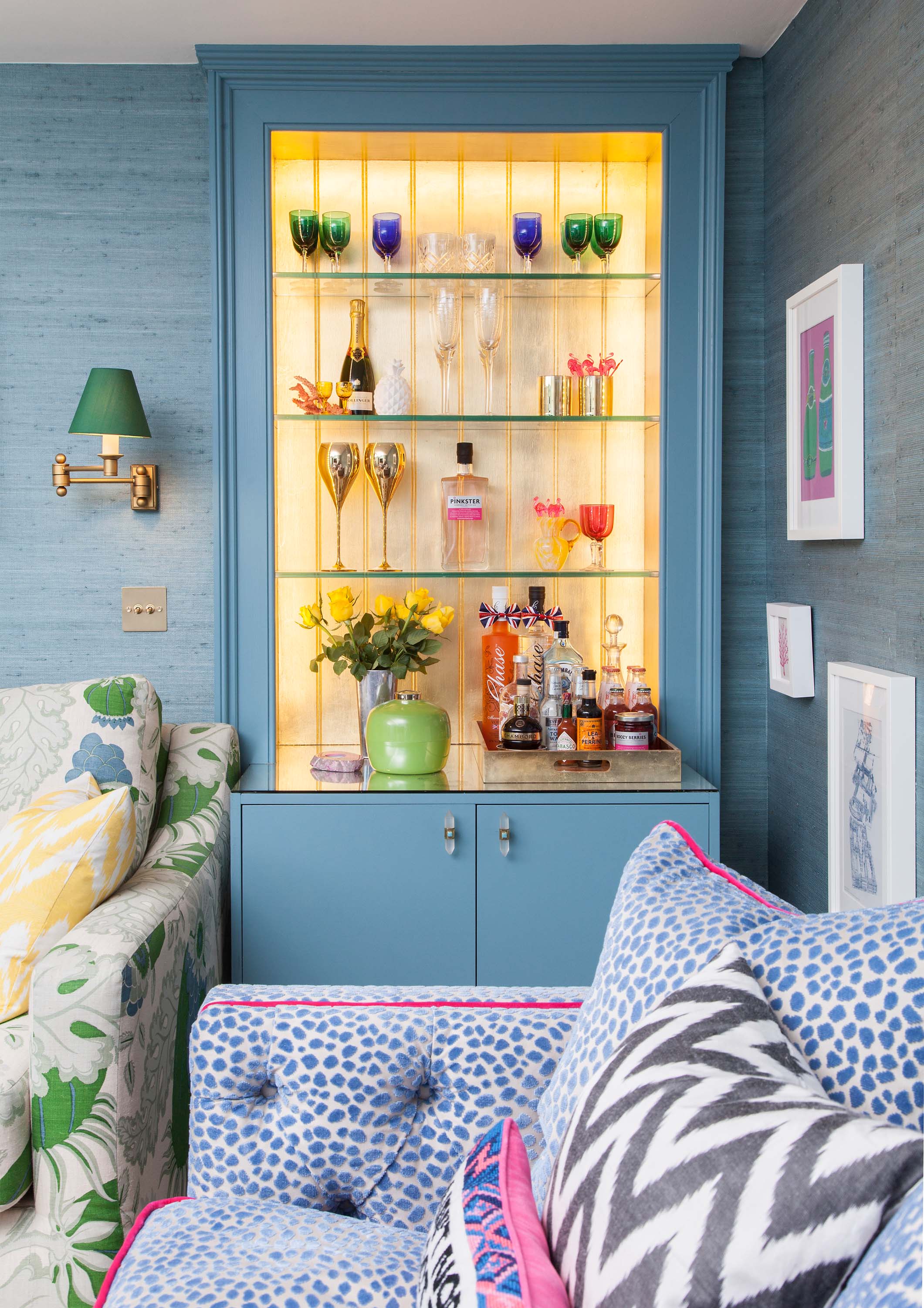
e) hidden LED light strips that illuminate the gold cocktail cabinet so it seems to glow from within
Accessories
Finally, my favourite bit - finding all those home decor details that bring the room together and give it personality. These include:
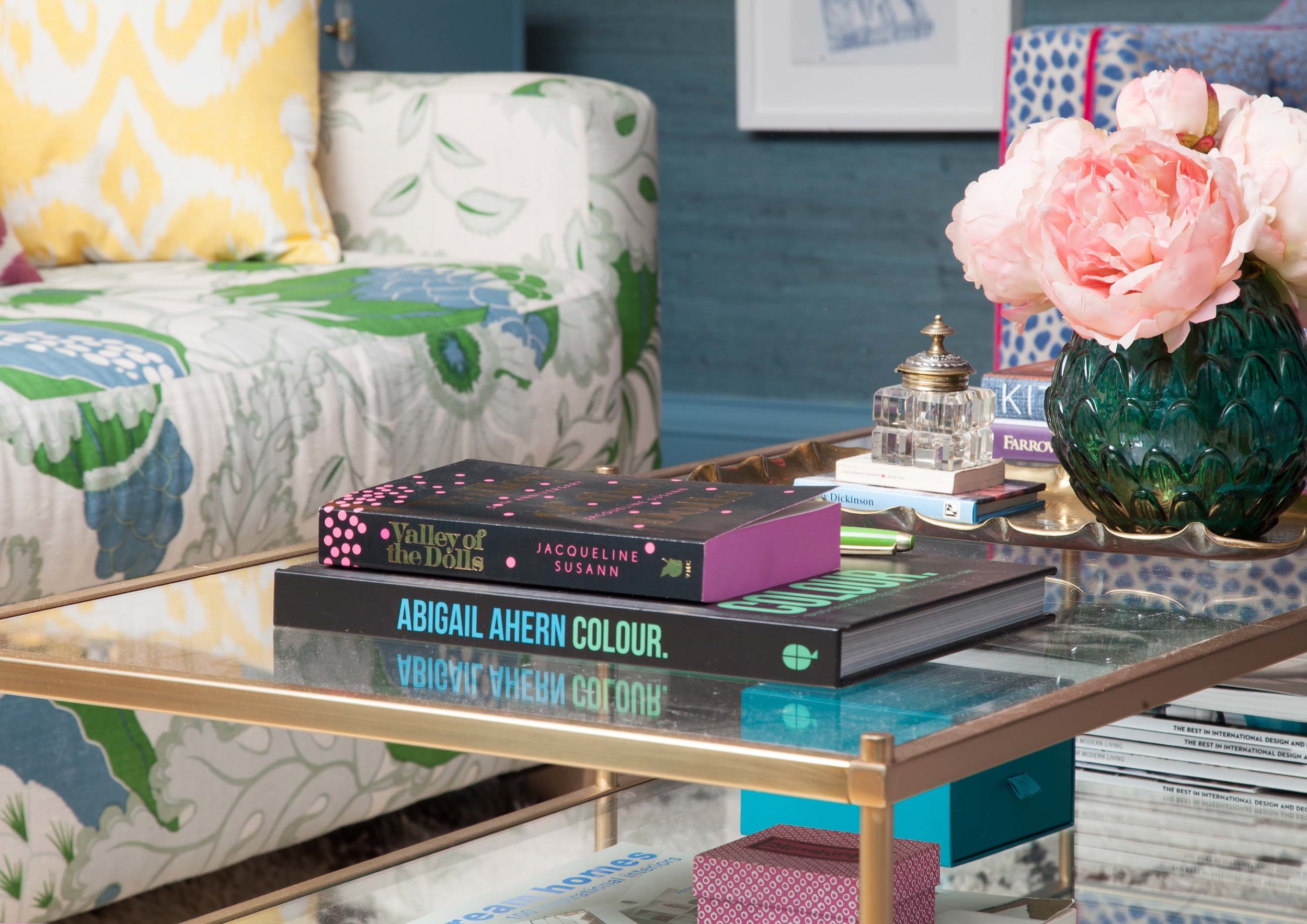
- a tiered glass-and-brass coffee table from West Elm, which fits the space perfectly, is reasonably priced, and holds loads of interiors books and magazines
- a little pink coral picture and a cross stitch 'Ain't Nobody Got Time For That' cushion with a pink velvet back from Furbish which I'm slightly obsessed by (yes the stuff has to be shipped from the States but it's so worth it)
- a load of patterned silk cushions from Jessica's very own online boutique (she came round with bags filled with various colours and patterns and we had fun deciding which should go where)
- cabinet handles from Anthropologie - crystal-shaped opaque glass set with tiny pieces of turquoise
- a gold lacquered tray from West Elm
- the MOST gorgeous vintage Beni Ourain Moroccan rug from the wonderful Larusi in North London, who supplies her stunning, authentic rugs to some of the world's most stylish homes and hotels. Mine is extra special as it's unusually wide for a Beni, and has flecks of blue scattered here and there
- vintage coloured glassware I scavenged from antique shops
- gold John Lewis wine glasses and tumblers
- a vintage green ice bucket I found on eBay
- a Bridget Riley signed print, from Vanessa Brodrick Fine Art
- a Dale vN Marshall watercolour for the hallway, also from Vanessa Brodrick Fine Art (if you're into grafitti/urban art, see here for my post on Dale's work - he's amazing)
- brass Buster + Punch lightswitches and candle holders
- a Bella Freud scented candle
- Pinkster gin (obvs!) for the bar
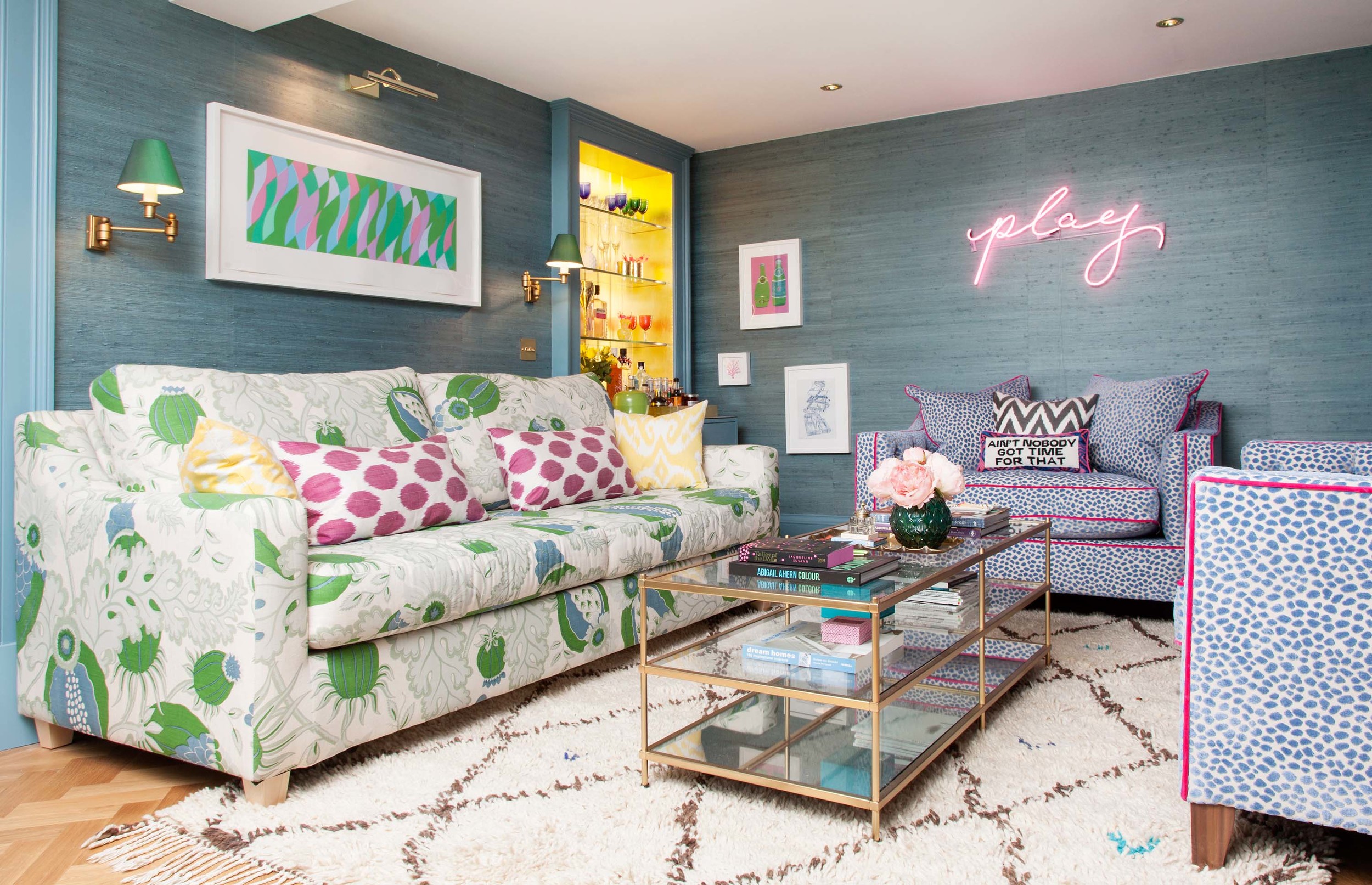
The Den 'After'
And so, finally, the room is finished! It took about six months in total, but I hope you'll agree the transformation is remarkable. Goes to show that you can take the grottiest, least inspiring room in your house and turn it into the most glamorous. And it helps to have the amazing Susie Lowe taking the After photos too...
I'd love to know what you think - let me know in the Comments section at the end.

