Spring is finally here, and for many of us it’s an excuse to freshen up our homes with a lick of paint. But the question is: which colour? Choosing a colour scheme can be seriously stressful. After all, there’s no limit to the options if you’re prepared to mix your own. And even if you narrow down the choice by selecting from a paint chart, you still have hundreds of hues to choose from.
To my mind, this overwhelming choice is one of the main reasons so many of us either stick to white walls, or revert to colour ‘rules’ when it comes to interior décor. Problem is, so many of these rules are not only confusing, they’re downright wrong, and following them can mean missing out on a stylish, inviting home.
Here are my five colour rules worth breaking – and why it pays to be naughty…
1) Blue and green should never be seen
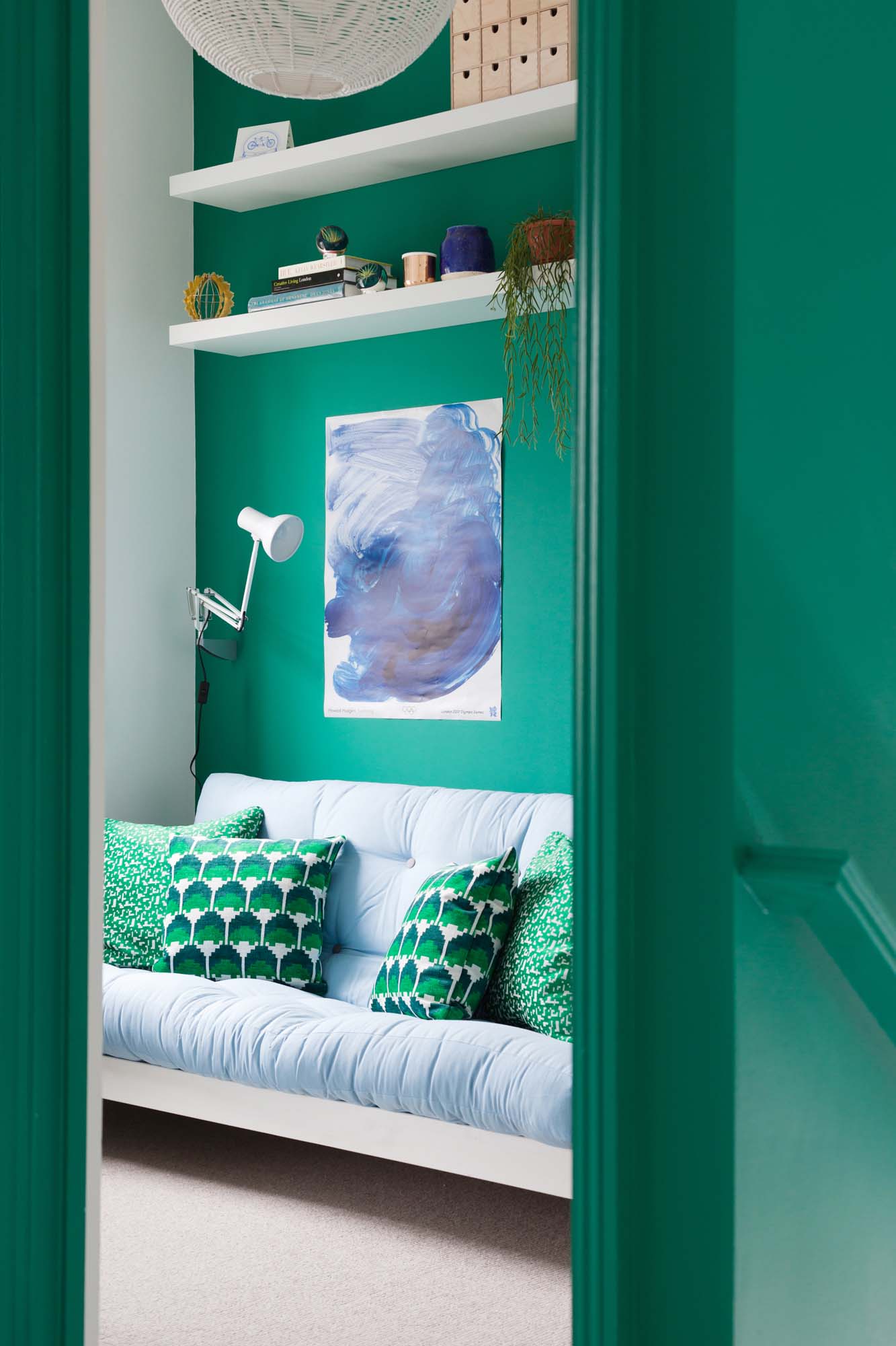
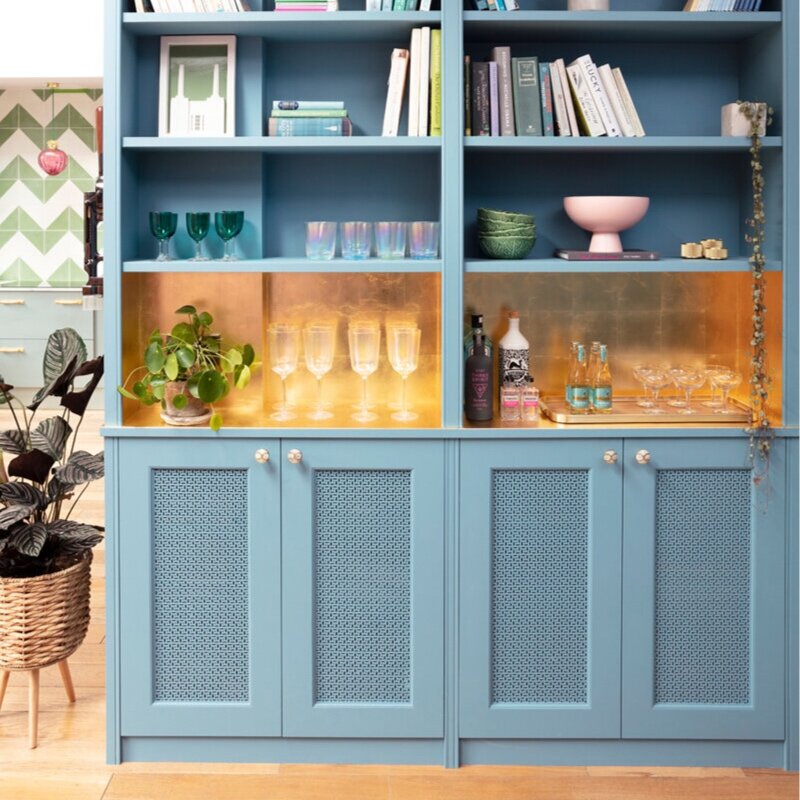
Blue and green interior design by Jessica Buckley Interiors
Despite all evidence to the contrary, it’s amazing how many people still think this is a hard-and-fast interior design rule that you break at your peril. But in the colour combo’s defense, I give you three little words: trees, sky, sea. If it’s good enough for Mother Nature…
“I think the historical reason for this rule is because blue and green are similar in tone and need to be broken up a bit with some contrast,” says Jessica Buckley from Jessica Buckley Interiors. “I adore blue and green together - particularly with large doses of white (for the aforementioned contrast) and then adding in another colour such as pink or yellow.”
2) Ceilings must be white
Design by 2 Lovely Gays/Photo: Megan Taylor
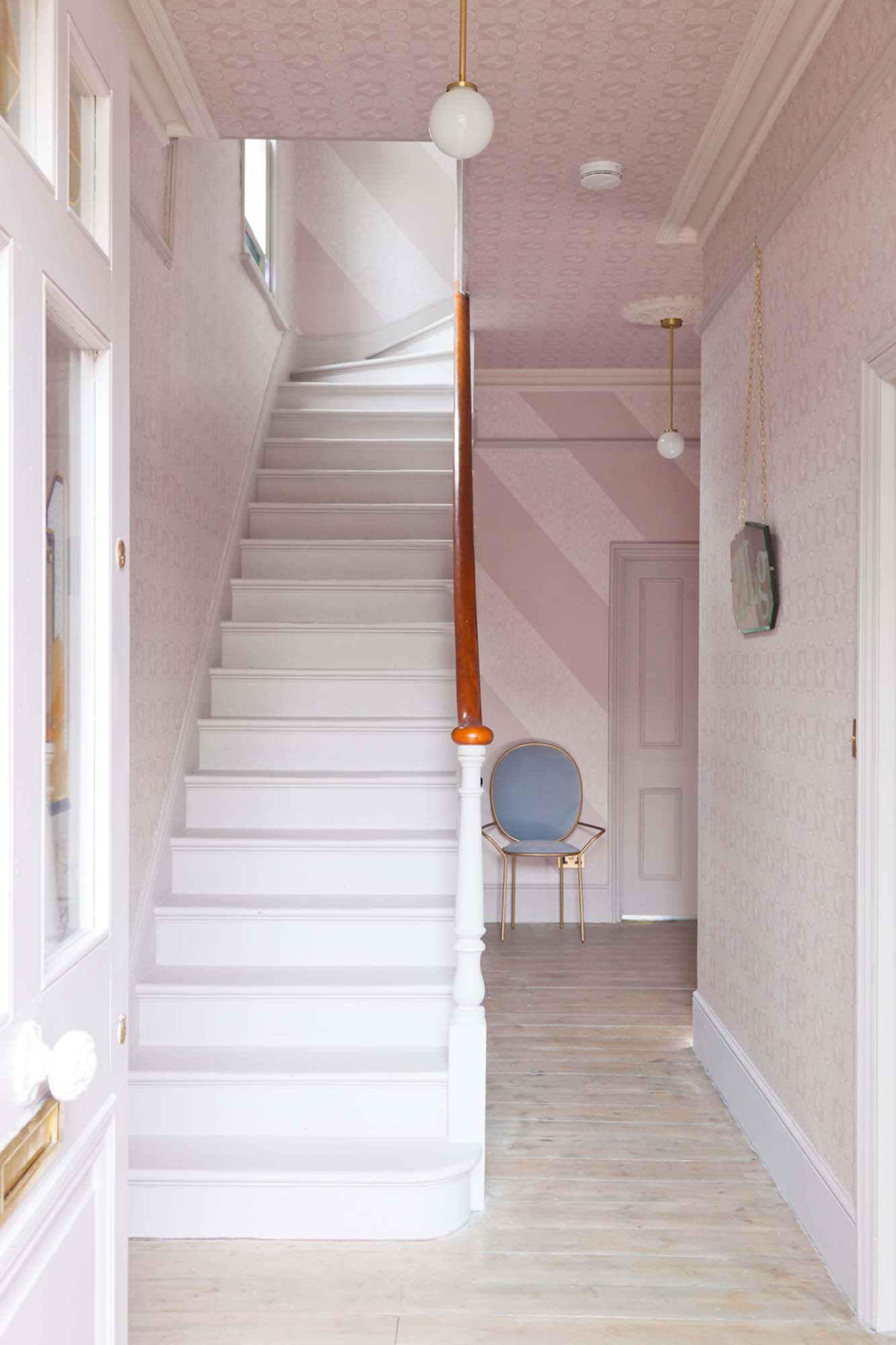
“Paint the ceiling the same colours as the walls,” explains interior designer Lee Broom. “Nobody ever wants to, but in fact it makes the room feel bigger, instead of marking the space between walls and ceiling by having them in different shades.” Interior designer Russell Whitehead from 2 Lovely Gays agrees: “Ceilings are the great forgotten space in so many homes across Britain. For so long people have been concerned about space and light. But now we are getting more interested in 'atmosphere' too - how a room makes you feel. We love to paint with colour or even wallpaper ceilings (see pic, above, of 2 Lovely Gays' hallway papered with their wallpaper design for Graham and Brown) because it can create such a wonderful vibe in a space.”
3) Only two colours per scheme
Design: 2 Lovely Gays/Photo: Megan Taylor
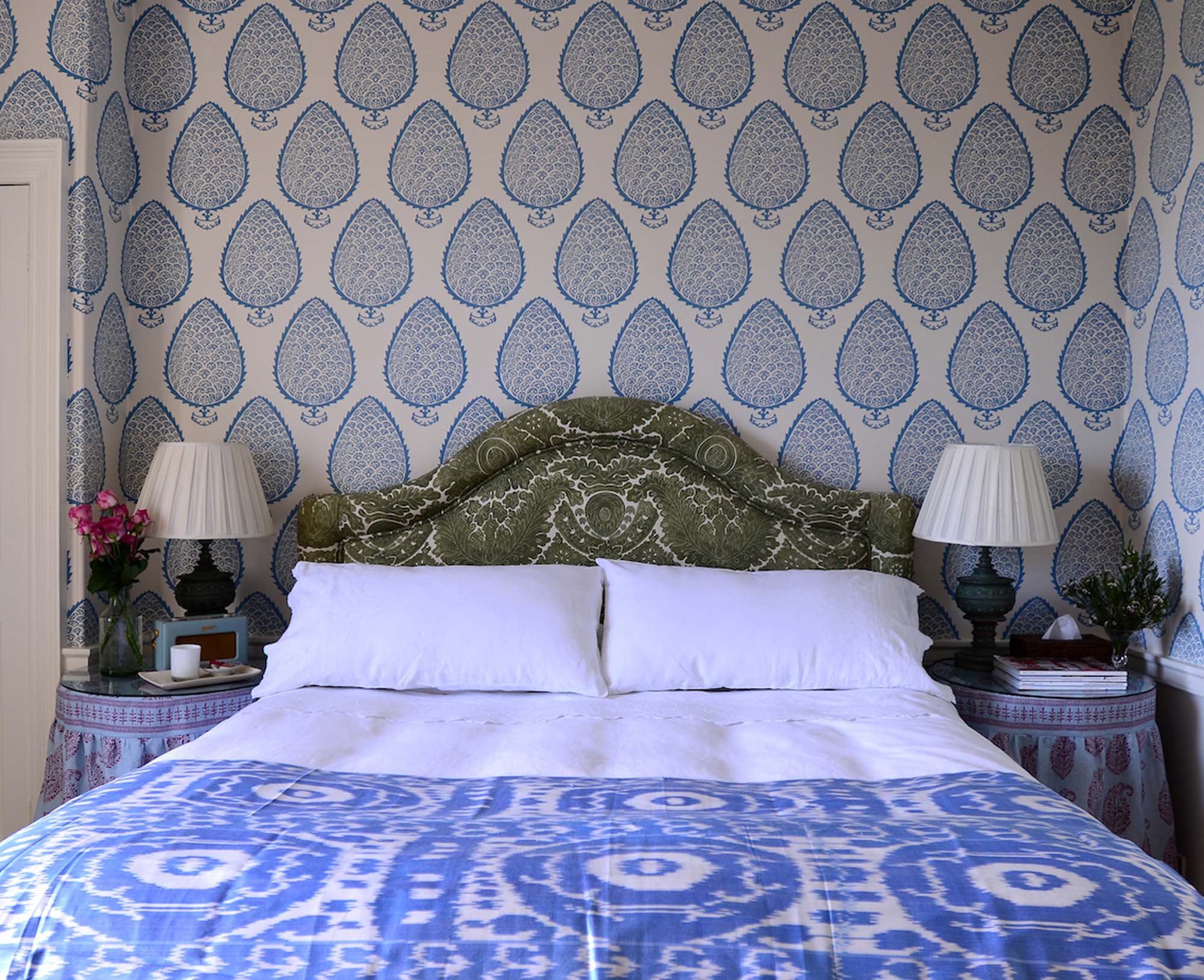
“Once you have found two colours that go really well together it can be tempting to leave it at that - and there’s nothing wrong with this approach per se,” explains Jessica. “However, by introducing a third – or fourth – colour into a decor scheme you will see the room develop more of a personality. In the case of a blue-and-white scheme, for example, you could add bright pink (a personal favourite), red or emerald green. Adding that extra colour will instantly give the scheme a new direction.”
4) Woodwork should contrast with walls
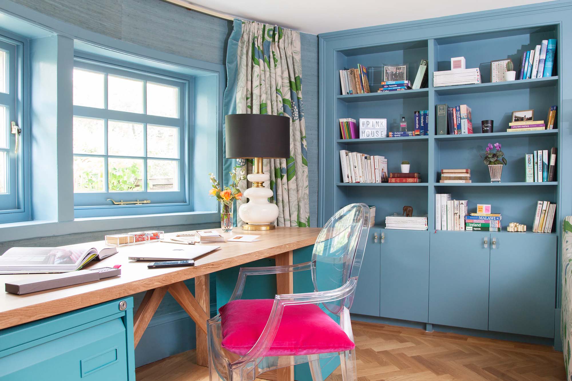
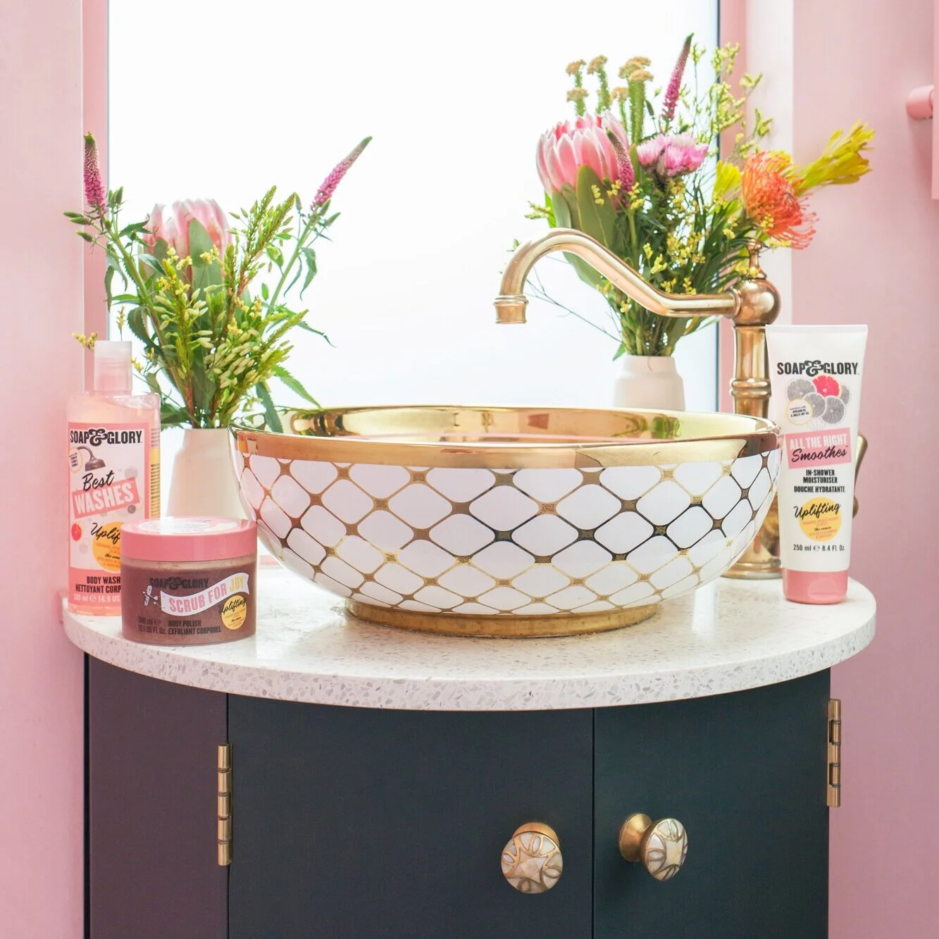
My office in The Pink House/Photo: Susie Lowe
The traditional style of painting skirting is to use white gloss paint, whether your walls are neutral or a brighter hue. However, a more modern approach is now to continue your wall colour through to your skirting, and, if you’re in a period property, your picture rail and cornicing. “Painting the woodwork in the same colour as the walls is a good trick for keeping things looking streamlined and unfussy - this is particularly good in smaller rooms or if you have a room with lots of doors or window frames,” says Jessica.
To create light and space you could even use the lightest colour on the walls, and a darker tone on woodwork.
5) Pink is for girls’ rooms
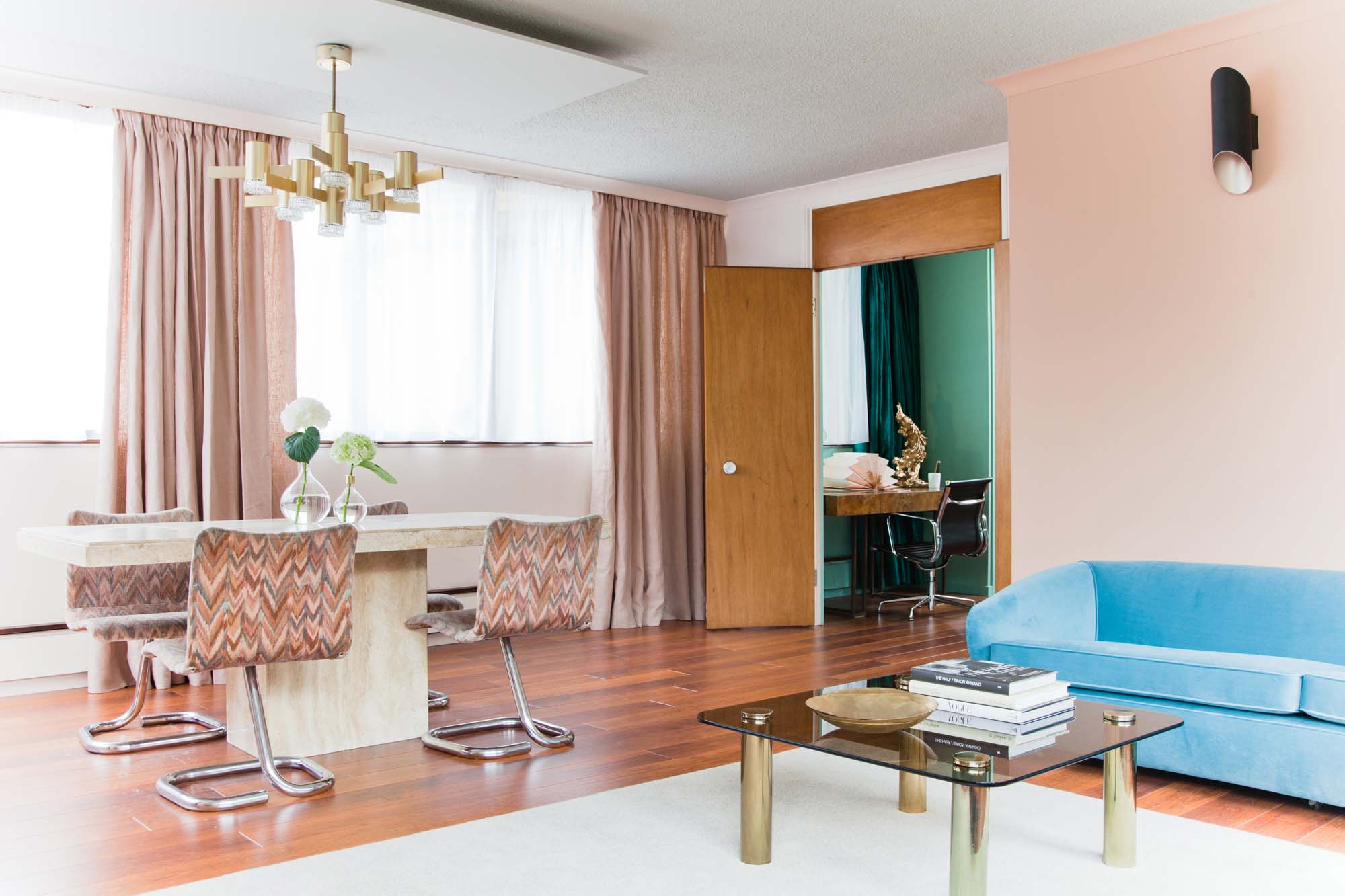
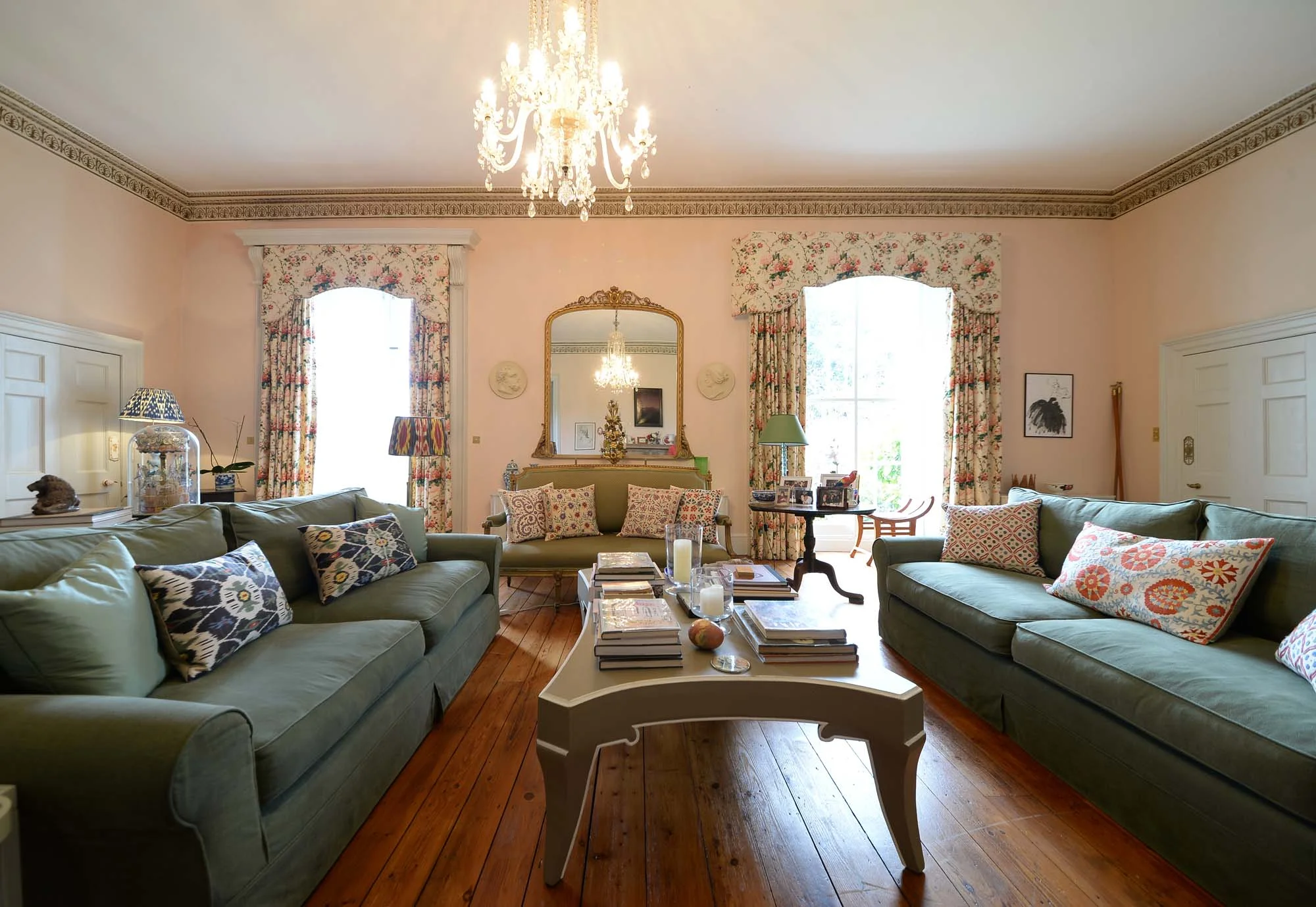
This is a colour rule entirely conceived by marketing departments – in fact, in Victorian times pink was seen as being more of a ‘boy’s’ colour, as it is the paler form of ‘manly’ red. Just a glance at this beautiful pink-walled mid-century-influenced room (above), designed by 2 Lovely Gays, proves that pink can be elegant, refined and gentlemanly. As does Simon Rayner and Jeremy Langmead's oh-so-elegant drawing room in their Hertfordshire estate, painted in Farrow & Ball Pink Ground, below.
The pink-walled drawing room belonging to Simon Rayner and Jeremy Langmead
“Don't even get us started on this one!” exclaims Russell. “Why are people obsessed with gendering colour? It makes no sense - it's a modern invention. Pink makes the most stunning backdrop for other colours. We often use it as a new twist on neutral.”
So what are you waiting for? Pick up that paintbrush and get rule breaking!

