Photos: Nick Pope
Where do you start when it comes to designing a room?
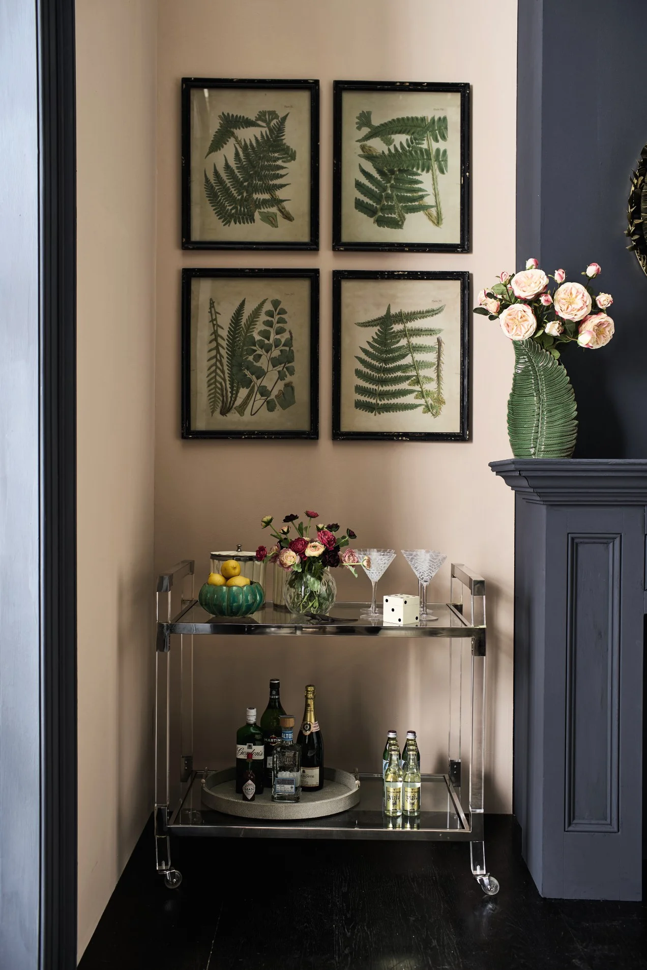
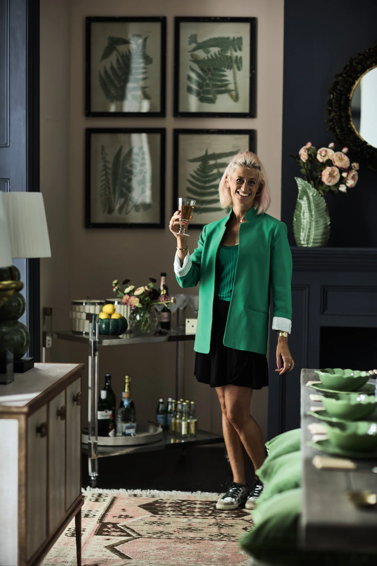
When OKA asked me to design a room - any room - using their products, my first thought was, “where is the bar cart going to go?”. I bloody love a bar cart, me. Not only for the obvious reason that it contains booze and booze is nice, but also because a beautiful bar cart makes me go weak at the knees before I’ve had a single sip. And, as you can see below, OKA’s Lennox drinks trolley is seriously sexy.
Martini, anyone?/Photo: Nick Pope
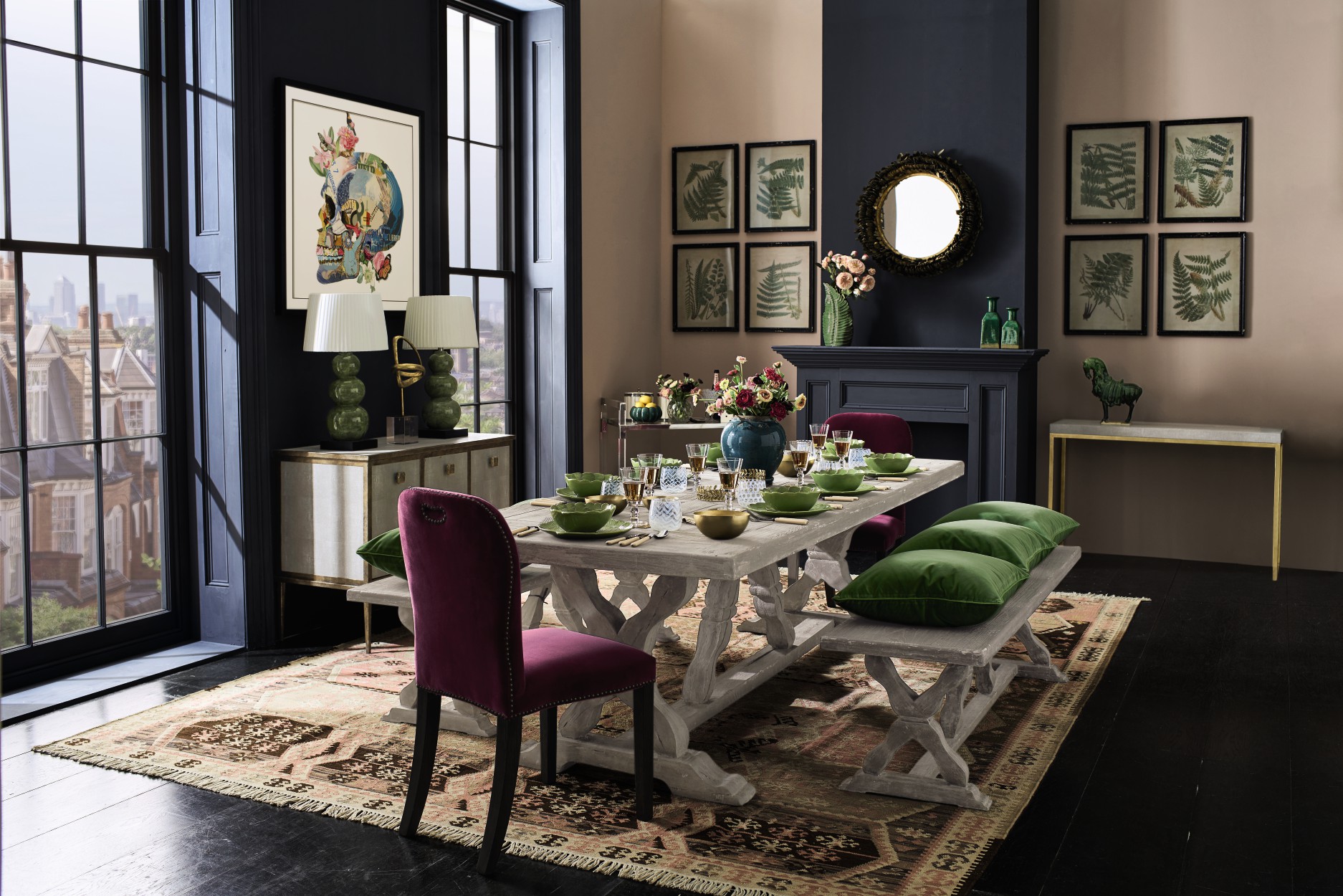
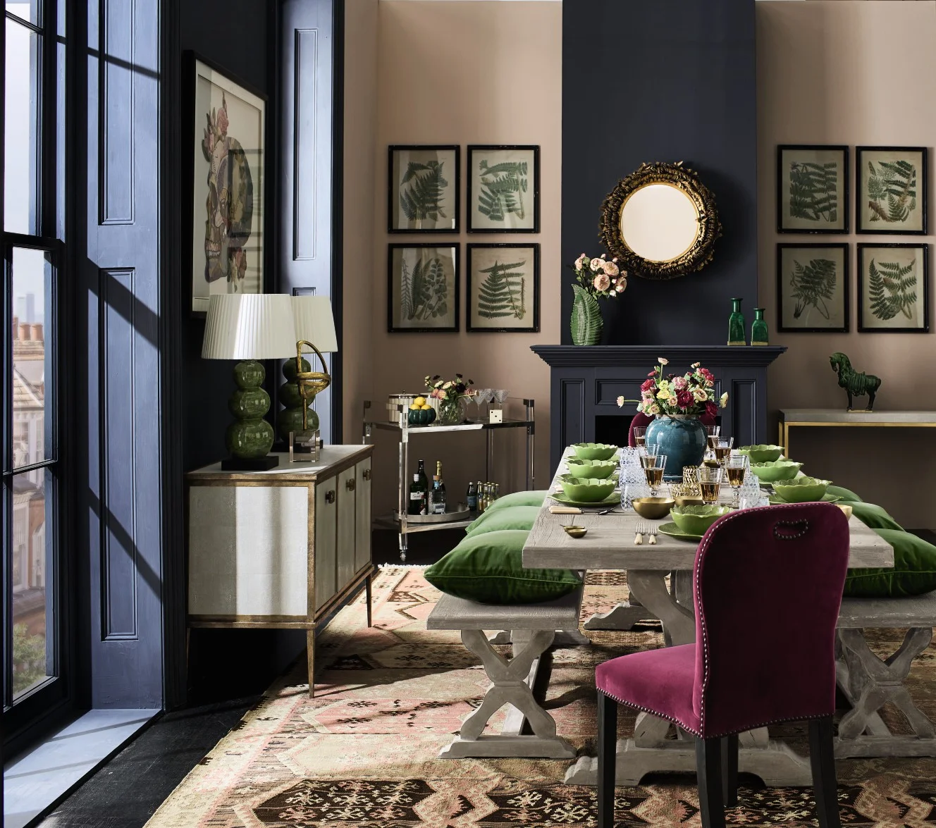
Once I’d decided on a dining room setting, I settled on my colour scheme (pink, dark grey and green) and design theme for the space. I chose to combine the delicate pale pink ‘Cuisse de Nymphe Emue’ by Edward Bulmer Natural Paint with an edgier vibe for a room that would feel at home in an urban setting, overlooking a big city.
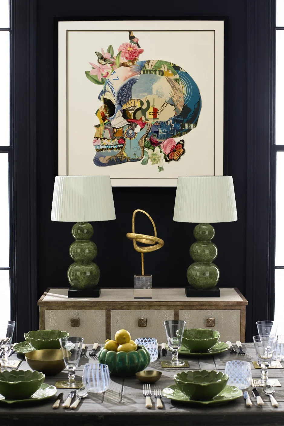
I’m often asked to sum up The Pink House’s aesthetic, and an essential part of it is the balance between prettiness and punkiness. Luckily, OKA has loads of beautiful items that tick either the pretty or the punk-y boxes (and a fair few that work for both - hello, beautiful faux shagreen table lamps) so my job was made that much easier. Breaking up the blush pink walls with a slash of graphite grey up the chimney breast and on and in-between the windows gave the room an edgy glamour when paired with OKA’s gorgeously luxe decor.
The OKA skull print add a rock n roll vibe while tying in with the nature theme/Photo: Nick Pope
I also knew I wanted to incorporate some plants. I’m a city chick with a country girl frolicking not far beneath the surface, so I always try to bring nature into my room designs. OKA made it easy for me again with a wide selection of nature-inspired prints, tableware and accessories in vibrant, leafy greens. Plus, their faux flower selection - those ranunculus and roses aren’t real! - is amazing.
Table set for a sumptuous supper/Photo: Nick Pope
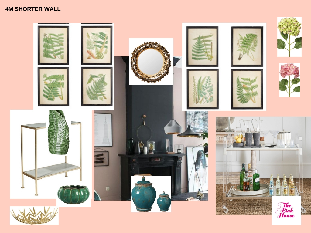
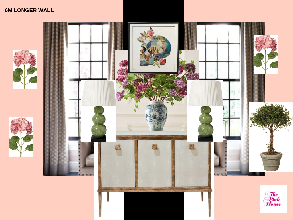
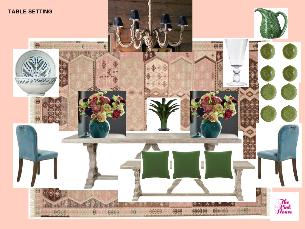
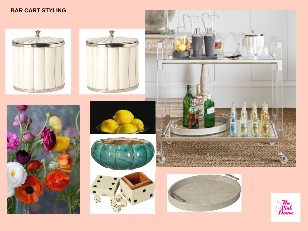
When I’m trying to get my head around how a scheme will look, I find it really useful to see the elements I’m planning on using side-by-side, to check if they work together. I love Canva.com for this - it’s such an easy way to create casual mood boards that help you visualise the finished room. Here are the mood boards I made as part of the planning process for this room, by combining screen grabs of the actual OKA items I planned to use, with room shots pulled off Pinterest. You can see some elements changed slightly in the finished design, but hopefully you’ll also see how they gave me a sense of how the space was going to work.
I love my finished room. It’s fun yet glamorous, edgy yet welcoming. Now all we need are a couple of crates of pink champagne and the dinner party can begin. Who’s coming?!
Cheers Tom Hardy - so glad you could make it!/Photo: Nick Pope
This post was sponsored by OKA, but as always, all thoughts, opinions and desires to have Tom Hardy as a fantasy dinner party guest are entirely my own.

