Want to paint the town - or at least a room - pink, but struggling to find the perfect shade? The Pink House is here to help! We caught up with Charlotte Cosby, Head of Creative at Farrow & Ball, and Annie Sloan, queen of chalk paint, to get their top tips for using pink in your home, whatever vibe you’re trying to achieve.
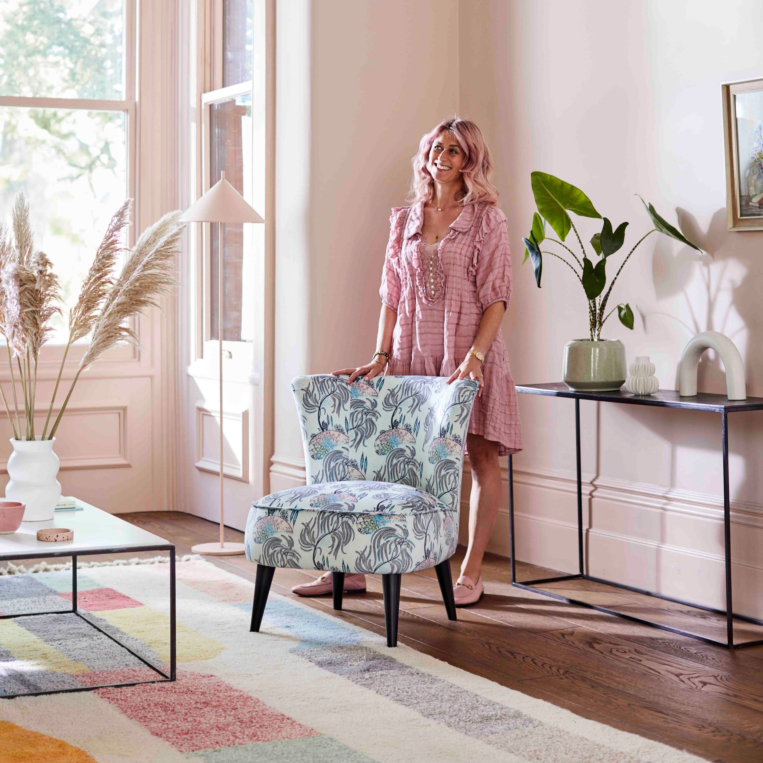
Annie Sloan will only pose against rose-tinted backdrops - smart woman
Q: Which colours work best with pinks for a bold look?
Annie Sloan: If you really want bold, go pink, yellow, orange and turquoise! Stunningly impactful and bohemian. Juicy, tropical colour schemes like those used in Central America and India are completely joyful and very bold.
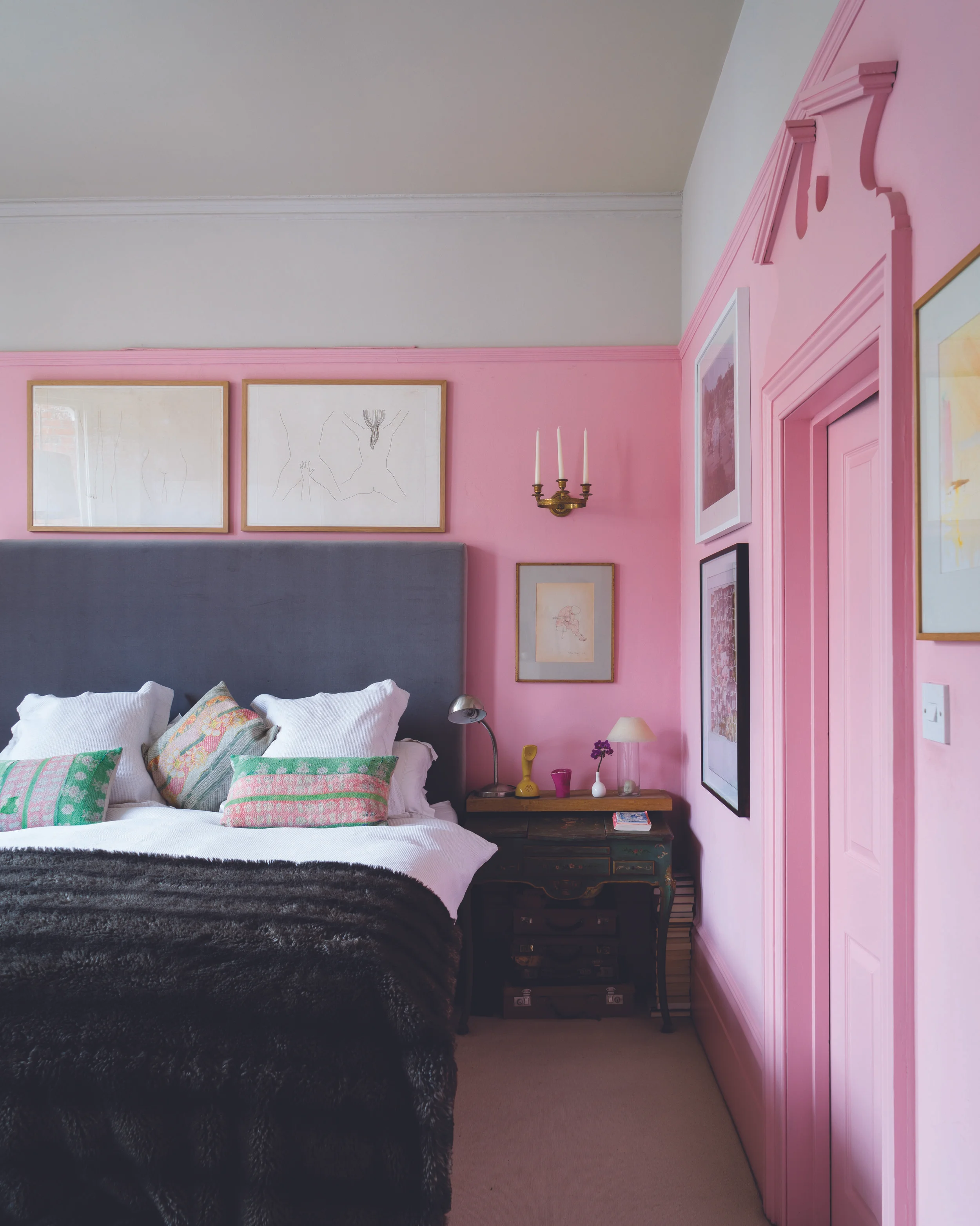
Farrow & Ball’s Rangwali Pink
Charlotte Cosby: When used together, dark tones and bright pinks create the most beautifully bold schemes. Farrow & Ball’s dramatic Paean Black looks fantastic with its Sulking Room Pink, a dirty rose shade subtly restrained by grey undertones. Complex, yet easy on the eye, this colour combination elevates any room creating a sophisticated and timeless look.
Annie Sloan recommends going all out and layering pinks with oranges (pink on walls, Antoinette; pink on floor, Scandinavian Pink - styled by Marianne Cotterill)
Q: Do you think pink walls can work in a space of any size?
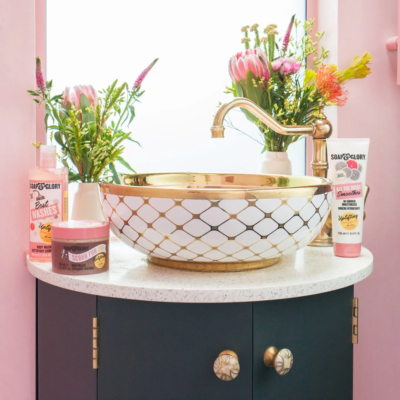
AS: Totally. My sitting rooms have always been all pink. A soft pastel like our Antoinette shade makes a good backdrop for bold patterns and colours, and is gentle enough to function as a neutral. A bright raspberry pink in a small space, like a bathroom, is amazing. It won’t work if you don’t love the colour, but then of course that’s true of any shade.
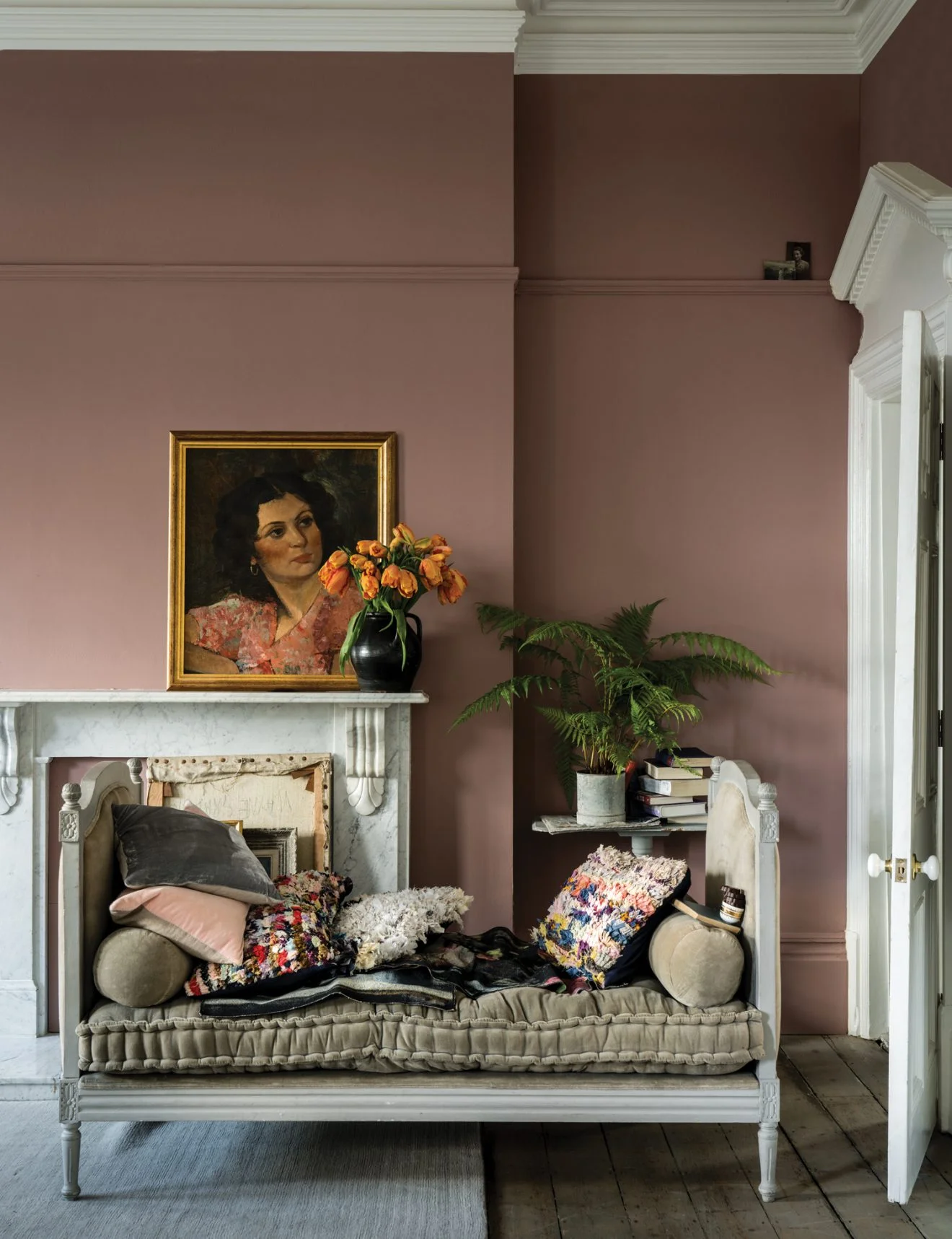
CC: Yes of course! Pinks are versatile shades that work well in all areas of the home; they add warmth and evoke feelings of joy. Cinder Rose, a romantic pink, works well in large spaces like living rooms as it creates a dusky feel which is easy to be around, while the delicate Calamine, like its namesake, is a soothing pink that’s perfect for creating a calming scheme in a smaller room that doesn’t have as much space.
Annie Sloan’s Antoinette shade works beautifully paired with deeper, bolder hues (styled by Marianne Cotterill)
Q: How do you think pink should be layered? Which textures and pink tones work best together?
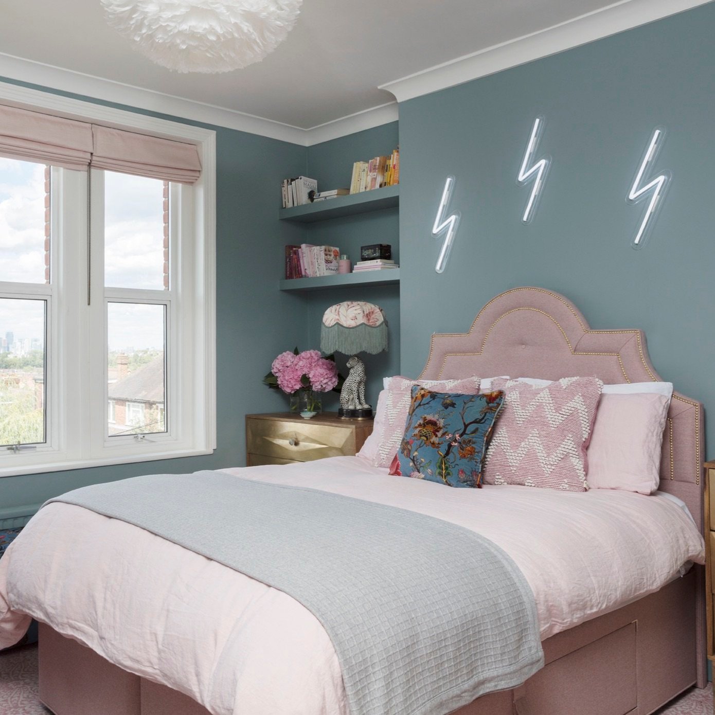
AS: Pinks divide into two groups. Those which are earthy and go with stone and ceramic and weathered oak, and those which are modern and look fantastic with metallics for a glamorous old Hollywood chic look.
CC: Layering pinks with tonally similar colours is a great way to achieve a cohesive effect. For example pairing Farrow & Ball’s dusty Cinder Rose with the elegant Dove Tale which has similar grey tones creates a soft scheme.
Choose a pink that pairs well with earthy woods or metallics (these are Annie Sloan paints, image styled by Jennifer Haslam)
Q: How can people who are a bit nervous about bright colours bring pink into their homes in a way that doesn’t feel overwhelming?
AS: I think you need to use lots of neutrals; greys and whites, with a flash of bright pink like a splash of lipstick. When that pop of pink catches your eye, your spirits will lift. Bright colours bring joy like that! Soft pastel pinks such as our signature Chalk Paint® or Wall Paint in Antoinette are another way to ease yourself in. A gentle pink on the ceiling is extremely modern and beautiful. The House of Chester blog is a brilliant example of this.
CC: For those of us wanting to introduce pink into our homes without committing to the intensity of a brighter pink like our Rangwali, could try a more neutral pink like Great White. When paired with All White, the red undertones come to life and create a mood of stillness and calm, without a striking contrast. If you do want to dip into brighter pinks without committing to painting the whole room, try painting the inside of a bookcase or a piece of furniture with a pop of bold pink.
Charlotte suggests painting the inside of a bookcase or cupboard a bold pink hue for a hit of colour that isn’t too in-your-face
Q: What are some of your favourite shades of pink paint to work with and why?
AS: My Scandinavian Pink is probably my favourite, I think it adds immediate cool, but in a fun way. That said, I do really love our Antoinette shade, too - and those two colours together, that’s an absolute delight! Different shades and tones of the same colour used together gives great depth and brings out the complexity and nuance in each colour beautifully. Taking Scandi Pink and adding increasing increments of our Old White, and using the spectrum from darkest to lightest pink in the same room, or on the same piece of furniture, looks beyond fabulous.
CC: As someone who loves colour, it’s so hard to pick a favourite! At the moment I really love F&B’s newest pink, Sulking Room Pink, because it ticks so many boxes for so many different spaces – it’s soft and romantic, but at the same time has a really moody edge
Charlotte Crosby’s current favourite pink: F&B’s Sulking Room Pink
Scandinavian Pink is an Annie Sloan cult favourite
Q: What sort of pink do you think works best with busy patterns?
AS: If you want something bold and crazy and bohemian go bright pink. That would be my gut instinct I think. It needs to be really strong pink. I’d mix Burgundy or Emperors Silk with Pure to get something with punch.
CC: It depends on the colour of the pattern but either opting for more neutral pinks like F&B’s Great White or Pink Ground which wouldn’t take away from the busyness of the pattern, or embracing the busyness and opting for bolder shades like Rangwali, the depth of this colour means that it won’t be lost in a scheme that is adorned with patterns. If using F&B wallpapers for pattern, which are made with our paints, then you can create a cohesive scheme by using the same ground colour or pattern colour on the walls.
F&B’s Cinder Rose (on the walls) holds its own against the brightly patterned rug
Thanks so much for the wonderful pinkspiration Annie and Charlotte. We’ve no excuse now not to paint the entire house pink!
Follow Annie Sloan and Farrow & Ball on Twitter and Instagram @anniesloanhome and @farrowandball.

