FINAL 'AFTER' PHOTOS REVEALED AT THE END OF THE POST!
If you've read about The Pink House's current kitchen, you'll know it's one of the rooms we haven't really changed that much since buying our house more than five years ago. Kitchen renovations are rather daunting - ripping the old one out and replacing it is bound to cost mega bucks, as well as being a massive disruption to family life. I for one had no desire to be microwaving my tea in the hallway, feeding the kids cold baked beans in their bedrooms or mustering up a Pot Noodle in the play room, much as I love a Chicken & Mushroom.
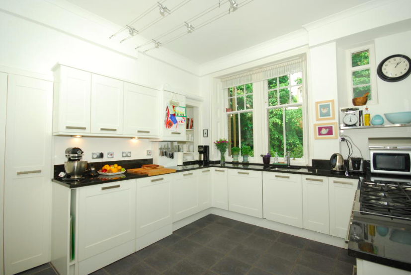
So we did the minimum: tore up the black floor tiles to reveal the original wooden floorboards, painted the walls, changed the lighting and added a Smeg fridge. But the bulk of the kitchen - the granite work surface, the cupboards, the range cooker (which I didn't even know how to turn on until nearly four years of living here) - we left untouched.
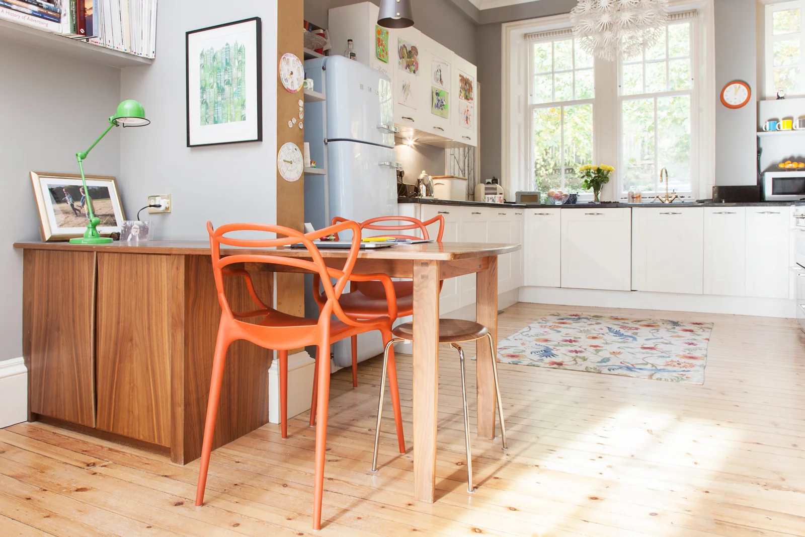
BEFORE Part 2: The kitchen after the first renovation - still with laminate cabinets and uninspiring handles/Photo: Susie Lowe
But the fact remained: our kitchen was just a bit too...kitcheny. As the room is now open-plan to the living room, the slightly grubby laminate cupboards (they look nice and white in Susie's shiny photo above, but don't be fooled) weren't really doing it for me. And although I appreciated the Pink House Husband swapping the existing unpleasant handles for others that were unpleasant in a different way, it didn't quite solve the problem.
So what to do? How to bring the kitchen up to standard, without months of domestic hell and spending a fortune? The answer came - as answers so often do - in the shape of Mick Hucknall, AKA my amazing painter and decorator Paul Sutherland, who, with his mop of strawberry blond hair, is a dead ringer for the Simply Red singer. So much so that he even gets pestered for Simply Red selfies on occasion.
It's not just his looks that make Paul more than your average tradesman; it's his attitude. Paul doesn't say that something unconventional can't be done just because a) it's a bit tricky, or b) he hasn't done it before and can't be bothered to work it out. Nope, Paul is a perfectionist and always up for a challenge, making him the perfect person to come to The Pink House's aid.
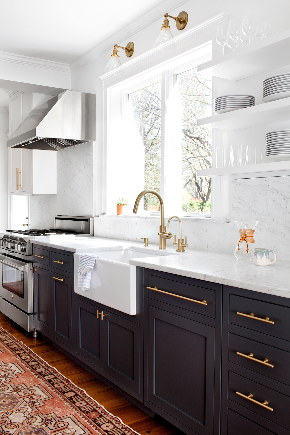
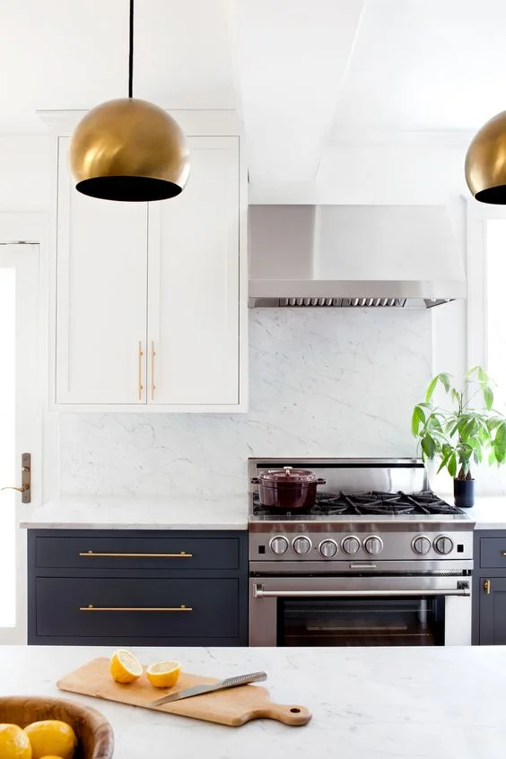
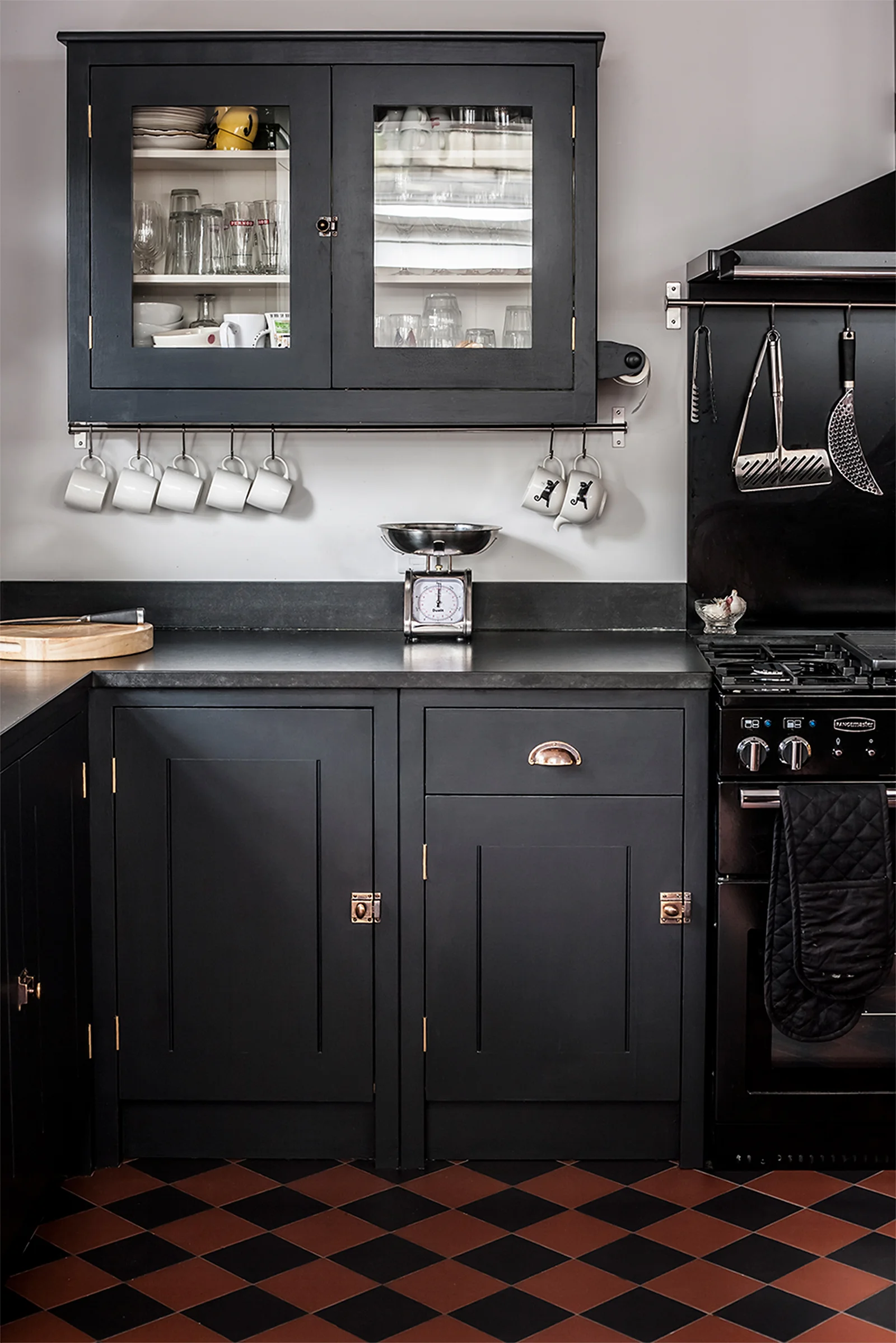
Of course, I had an idea of how I wanted the kitchen to look (i.e. I obsessed about it hourly for about six months), and showed Paul the Pinterest inspo pics below.
Pinterest inspo pic 1 - dark cabinets, brass handles/Photo: Jennifer Hughes, Design: Elizabeth Lawson
Pinterest inspo pic 2 - dark cabinets, brass handles, light wall cupboards/Photo: Jennifer Hughes, Design: Elizabeth Lawson
Pinterest inspo pic 3: black work surface, black cupboards, brass handles/Design: Plain English
Essentially, I wanted the bottom cabinets to be dark, and the wall-mounted cupboards to be paler, so they didn't feel so heavy. I was keen to keep the black granite work surface, and I wanted the whole effect to be that of a bespoke kitchen which had been pieced together, instead of bought as a job-lot from IKEA. I also wanted it to feel less clinical and more living room-y. And I needed some gold bling.
I also knew exactly what handles I was after, having drooled over the heavy metal hardware in Buster + Punch's rock-chic London showroom. The idea was for the handles to all be brass, and all from B+P, but slightly different in design, depending on where they were used. I wanted the T-Bar handles on the lower cabinets, fitted vertically; the Furniture Knobs on the upper cabinets; and the T-Bar/Plate on the drawers, fitted horizontally. We already have a Buster + Punch Hooked pendant lamp over the kitchen table, so I knew the hardware would go nicely.
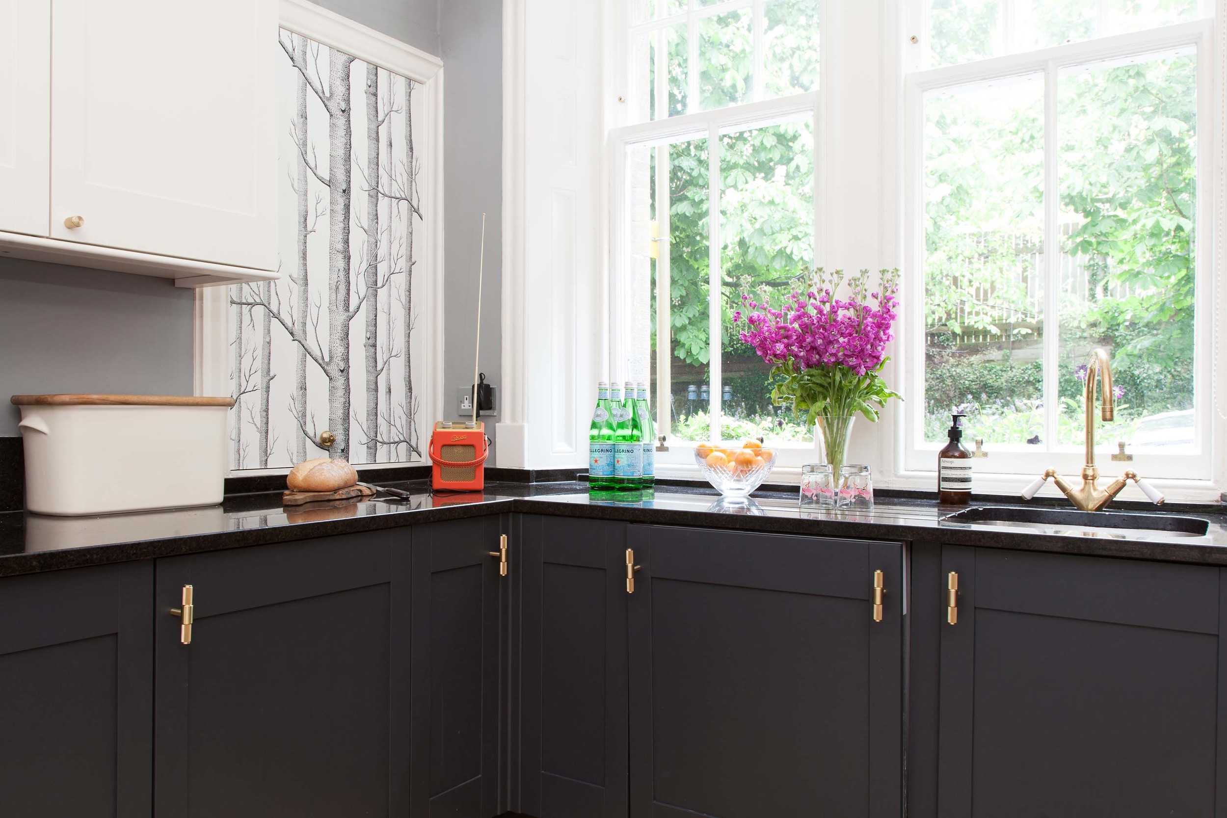
Buster + Punch T-Bar brass handles in the new Pink House kitchen/Photo: Susie Lowe
I also knew which colours I was after - Farrow & Ball White Tie on the wall cabinets (to match the woodwork throughout the open-plan kitchen), and Railings on the lower cabinets and drawers. I wanted a matt finish; our front door is Railings and I love the soft, greyish-black chalky effect, and the way the dark shade helps bright colours sing out.
"No problem," said Paul. "Here's what I'm going to do..." See below for Paul's 5-Step plan, in case you fancy trying something similar with your kitchen...
Painter Paul's 5-Step Plan for Painting Laminate Cupboards
1) "Remove existing handles and fill the holes"
2) "Clean the cupboard doors with soap and water, then give them a good rub with meths so they're really sparkling"
3) "Sand the doors very lightly with sandpaper"
4) "Next I use a special 'grip primer' that sticks to any surface with minimal prep work. I like this primer from Valtti, which I get made up to match the colour of the top coat as closely as possible"
5) "At this stage I could apply two coats of Farrow & Ball Railings estate eggshell. However, I reckon it'll be more kid-proof if I use this Valtti topcoat - Helmi Decorative Paint - in a similar grey-black, in a semi-matt finish. You can use this paint on a wide range of interior surfaces, either in gloss or semi-matt, and it's hard wearing and easily cleaned"
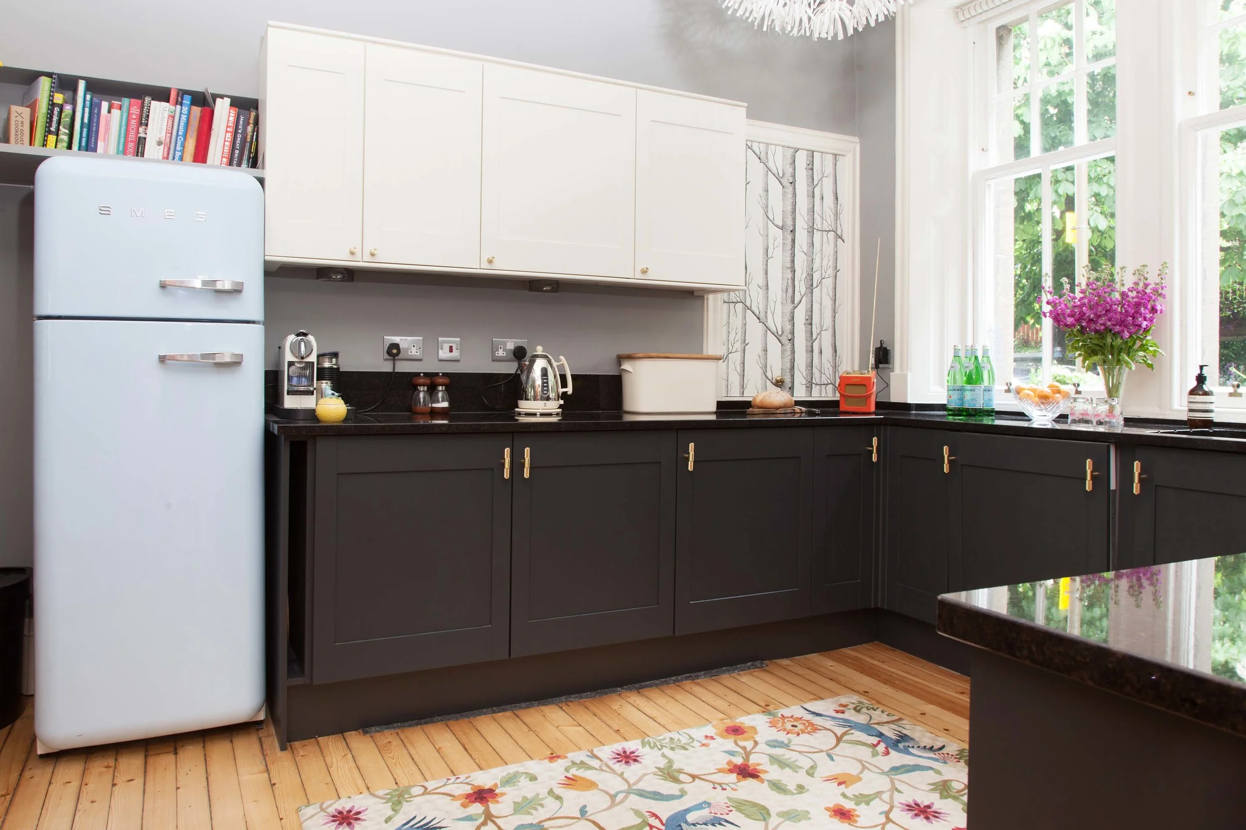
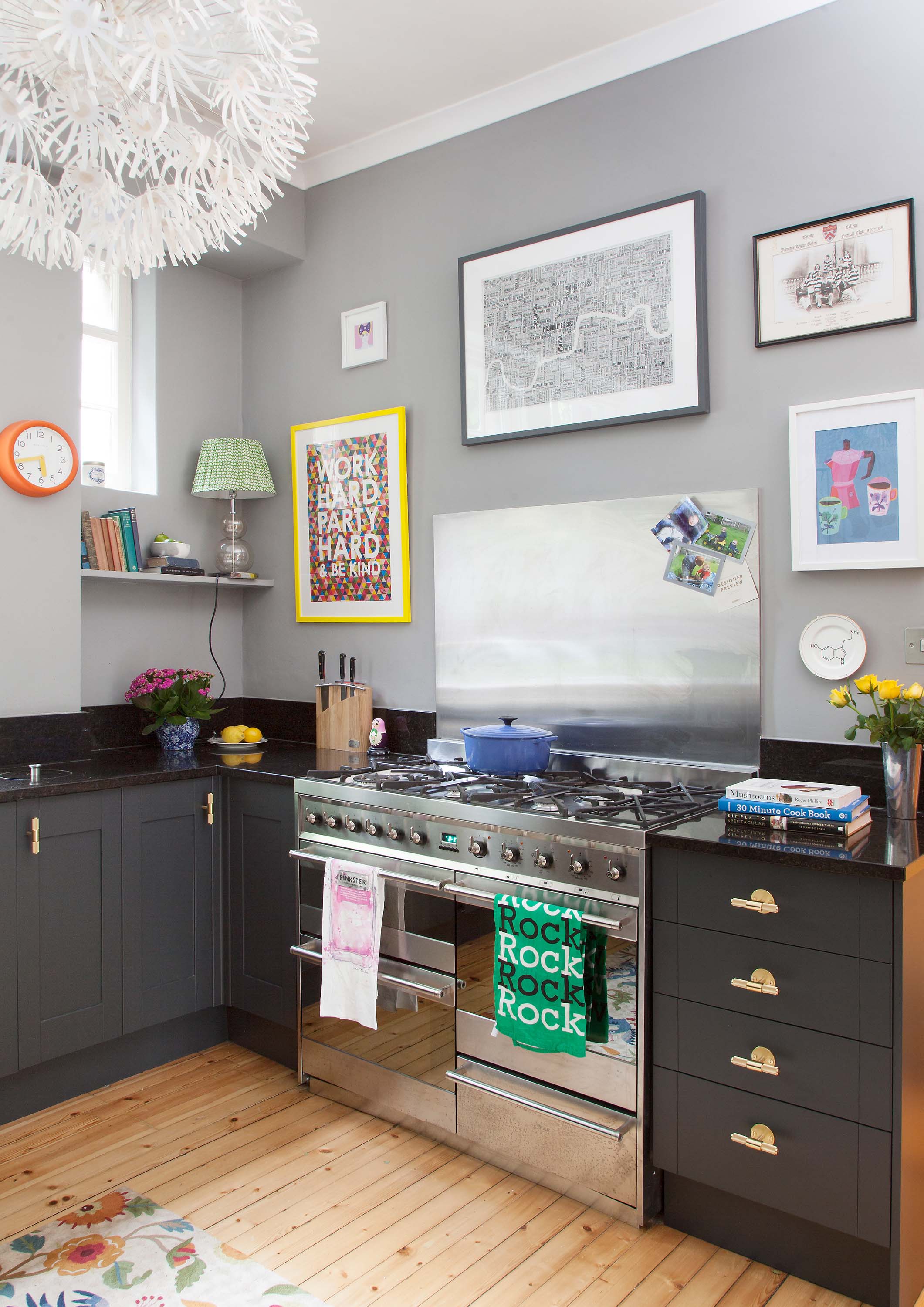
And that's it! After three days of Paul's prepping, priming and painting, and our joiner spending a couple of hours fitting the handles, our kitchen was transformed - and looked amazing. It was exactly how I'd imagined, but much cheaper and quicker than ripping out the existing kitchen and starting again. Oh, and if you fancy getting Edinburgh-based Paul to help with your home renovation (he's a dab hand at wallpaper too), you can reach him on subbo42@gmail.com.
So do you want to see what The Pink House kitchen looks like now? Do you? Oh go on then! Here, finally, are the 'After' photos the fabulous Susie Lowe took of the finished room:

