Full confession: I've been pretty sniffy about Scandi style in the past. I've haw-hawed at Hyyge ("it's just putting a blanket over yourself and lighting a candle, ferchrissakes"), poo-pooed the pared-back colour palette ("soooo unimaginative") and shied away from the bare walls and empty spaces ("where's all the STUFF?!"). But what I'd failed to realise is how Scandi subtleties are the very definition of less is more. Or that less actually CAN be more.
Now don't worry - I'm not about to start decorating my entire home in shades of pale, the mantelclutter is here to stay and I'll never, EVER lose my love of fluoro pink. But what my recent tour of West Sweden has taught me is the power of restraint. I'm a bit of a if-you-can-add-more-add-more kind of girl. But what they REALLY understand in West Sweden is the art of aesthetic editing.
And on that note, I'll stop rambling and share with you the 5 reasons my trip turned me on to the Scandi way of thinking...(nearly all photos by Robert Dahlberg; the odd one by me)
1) Emma von Bromssen and her slow design
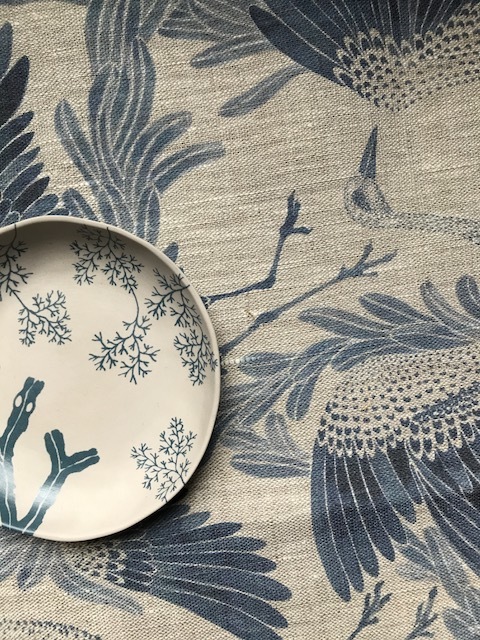
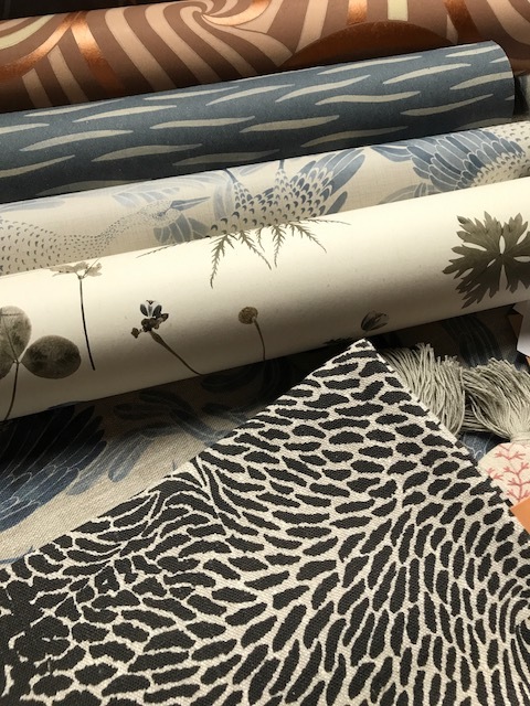
As you'll probably know by now, I have rather a thing for pattern. And colour. And colourful pattern. I like it bright and fun and fabulous. I also speak rather quickly and rather a lot. Gothenburg designer Emma von Bromssen also loves pattern, but she likes her pattern calm and muted and slow. Emma came to give a presentation of her designs while we breakfasted in Sweden's youngest art nouveau castle, Bjertorp (its green-and-gold bar is reason enough to visit this part of the world). And I was transfixed not only by her other-worldly hand-sketched illustrations which take flight on wallpaper and fabric (cranes, above, was my favourite), but by her slow, almost dreamlike delivery. Emma believes in the concept of "slow design", and her careful, handcrafted approach enriches each one of her pieces.
Slow down. Concentrate on the task in hand. You have all the time that you need. That's what Emma and her cranes taught me that morning.
2) Scandi blogger Frida and her cool AF photo
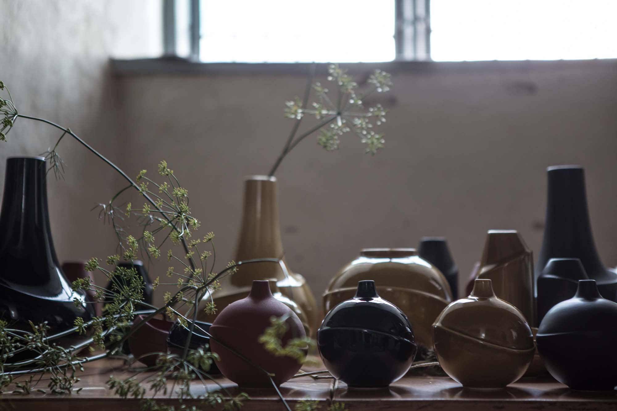
After watching the lovely Anna Elzer Oscarson's beautiful vases being made in the Lidkopings Porcelain factory, we were tasked with photographing the finished vases in the 15th century Lacko Castle (above), with the pure Swedish light spilling through the rippled glass onto ancient bare plaster and worn flagstone floors.
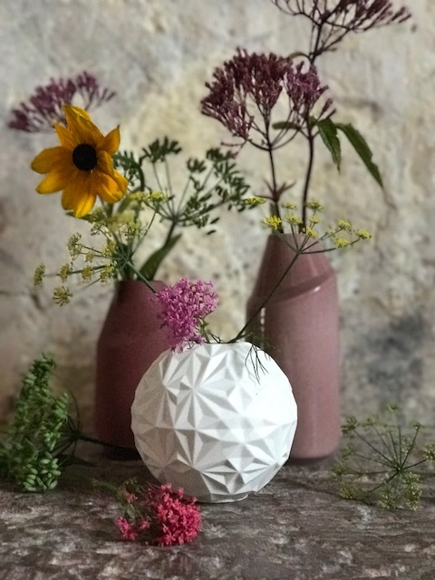
As part of our styling/photography challenge the team had assembled a range of Anna's vases on a long wooden table (above), and had brought armfuls of foliage and flowers from the castle garden (more on this in a bit) for us to use as props. We were then encouraged to seek out beautiful nooks and crannies in the castle to photograph our selection. However, I was unable to carry my extensive selection of ceramics and flora further than the floor next to the table I'd chosen them from - luckily it had a pretty patina and was well lit by a large window. I fussed with the flowers and rearranged the vases until finally I had some semblance of a styled shot, and snapped it on my iPhone 7 Plus (can't be doing with the faff of a proper camera!). But with no-one else nearby I had no idea of the approach taken by the other bloggers.
Faffing with flowers
My styled photo
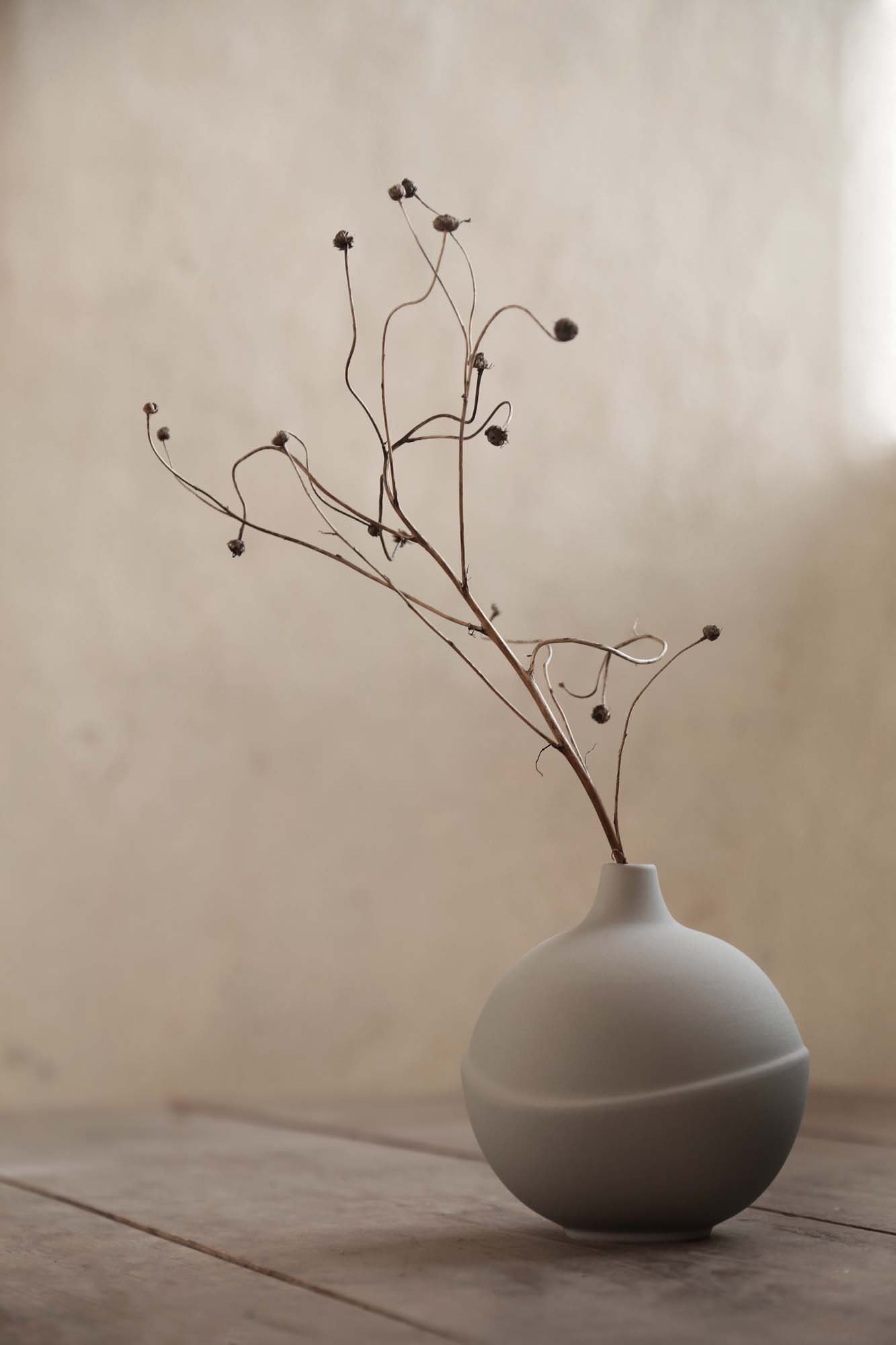
Before dinner, the various shots were shown on a projector for all to see. Mine was first (see above) and I thought, yeah, that looks ok, the composition's quite nice and there are lots of pretty colours. Then came Frida the lovely Swedish super-blogger, who has an enormously popular blog, Trendenser, and an Instagram feed with over 130,000 loyal followers. And from just one photo I could see why: this girl KNOWS design. She has it in her Scandi blood. With just one vase, one sprig of foliage and a bare wall (and a proper camera - that slow design again), her picture has a raw beauty that no number of colours, patterns or complicated arrangements can touch. See for yourself:
Anna Elza Oscarsson vase photographed by Frida Ramstedt from Trendenser: less is more
3) The gorgeous Gothenburg shops
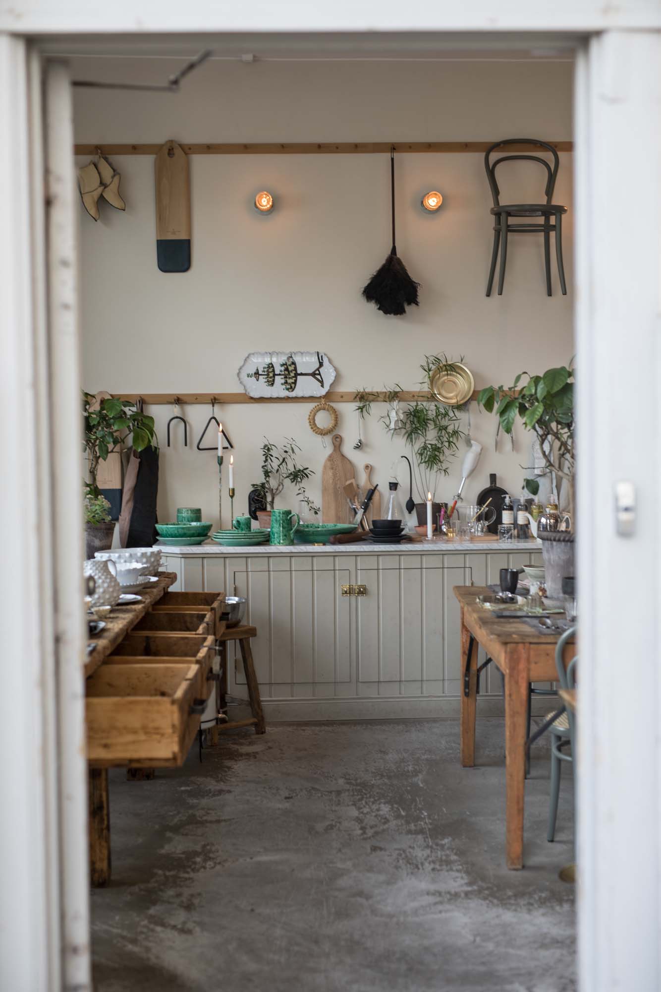
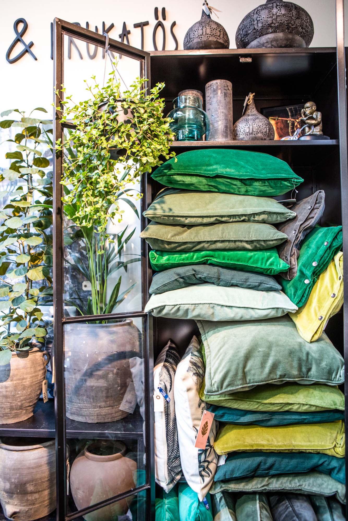
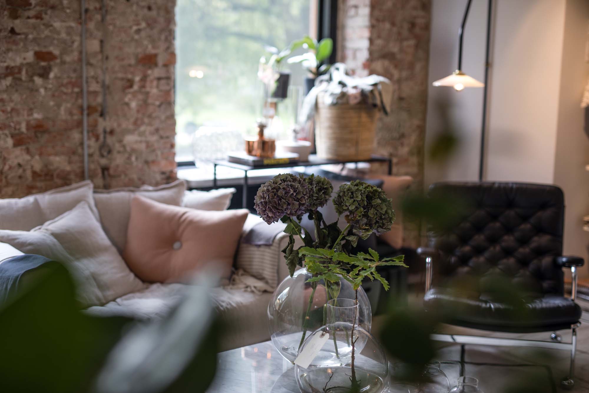
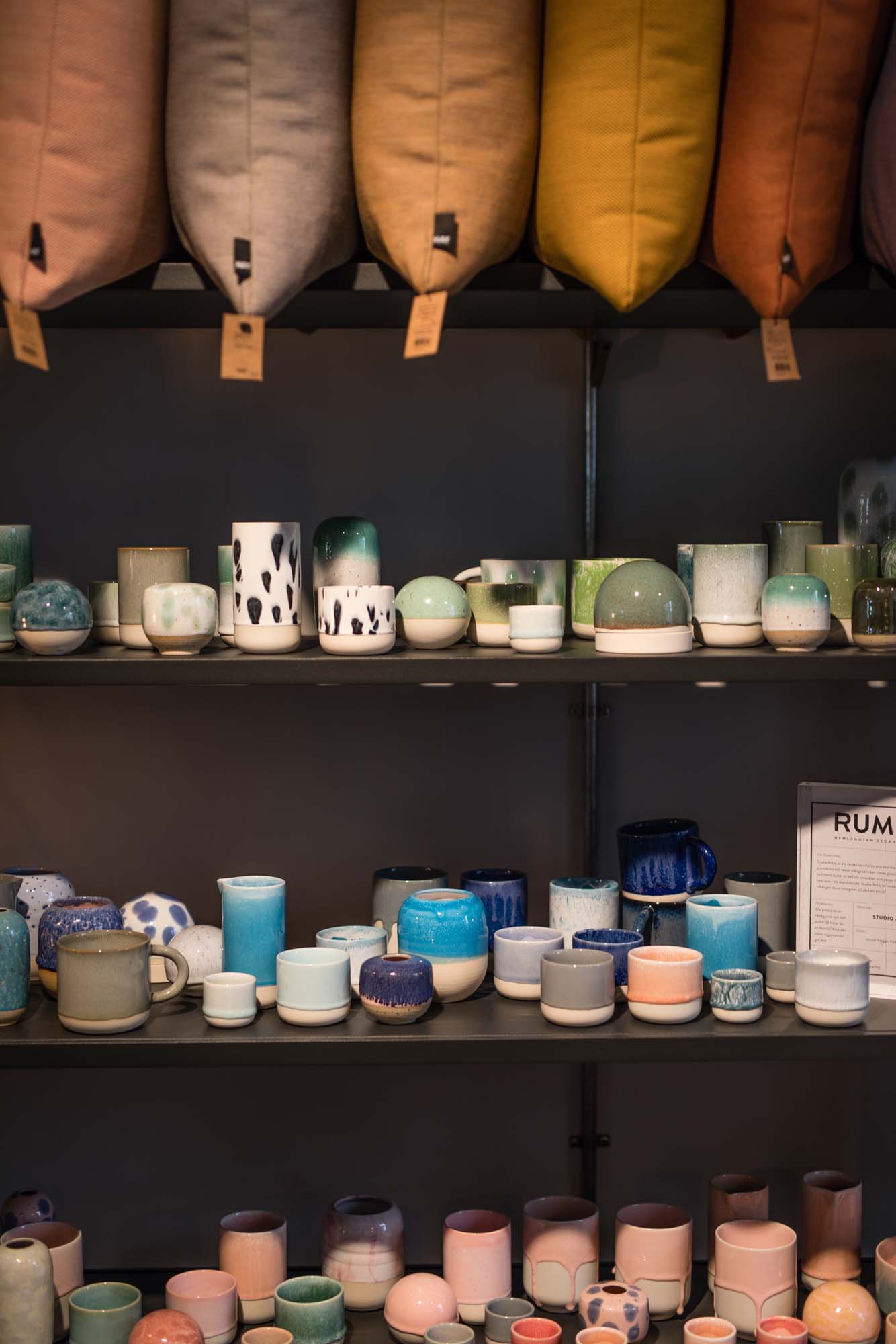
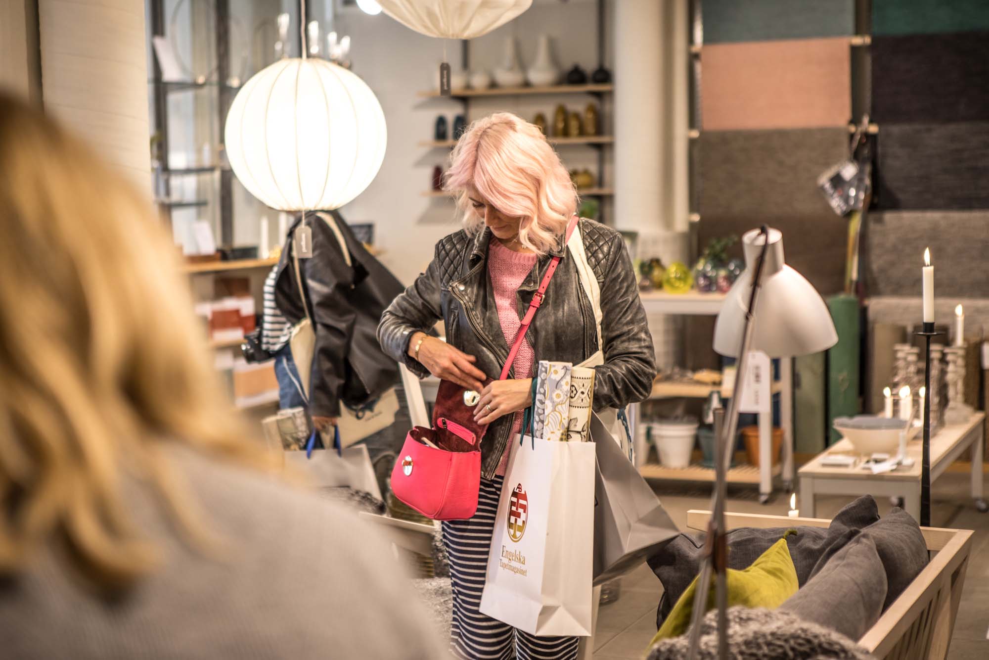
Every time we entered a shop in Gothenburg, I wanted a) to buy everything in it, and b) style my house to it looked just like the shop. In the spirit of my new-found less-is-more attitude, I'm not going to say any more on the subject; instead I'll let the pictures do the talking and include click-through links to each shop in the captions so you can find out more for yourself.
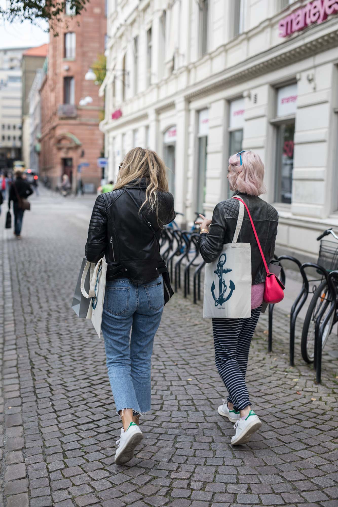
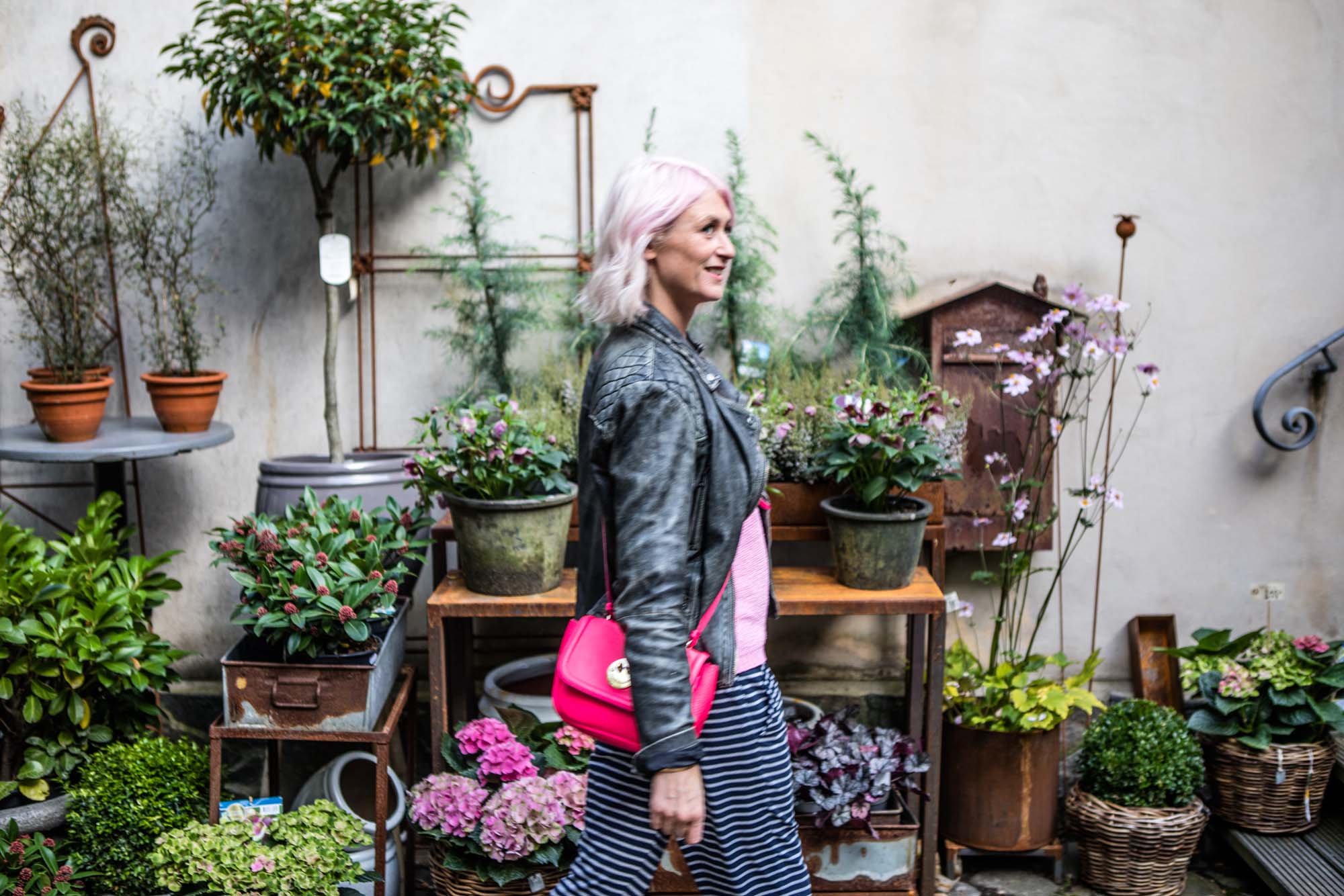
Shopping the streets of Gothenburg: me and Arianna both got the Stan Smiths memo
Floramor och Krukatos plant shop of dreams
Inside Floramor och Krukatos
Rum21 - I actually DID buy half the shop
Rum21 again - half of these ceramics now reside in my house
In Norrgavel: "Just let me get my purse; I'll take the lot"
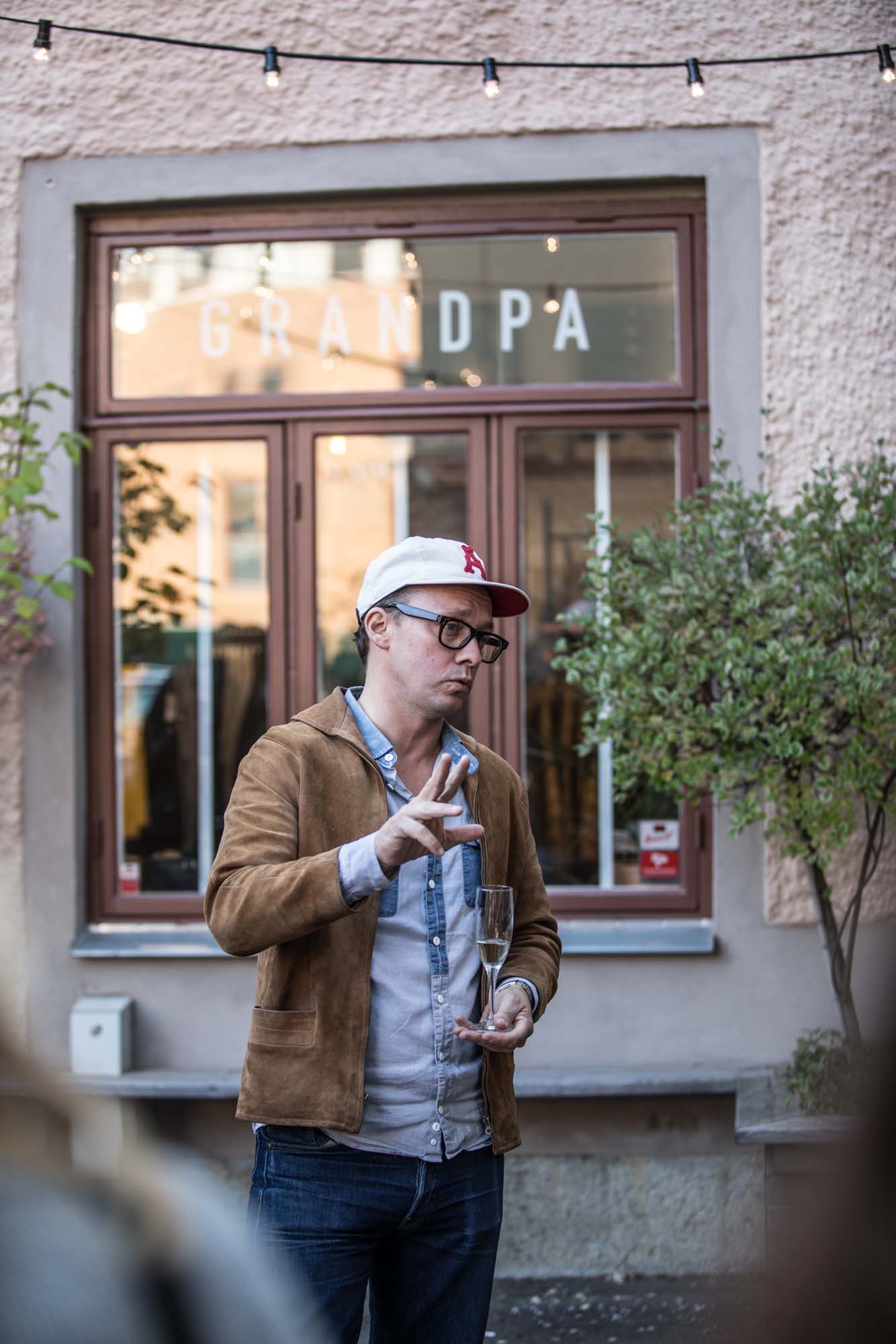
The owner of lifestyle store Grandpa, outside his own store
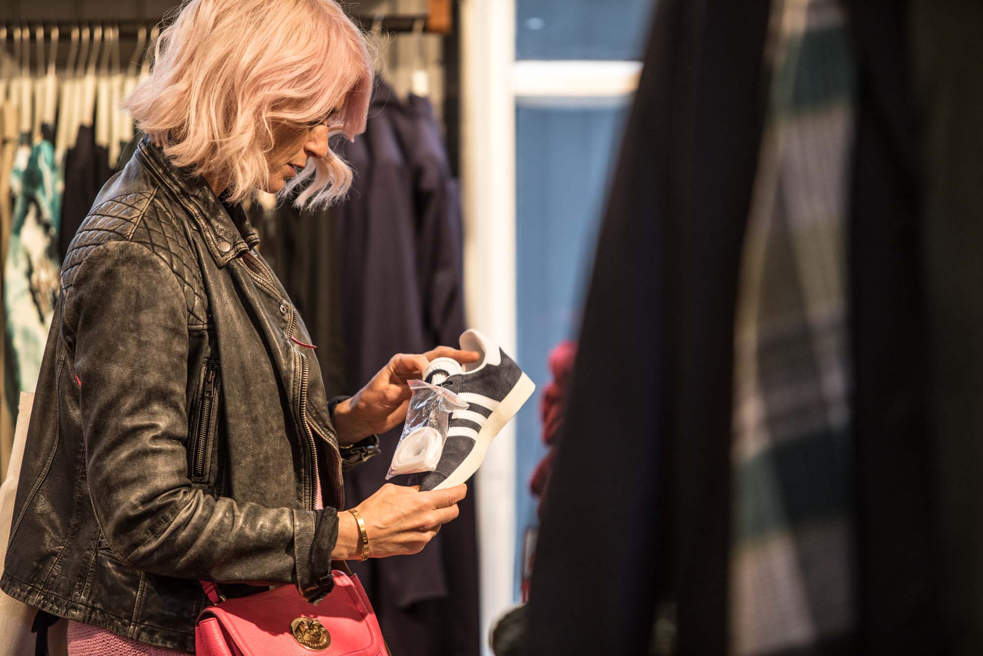
Feeding my trainer addiction in Grandpa. Yes I bought them.
4) The prawn sandwich at Heaven 23
Choice. We're always told it's a good thing, aren't we? But in this age of everything overload, sometimes the ultimate luxury is NOT having to choose; to instead be served something sensational that's been handpicked just for us. Many of my favourite dining experiences have involved either a dinner party, where the host cooks their signature dish; a set-menu restaurant, where the chef serves the seasonal pick of the day; or my mum's house, where she rustles up a pan of good old chicken soup.
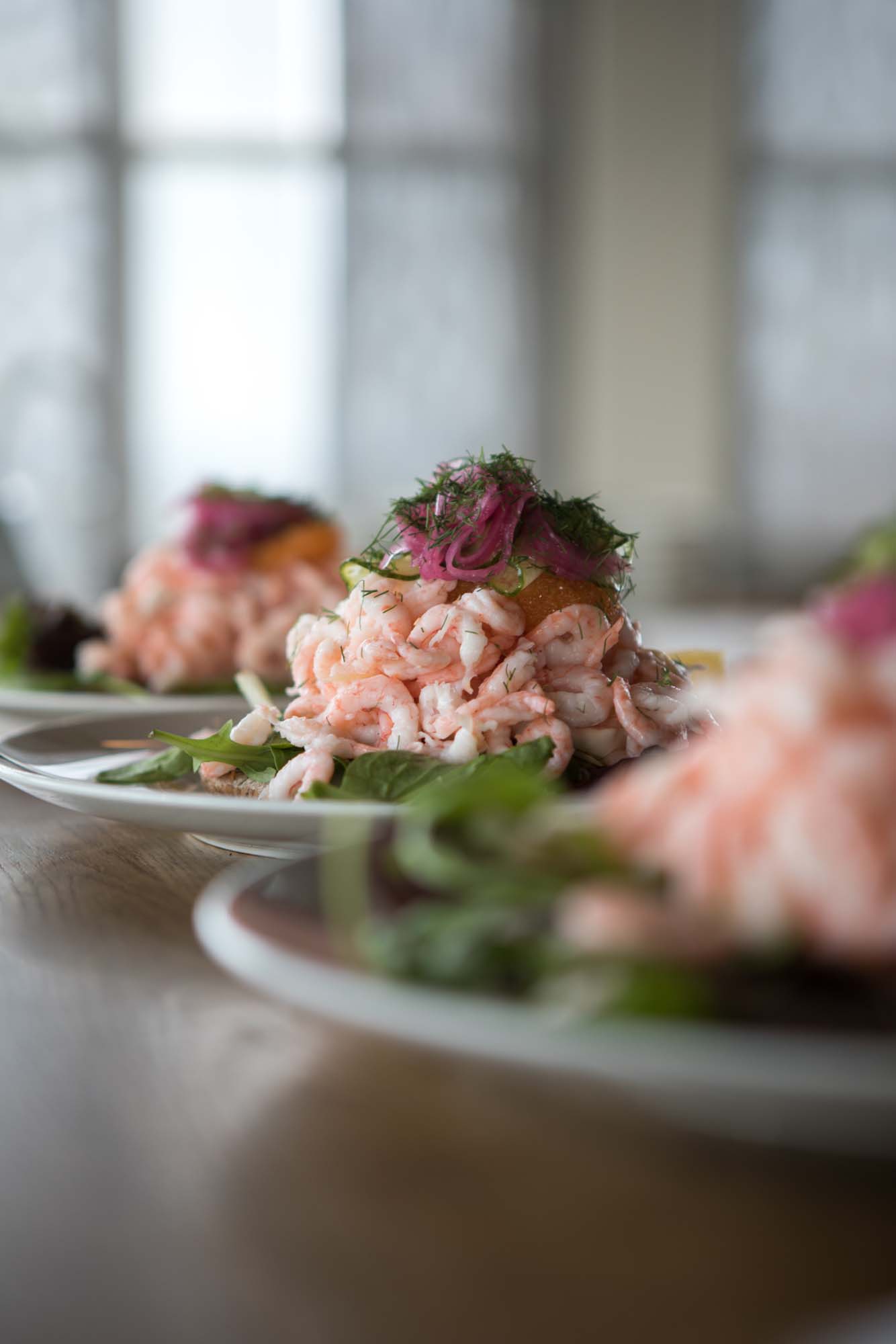
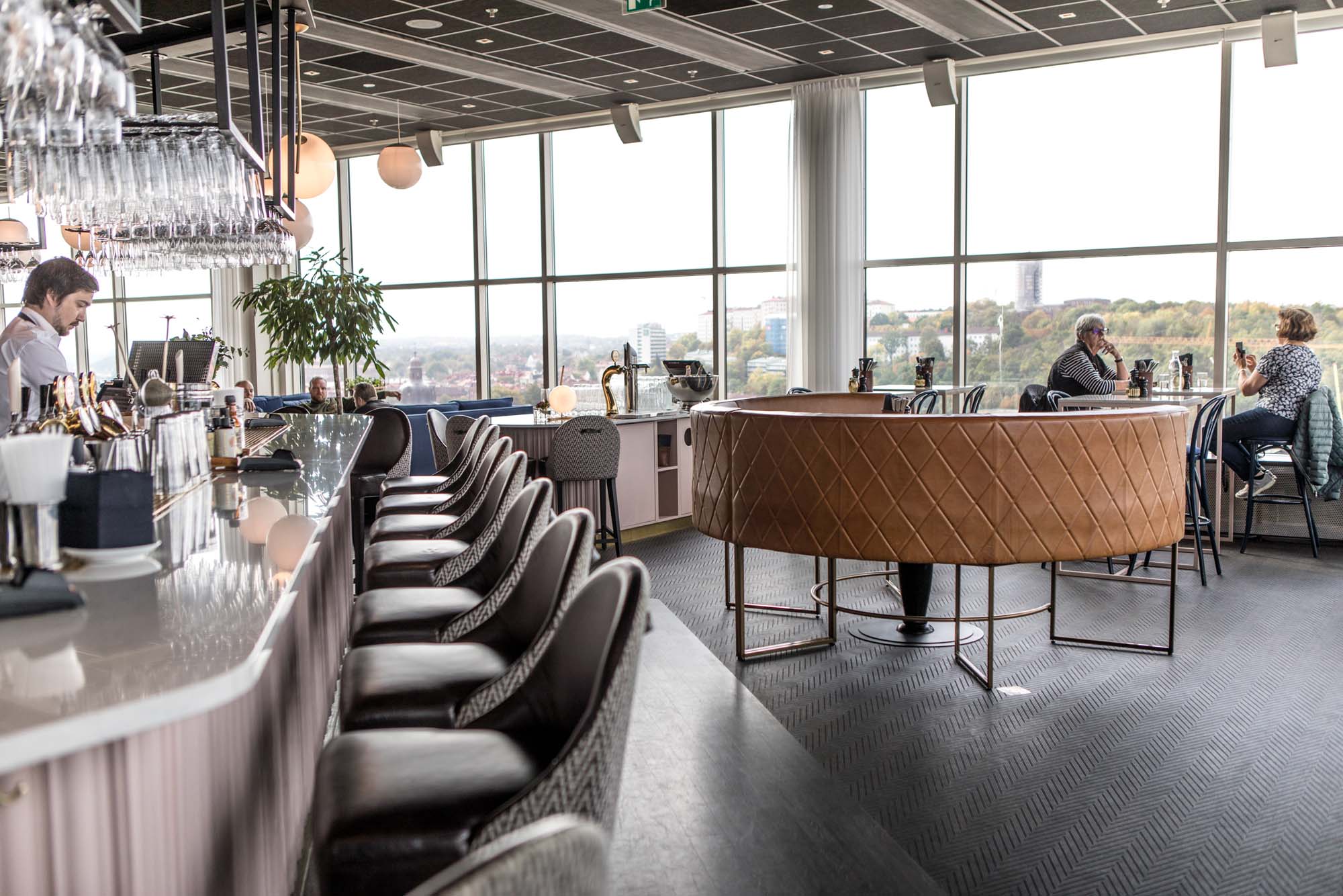
I'd like to add to my ultimate eating experiences my lunch at Heaven 23, high up in Gothenburg's Gothia Towers with views of the city. We were offered one option: the house speciality of the open prawn sandwich. And it was bloody amazing. Plus the interior design wasn't too shabby either.
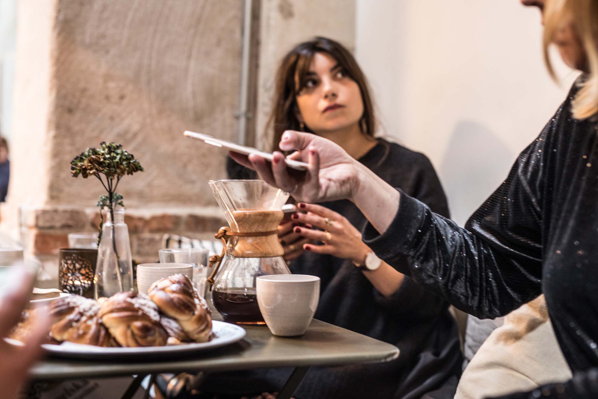
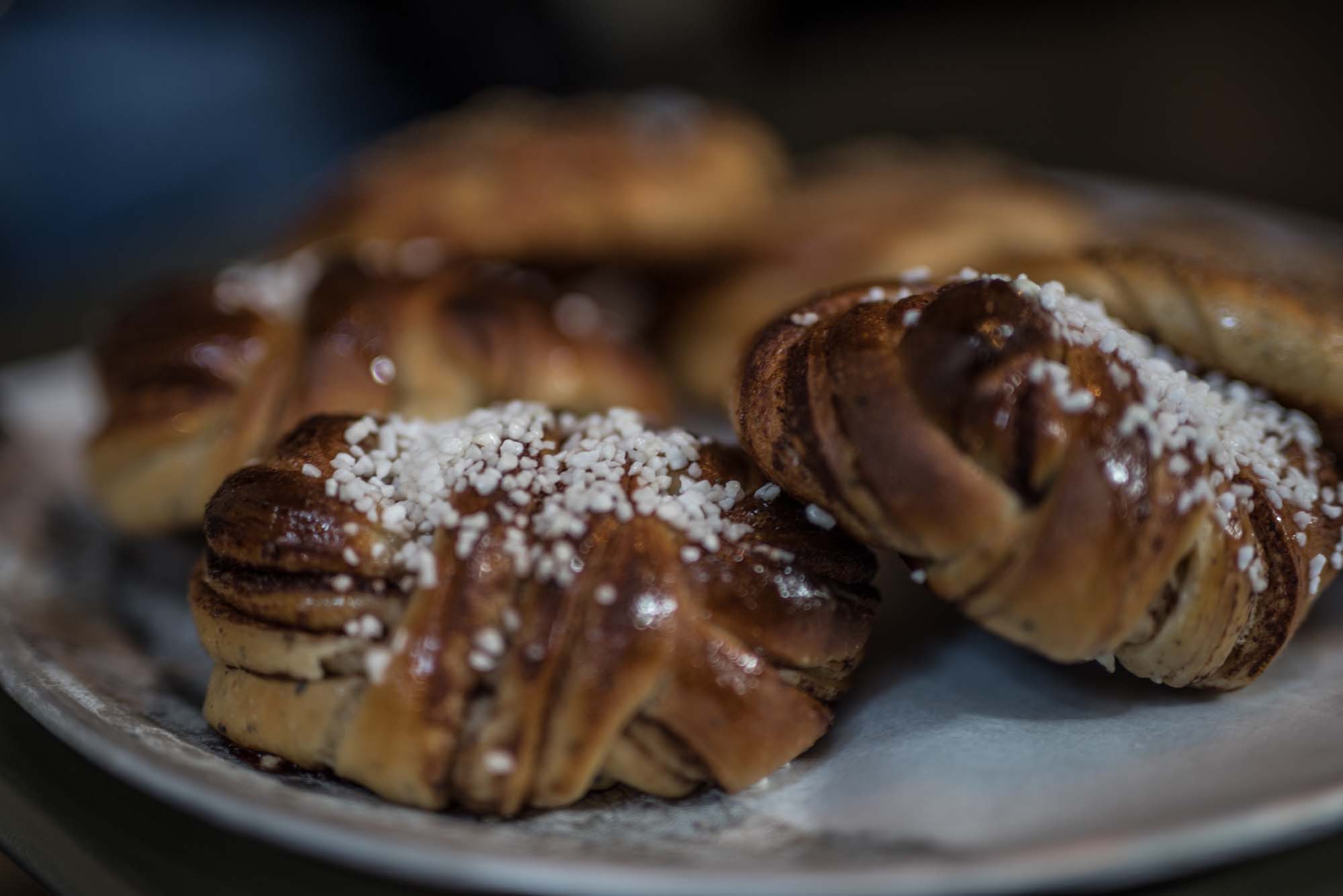
And one more top Gothenburg choice-free eating spot if I may: the DaMatteo coffee shop, where they roast their own and where they served me black coffee (milk and sugar are not an option). Despite my dairy/sugar addiction and initial reservations, it was possibly the best coffee I'd ever tasted. Plus my sweet tooth was catered for with the best cinnamon buns in the world (no other pastry was offered).
Choice. Who needs it?
The ultimate prawn sandwich at Heaven 23
The pink bar at Heaven 23 in Gothenburg's Gothia Towers. Sigh.
Best-ever buns and coffee at DaMatteo
Check out those BUNS
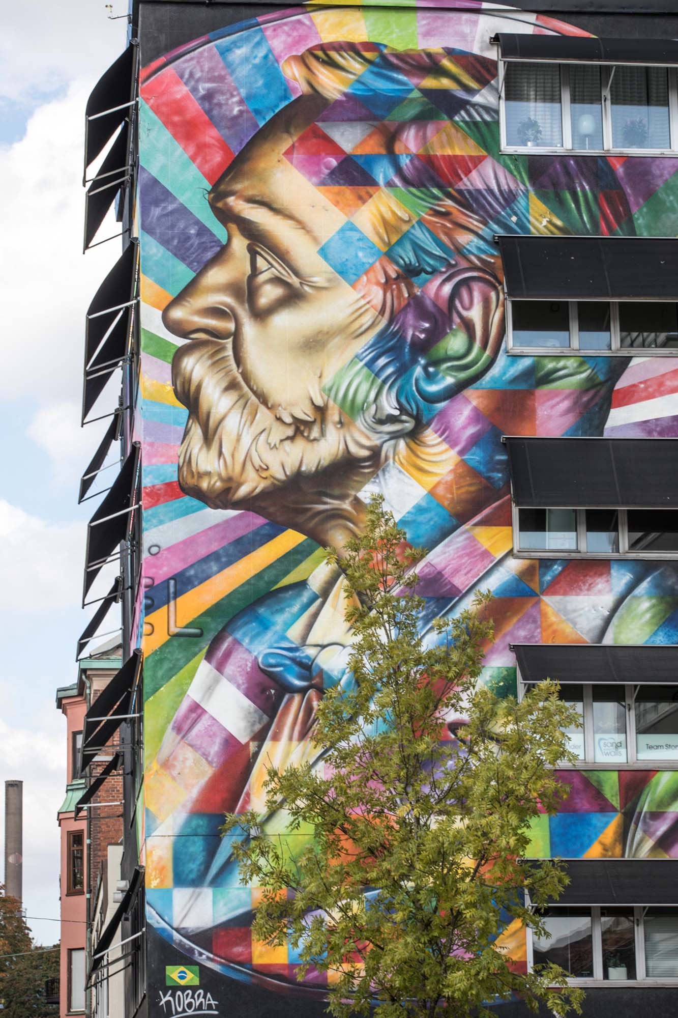
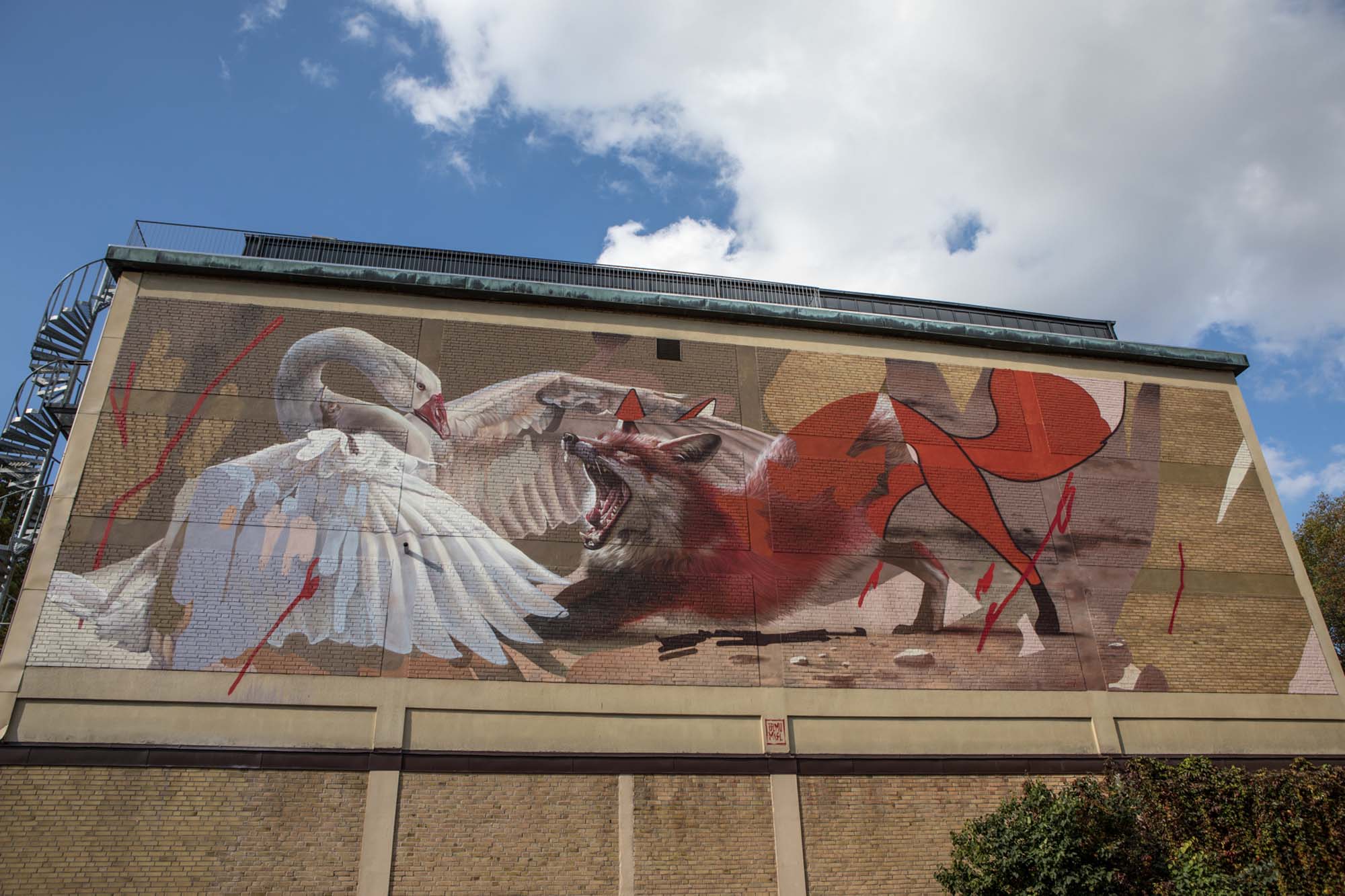
5) The street art in Boras
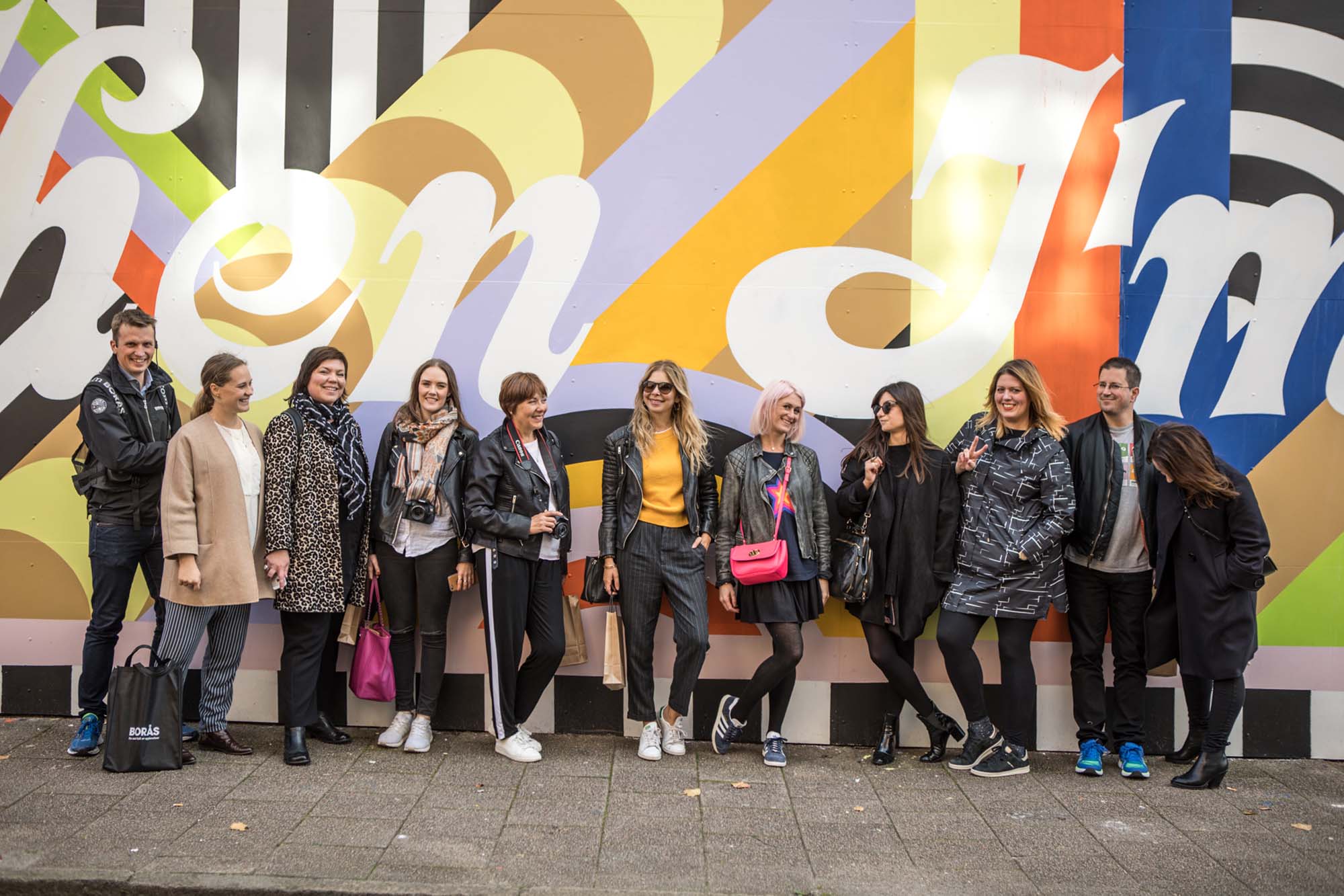
One of the things I love about my home town of London is the urban creativity found on the gritty streets of Shoreditch. But Boras, a 45-minute drive from Gothenburg, is a shining example of how a city can be both spotlessly clean, AND packed with creativity.
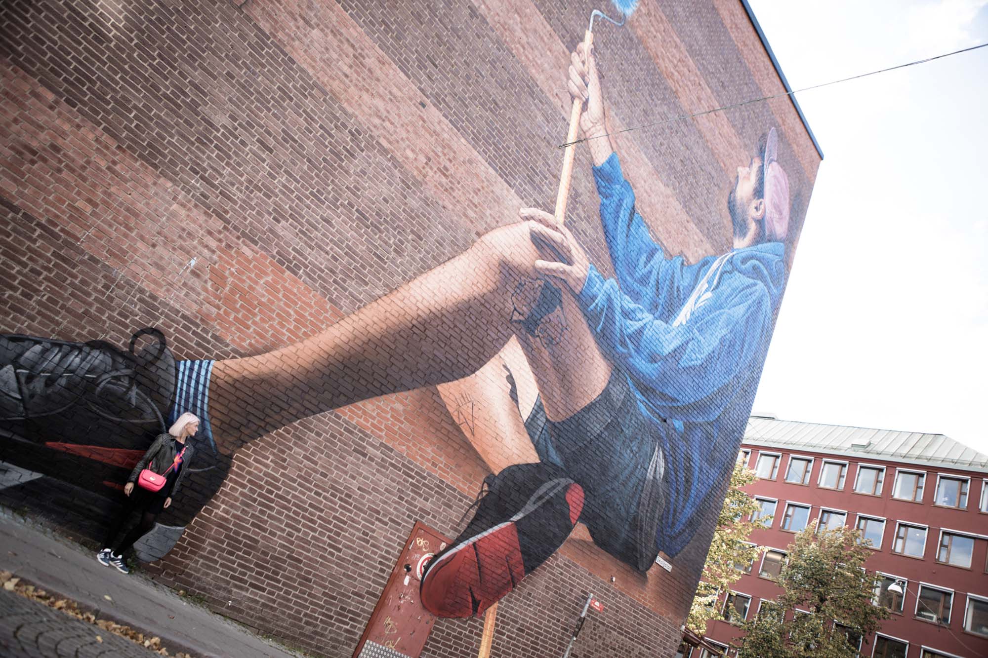
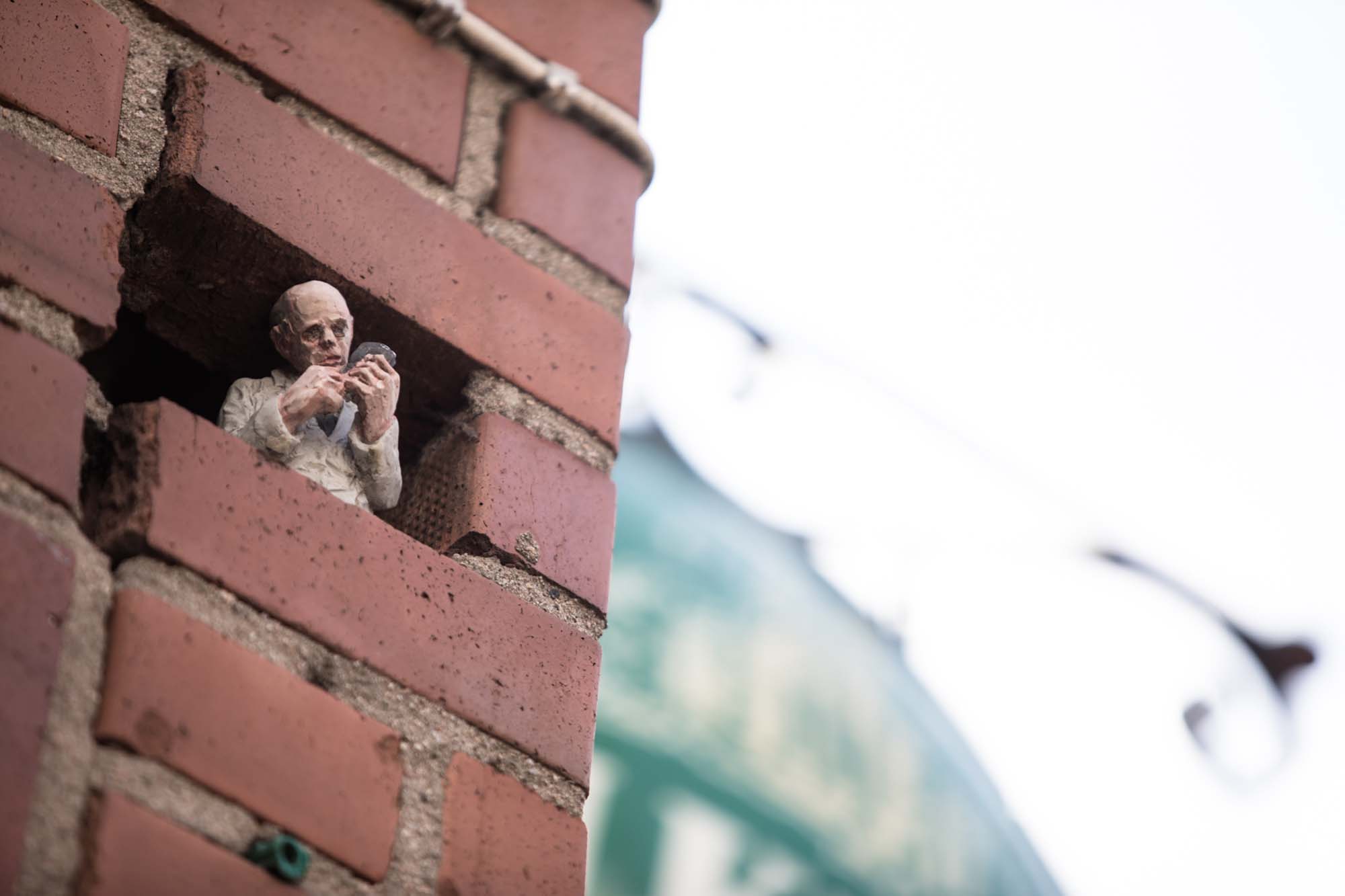
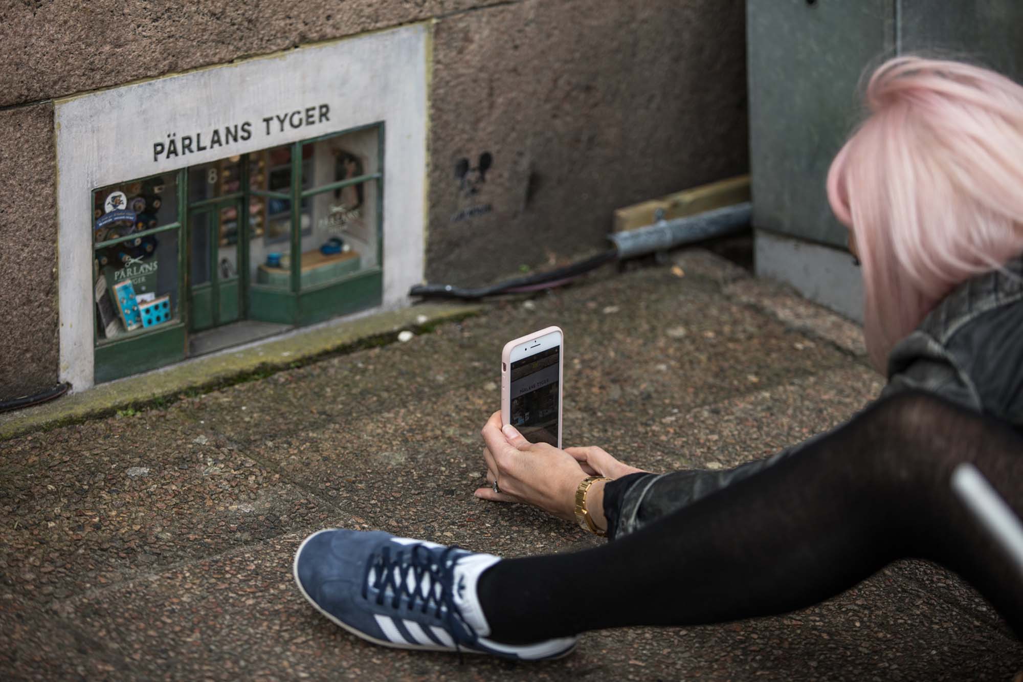
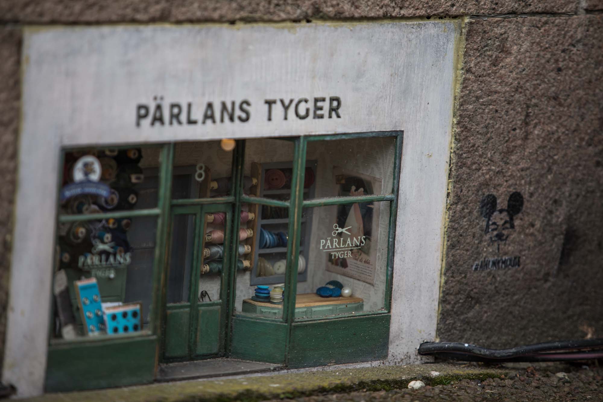
Because not only is Boras home to the Textile Fashion Centre, a place so cutting edge that students produce designs that are worn by the likes of Lady Gaga and Rihanna, it is also the canvas for a wide variety of street art, some of which - like the mouse-sized shops set into the sides of buildings - totally blew my mind (see below for pics).
If this is Scandi style, I'm a complete convert. If there's Hygge to be had, I say BRING IT ON!

