I’ve no idea who told me that if you love pops of colour in your home you must paint your walls white. But while I can’t remember where I heard it, the white walls ‘rule’ stuck with me throughout my teens and twenties. So I painted every wall of the first flat I owned in North London’s Kentish Town in shades of pale. Same with the next apartment I bought in Archway. Finally I made the big move north to Edinburgh and my first family house, where I was planning to continue in the same bloodless vein.
But the thing about Edinburgh is it’s arse-munchingly cold and dark during winter. And the thing about having kids is you end up staying in night after night while your baby either does or doesn’t sleep. As a result of the cold, dark, semi-sleepless nights in, I started to crave cosiness. Despite my house being prettily proportioned, with all the period details you could want, and despite the heating being turned up beyond what my parents would ever approve of, and despite there being a roaring log fire, I still didn’t feel properly warm.
One day I was flicking through Livingetc when I realised the one thing uniting most of my favourite spaces was the combo of a dark-ish background and brightly coloured furnishings and fabrics. A lightbulb moment: maybe the key to cosy was the colour of my room?
The Pink House living room with Farrow & Ball Manor House Gray walls and Wendy Morrison Design 'Enchanted Wood' rug/Photo: Susie Lowe
So I took the plunge and (nervously, I’ll admit) painted my living room and open-plan kitchen walls a medium-dark grey – Farrow & Ball Manor House Gray to be precise (see above). The transformation was incredible; I felt instantly warmer and happier, even though the thermostat stayed the same. It was like the living room was giving me a big, warm hug. I even felt less tired. We’d also just bought an emerald green velvet sofa from Ikea, and I was amazed by how the colour of the sofa - which I’d thought might get lost against the darker walls - shone out, more jewel-like and vibrant than it had been against off-white.
As I quite literally warmed to my colour-against-dark theme, I started to discover inspirational Instagram feeds whose owners had come to the same realization. These included:
- @stellaandthestars and her dark grey London walls, the perfect foil to pink neon and sunshine yellow chairs
- @patirobins and her no-fucks-given rainbow of cushions, cactuses and crazy-cool art against a smoky backdrop
- Lucy from @rockettstgeorge, who uses navy blue walls to help warm up a space in the middle of a period house, and show off her Slim Aarons’ Poolside Gossip print (I desperately want this print; Pink House Husband is less keen)
- High priestess of the dark side and magnolia’s anti-Christ, @abigailahern
- The #styleitdark hashtag, and the stylish group of interior experts @artynads @cowboykate_ and @jazzierere who launched it
I also discovered a lovely lady called Wendy Morrison from Wendy Morrison Design who had taken the colour-on-dark concept and applied it to the design of her stunning handmade rugs.
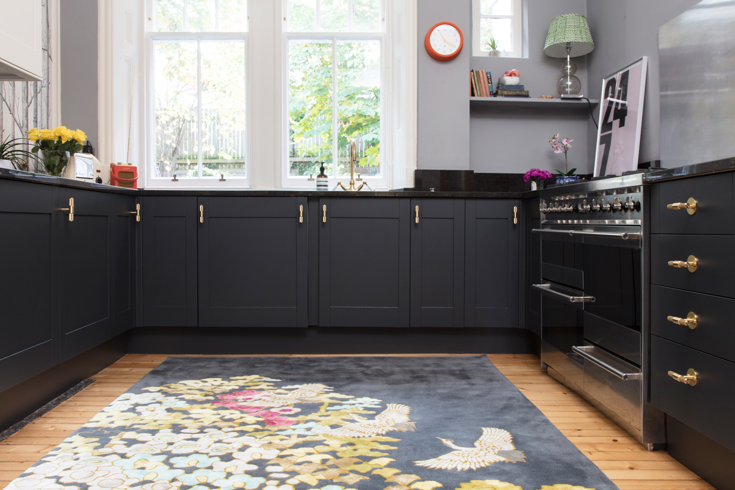
Such was my love for Wendy’s rugs (which are also sold by John Lewis as part of the retailer’s Design Collective), that I persuaded photographer Susie Lowe to do a shoot with the rugs in The Pink House, the transformative results of which can be seen throughout this post. As we placed Wendy’s rugs in various rooms, I marvelled at the vibrancy of her designs when set against a darker wool background (as in the Mount Orient rug in my kitchen, above, and also in her Summer Bloom, Chinese Deco and Forest designs). I was also struck by the cosy, luxe effect of having a darker rug in a room; like painting your walls darker, but easier to switch around if you suddenly feel like a different look. So many beautiful rugs, but my three favourites all riff on the style-it-dark concept:
1) Mount Orient, as seen in my kitchen
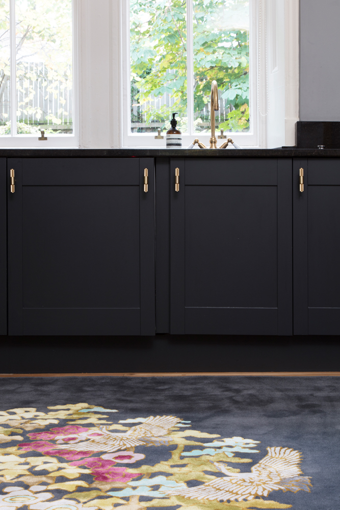
Wendy Morrison Design 'Mount Orient' in The Pink House's kitchen/Photo: Susie Lowe
The dark grey background takes the pretty Japanese-inspired floral design and gives it an edge. I also love how the dark grey and gold pick up the colours in my cabinets.
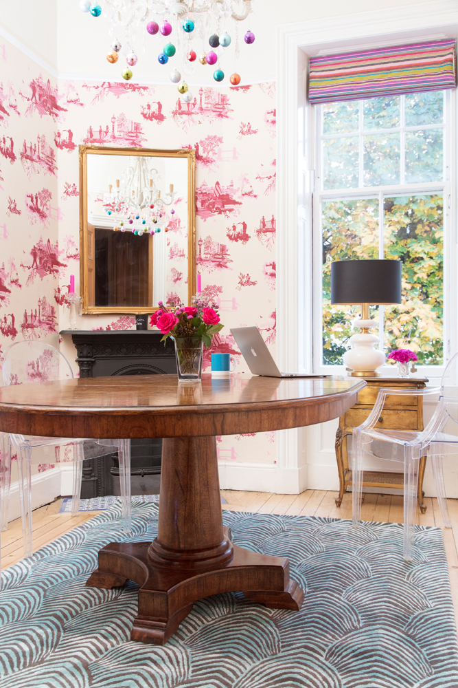
2) Peacock, as seen in my dining room
Wendy Morrison Design 'Peacock' rug in The Pink House dining room/Photo: Susie Lowe
As subtler take on the style-it-dark concept, the mid-grey background lets the turquoise pattern sing without being OTT. Having a darker colour in the rug also grounds the space, while drawing your eye to the darker elements in the room, which also happen to be my favourites – the Victorian fireplace and vintage black-shaded lamp.
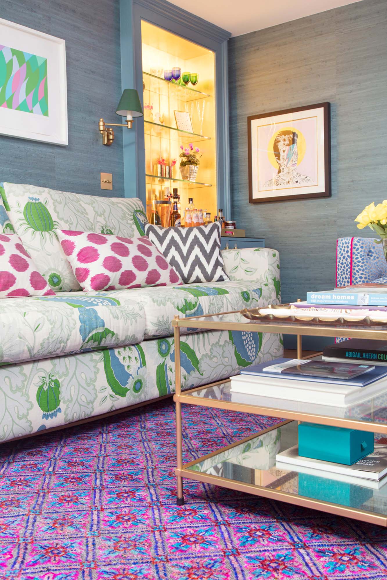
3) Govind, as seen in my Den
Wendy Morrison Design 'Govind' rug in The Pink House Den/Photo: Susie Lowe
A brighter take on dark, but replacing my cream Beni Ourain with this rug in my basement Den transformed the room into a more opulent, decadent space. As well as having serious impact, the sumptuous feel of this wool and silk rug is to die for. I literally spent half an hour just stroking it and gazing at the iridescent threads.
Still unsure about ditching the white background for something braver? Perhaps Abigail Ahern herself can persuade you: ‘Bold hues make everything on display feel grander, cooler, more intense, with beautiful undertones subtly changing in the daylight. You’ll never look back!’
For more about Wendy Morrison Design, and to see (and shop) all the amazing rugs, visit www.wendymorrisondesign.co.uk
This post was sponsored by Wendy Morrison Design, but all opinions are my own.

