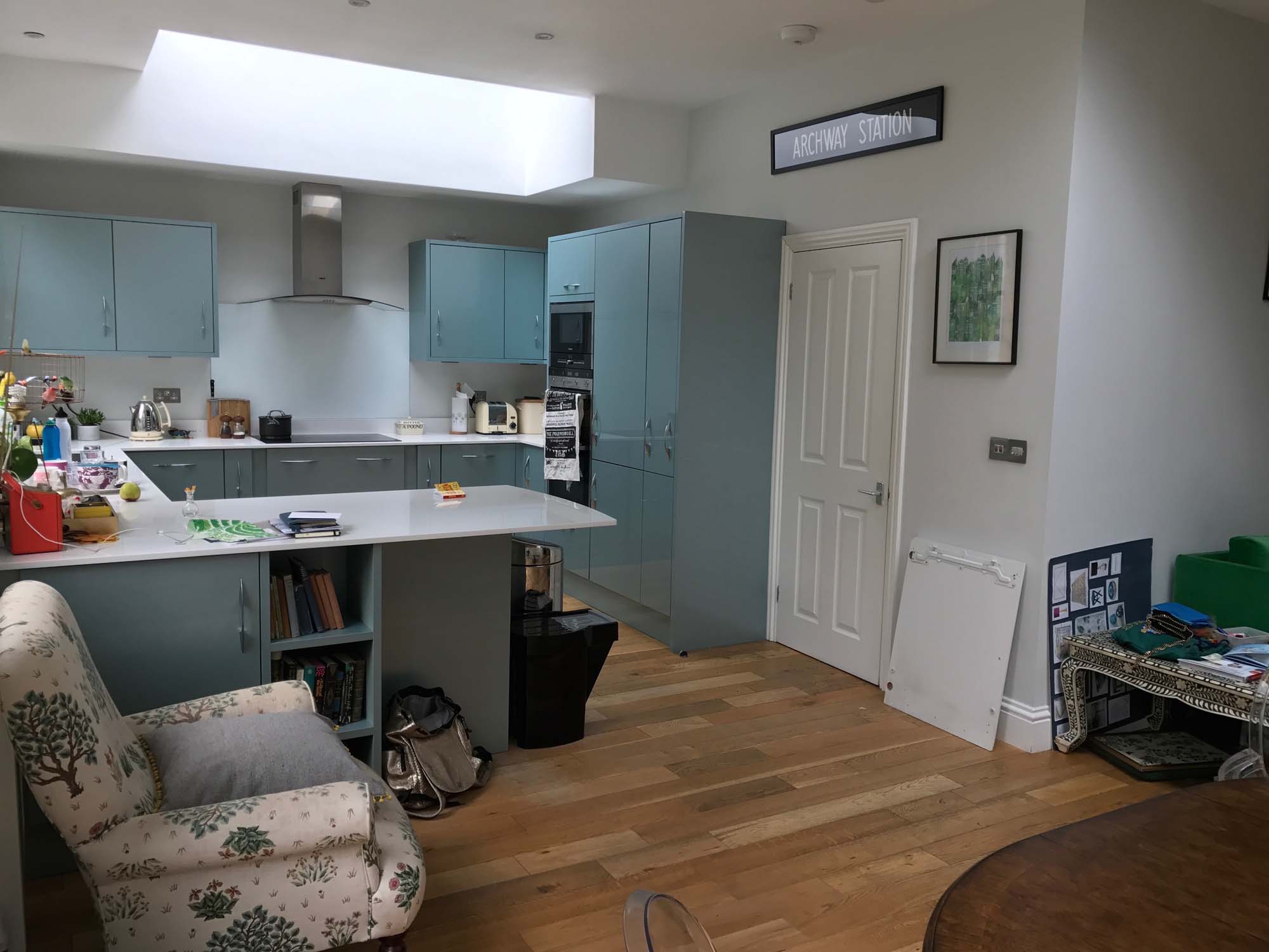
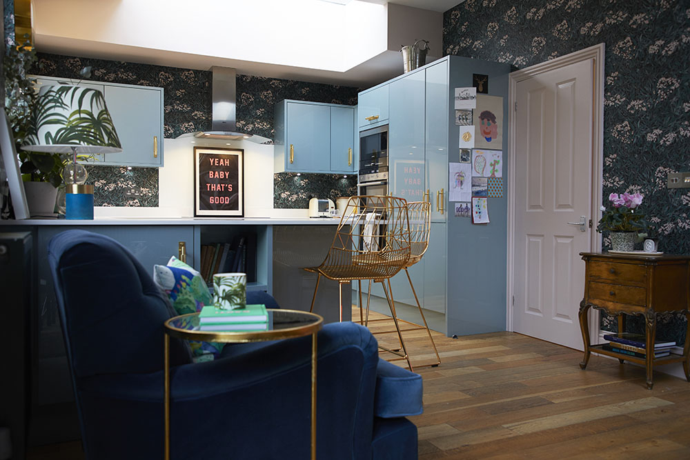
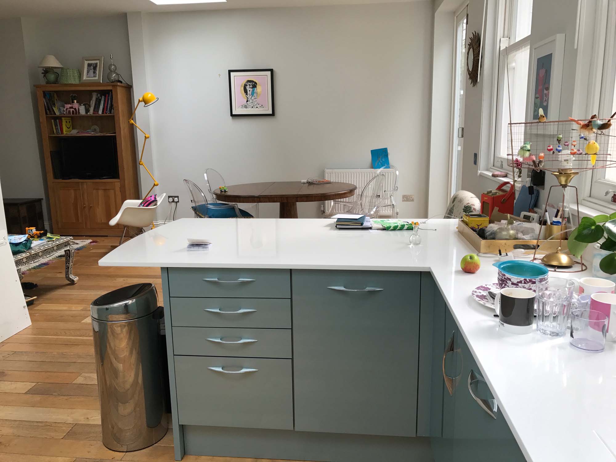
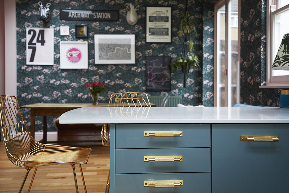
BEFORE/AFTER PHOTO REVEALS FURTHER DOWN | ALL 'AFTER' PHOTOS BY GAVIN SMITH
The other day I was walking past Liberty’s (who am I kidding; I'd been inside for about two hours and had just emerged, blinking into the semi-darkness) and a woman hurried up to me.
“You’re the Pink House lady aren’t you?”
I assured her I was the very same.
“Well, I just wanted to say welcome back to London. And tell me: how are you getting on with the house?”
I still find it wonderfully weird that anyone knows/wants to know so much about me and my home. But being a chronic oversharer (some call us ‘bloggers’), I’m not going to question it. So here, for the lovely lady outside Liberty’s, and anyone else interested in the progress of the bricks-and-mortar Pink House in London, is the update on my kitchen/diner renovations, 6 months after we moved in…
Can't beat an armchair in the kitchen
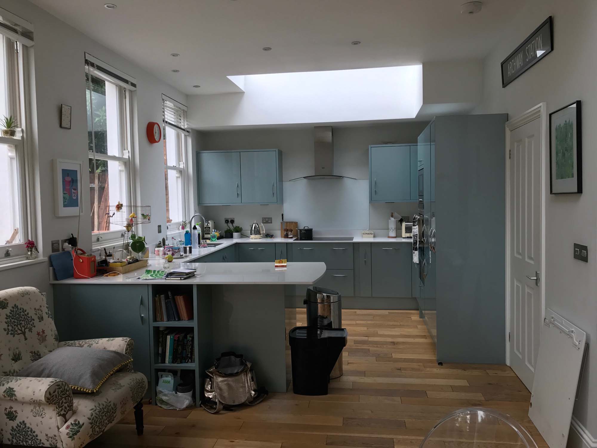
This room, the open-plan kitchen dining room, which opens onto the family room (more on this in another blog post coming soon), is the largest and brightest in my South East London Edwardian house, and is the result of a south-facing extension that was added by the previous owners about 5 years ago. It spans the width of the back of the house, with south-facing windows and a bi-fold door facing on to the back garden, which in turn leads directly to the private 4-acre nature reserve/park we share with the other houses on our block. The room, and the semi-wild-yet-secure outside space that it backs onto (AKA mother nature-as-nanny), is the main reason we bought this house.
As you’ve probably gathered by now if you follow @pinkhouseliving on Instagram, when we bought the place it was a vision in shades of beige, which at least makes for some striking reveals as I colour it in, room by room. This room is no exception. So here you go – before/after shots of the first stage of our renovation of this room…
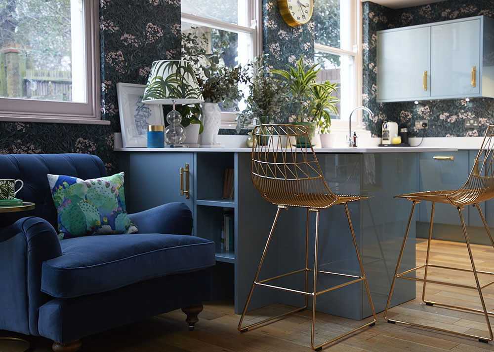
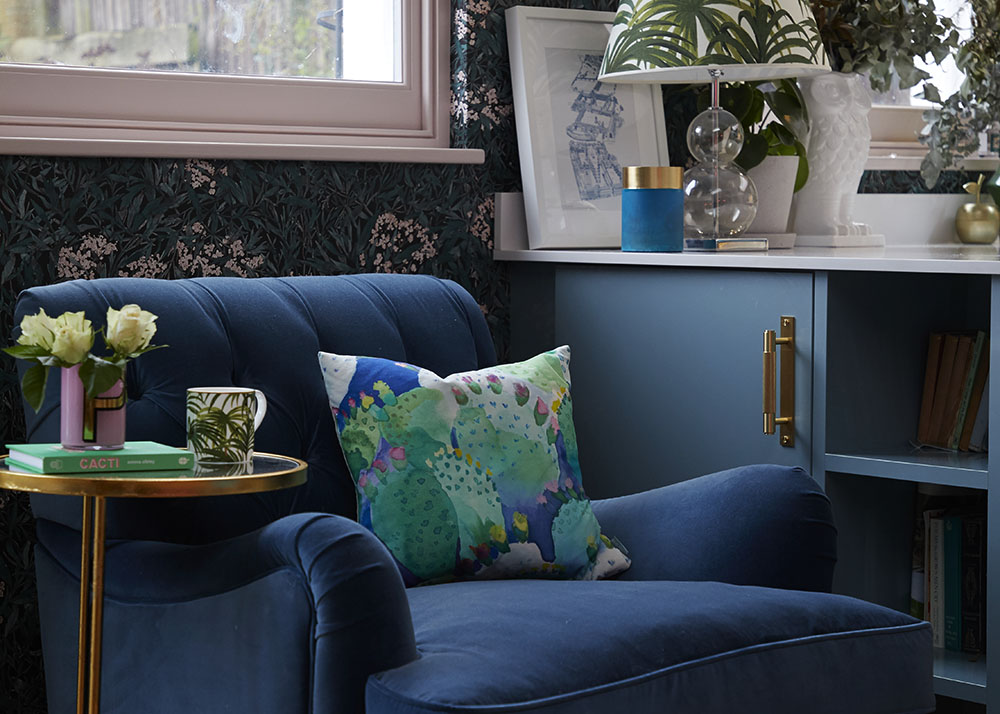
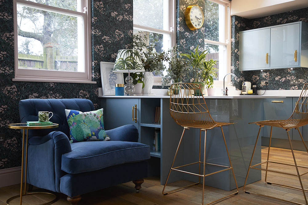
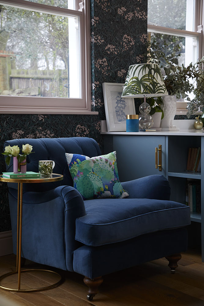
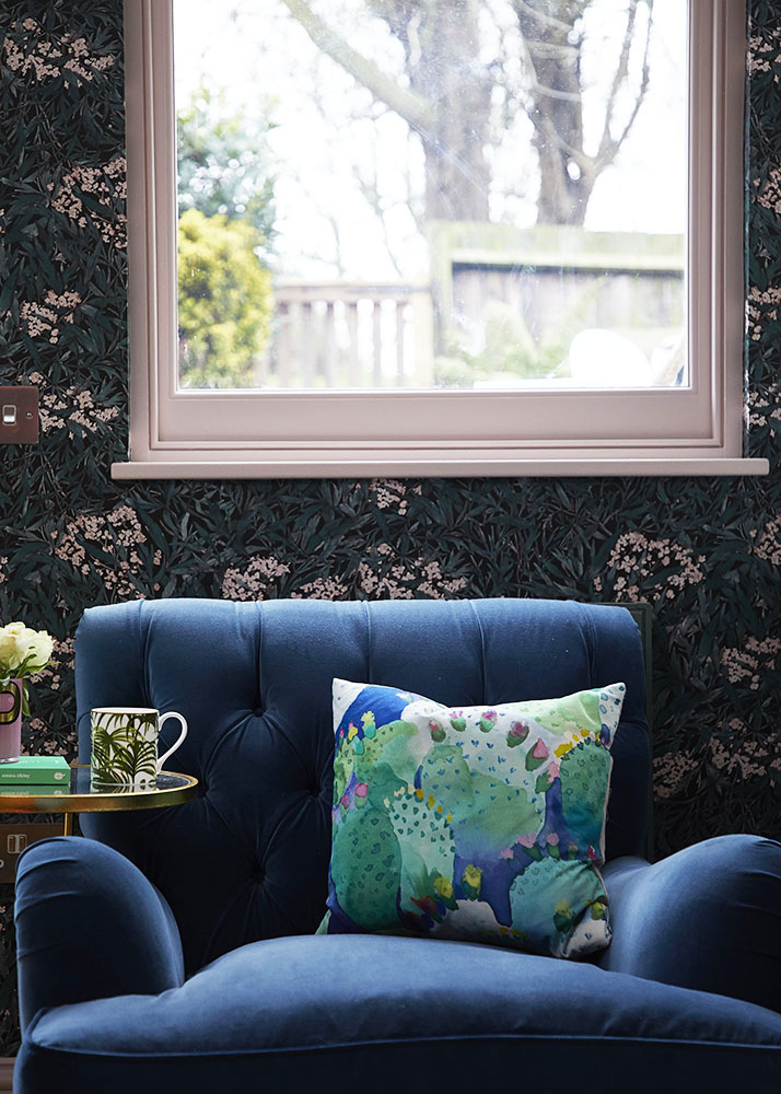
Sofas & Stuff Chiddingfold armchair upholstered in Ian Mankin airforce velvet
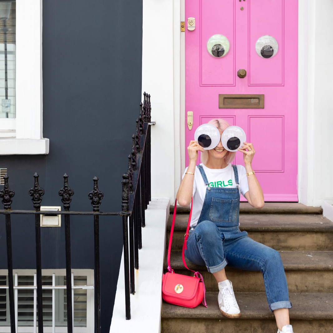
Farrow & Ball Calamine pink on the door (please ignore nasty door handle; that's for Part 2 )
Sexy Bend Goods counter stools at the breakfast bar
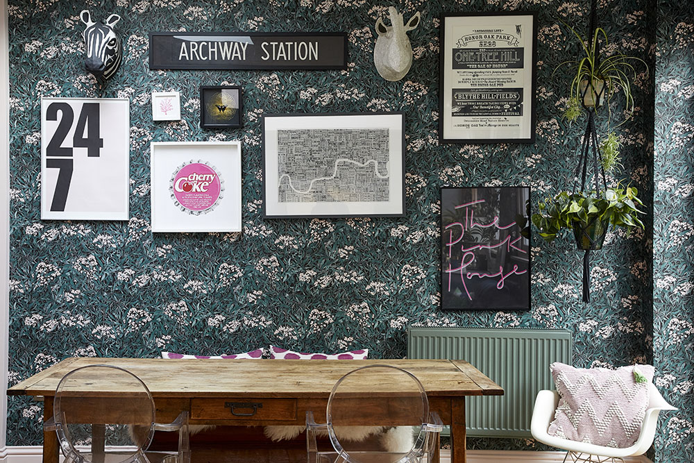
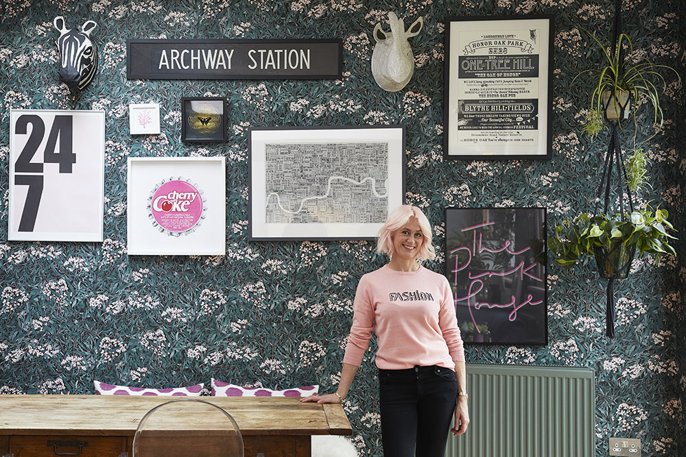
My vintage French 19th century refectory table in front of Sandberg Malin wallpaper
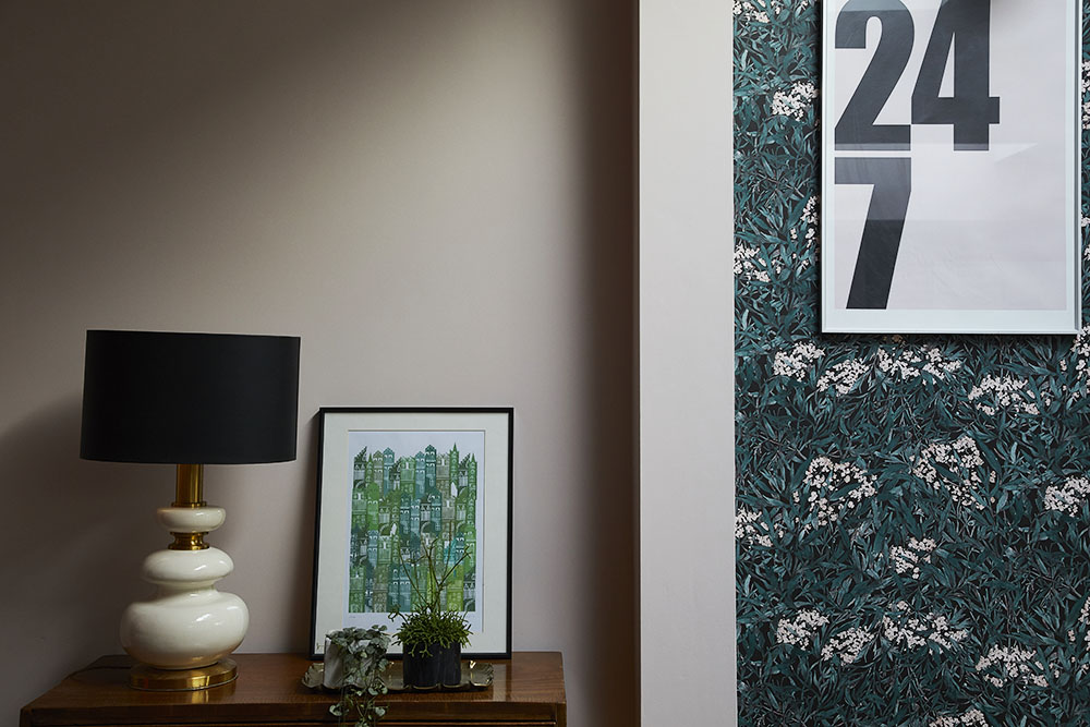
Farrow & Ball Calamine pink walls and my vintage lamp where the dining area meets the family room
Bluebellgray cactus cushion and House of Hackney Palmeral lampshade
My starting point for the design was a leafy wallpaper – I knew I wanted to bring the outside into this space so it connected as closely as possible with the garden. So I decided against tropical prints (though I very nearly went for House of Hackney’s Palmeral, such is my love for this print – as you can see I settled for having it on a lampshade and cushion) and went for this Sandberg paper that seemed to better reflect what was actually growing outside the window. Then I added soft and hot pink, and touches of blue, green and brass.
Things I like most
- The fact that it doesn't feel 'kitcheny' - I don't like cooking, and I don't like to be reminded of cooking. As far as I'm concerned, a kitchen is just another living room which happens to have a fridge and a toaster in it. My last kitchen (click HERE to see) didn't feel kitcheny either
- The layers of greenery: leafy wallpaper; tropical prints; actual plants all combine to give the space a greenhouse type effect. I’m especially fond of my macramé plant hanger from By Me Katie
- The brass Buster + Punch handles which transformed the greeny-blue cupboard doors to such an extent I didn’t have to repaint them – phew!
- The luxe blue velvet armchair in the kitchen – I love upholstered furniture in unexpected spaces
- My antique French dining table complete with marks where kids from years ago did their maths homework – vintage furniture adds personality to a space like nothing else
- The typographical gallery wall against the leafy wallpaper; I think sticking strictly to a monochrome/pink palette for the prints worked well
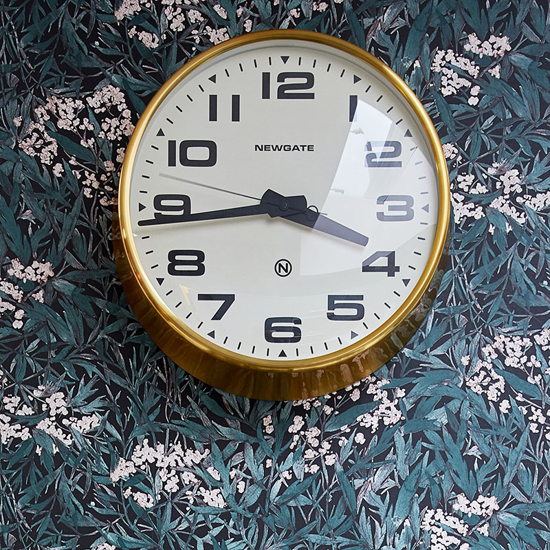
Graham & Green Brixton clock
Where it all came from
Walls
Wallpaper is Sandberg’s Malin Black | Pale pink Farrow & Ball Calamine woodwork on the doors and windows, and the top part of the wall above the cooker
Furniture
Sofas & Stuff Chiddingfold armchair upholstered in beautiful airforce blue Ian Mankin velvet | Bend Goods gold counter stools of dreams | Vintage 19th century French refectory table from Retrouvius |
Decor
Rug is the Ourika from La Redoute | Swapped chrome cabinet handles for brass pull bar/plate Buster + Punch beauties | Lampshade is House of Hackney Palmeral | Plants from Forest London in East Dulwich| Macrame plant hangers from By Me Katie | Pink zig zag Aalto cushion, Projektittyny | Blue/green/pink cactus cushion by Bluebellgray | Brass Brixton clock from Graham & Green | Bright blue/brass planter, Rum21, Gothenburg
Art
The Pink House print, @inpolife | SE23 typographical print, Octavia Plum | Archway Station vintage bus blind, Rockett St George | Cherry Coke print, By Tom Love | 247 print, Weramused | Rhino and Zebra papier mache heads, Anthropologie, no longer available | Yeah Baby That’s Good, Dave Buonaguidi at Print Club London | Framed butterfly by The Curious Department
Sofas & Stuff armchair with Ian Mankin velvet upholstery
Renovation part 2
I’m currently working with Herringbone Kitchens to replace the existing composite worktops with Carrera marble (I’ve always dreamed of a marble kitchen), the existing leaky chrome tap with a brass babe from Perrin & Rowe, and the chrome cooker hood with one in gold leaf. Finally I’m going to get busy on the back wall and under the breakfast bar with some beautiful encaustic tiles I’ve chosen from Bert & May. And maybe add a pendant lamp over the table at some stage…Oh and the ugly switches and door handles will be removed to be replaced with more Buster + Punch brass perfection. Watch this space; I’m hoping the next stage of renovations will be done by the end of April, as long as The Pink House husband doesn't use his power of veto…
A huge thank you to the following, who gifted me with the various beautiful bits that you see in my kitchen: Sofas & Stuff, Ian Mankin, Bend Goods, Farrow & Ball, By Me Kate, By Tom Love, Print Club London, Projektittyny, @inpolife, Weramused, Octavia Plum, The Curious Department

