Now, I'd like to state for the record that I really do love my kids*. Just because I moan on about their mess/noise/piles of plastic crap doesn't mean I don't adore the little buggers. But, you know, there are times when I wish they would simply disappear, taking their mess with them. My number one I-wish-my-progeny-would-piss-off moment? That would be when our coolest Child-Free Friends come round for dinner. Those are the times I want my home to seem grown-up, serene, and devoid of Duplo. And you know what? I think I've found a way. Well, six ways, to be exact. Read on for the things you need to make your home appear magically child-free at a moment's notice...
*The eldest can now read AND knows my computer password; I'm covering myself
1) The huge-but-attractive storage chest
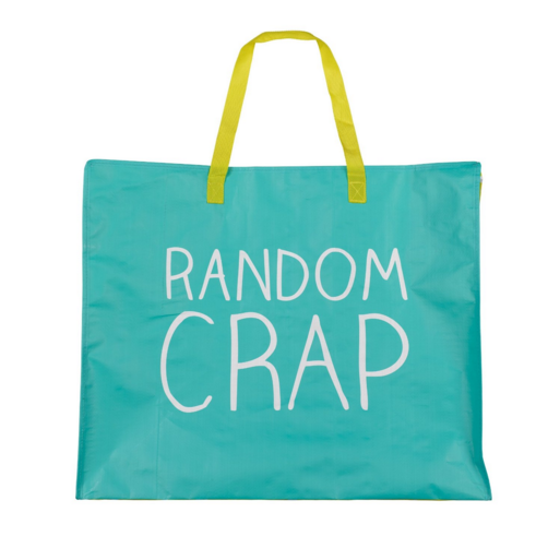
The key word here is 'huge'. To be honest, attractive is a bonus, but the most important thing is you have a massive container you can easily chuck kiddie crap into. I've added a picture of a Random Crap bag here, but that's mainly for comedic effect: this bag is not big enough for the full no-kids effect. For that, I would advise a big ol' wooden trunk - here's one from Oka. Or this lovely oversized gold pineapple storage sack from Mon Petit Zoreol. Another quick clear-the-clutter trick is to cut large cardboard boxes down into cardboard trays, so they slide under the sofa. Simply fill them with the smaller bits of crap - sorry, precious tiny toys - and push underneath.
2) The cool craft zone
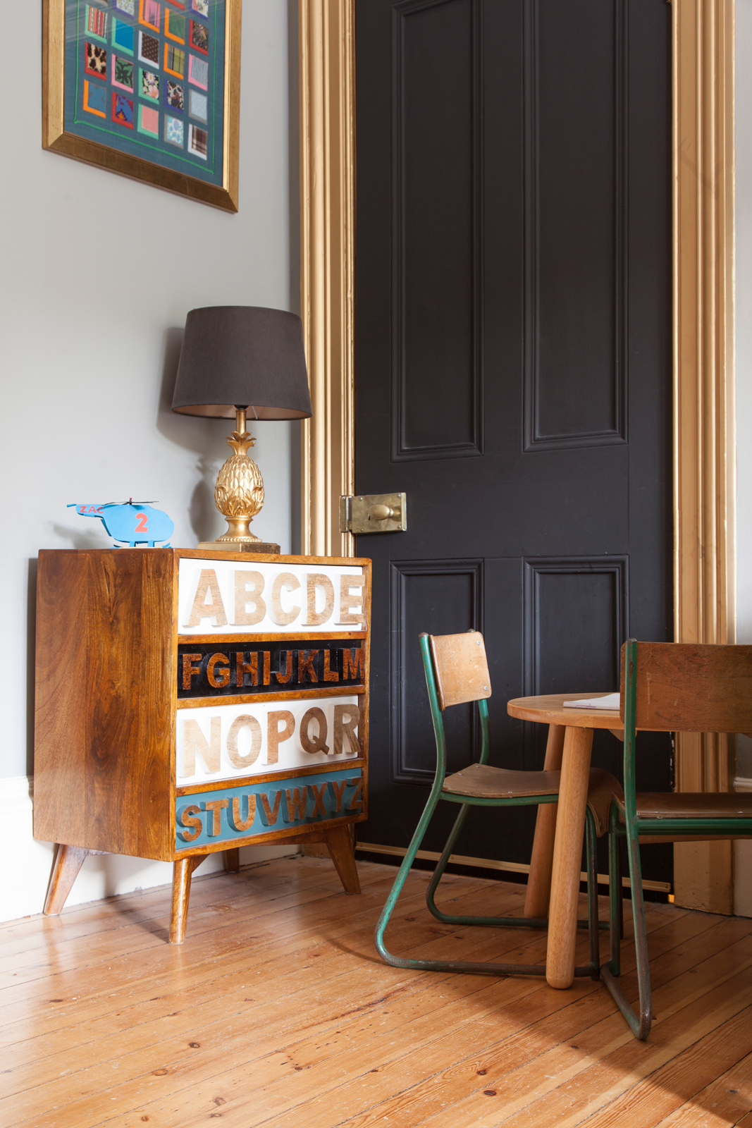
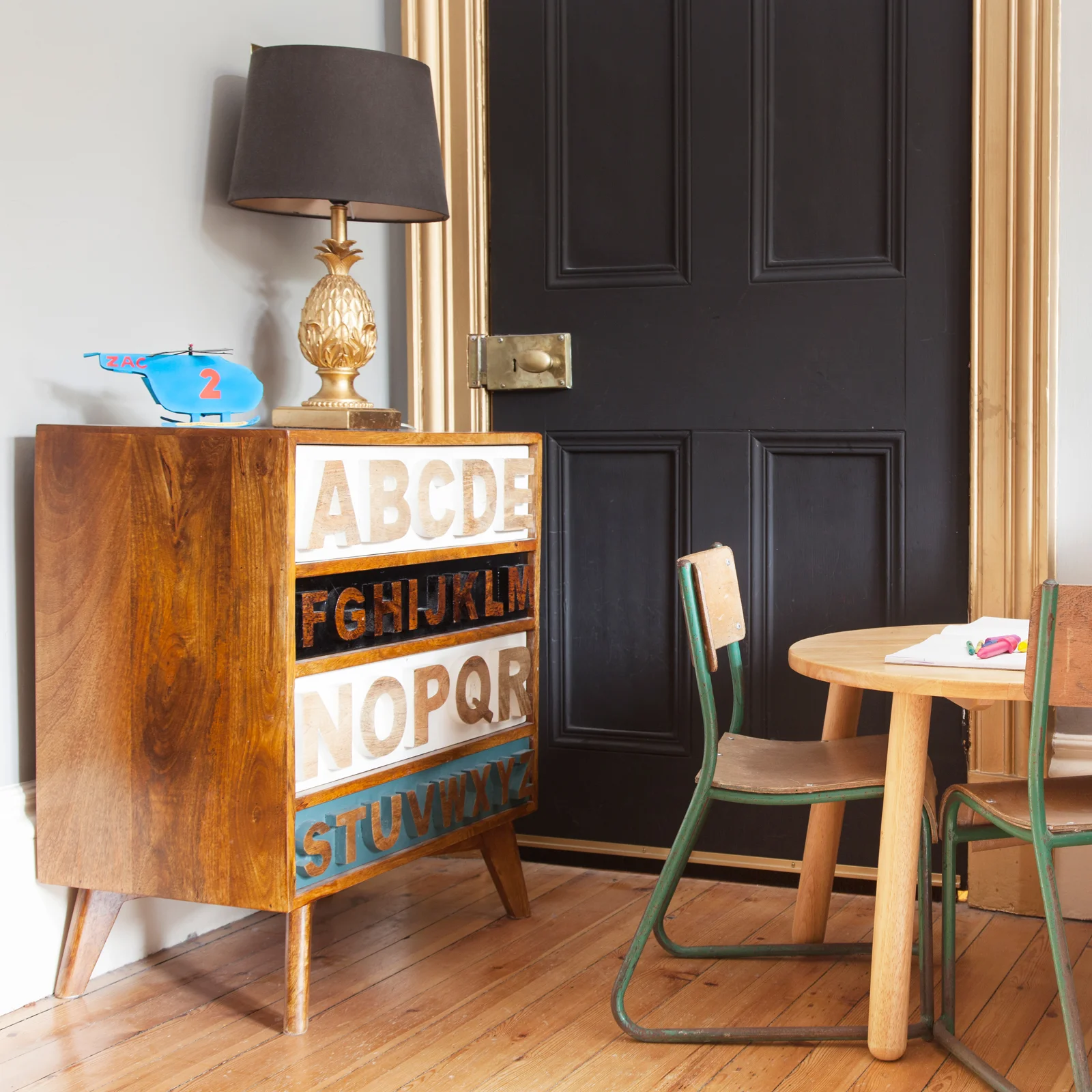
It's an unfortunate fact of parenting that children's creativity needs to be encouraged. With creativity, as we all know, comes glue on the floor, pen on the sofa, and the resulting 'masterpieces' on your wall (more of which later). But if you make the craft zone look cool, then at least you don't have the additional problem of hideous, primary-coloured plastic storage boxes, and piles of paper, pens and paints cluttering up your home. In our house, the living room art area comes courtesy of a lovely set of alphabet wooden drawers (from Graham & Green, but they don't sell them any more - try THIS fab alphabet chest instead), a blackboard-paint covered door, and some vintage school chairs.
The Pink House art area: no art to see here/Photo: Susie Lowe
3) The tasteful bath toys
1: DC Comics Batman Bath Duck - 'what the duck!' says the website, and we can't improve on that description
2: Plui Rain Cloud - fill with water, then control the flow of 'rain' by covering a little hole on top with your finger
3: Grimm's Small Sailing Boats - retro, wooden, cute, and they look good left lying around
4) The 'grown-up' spare room
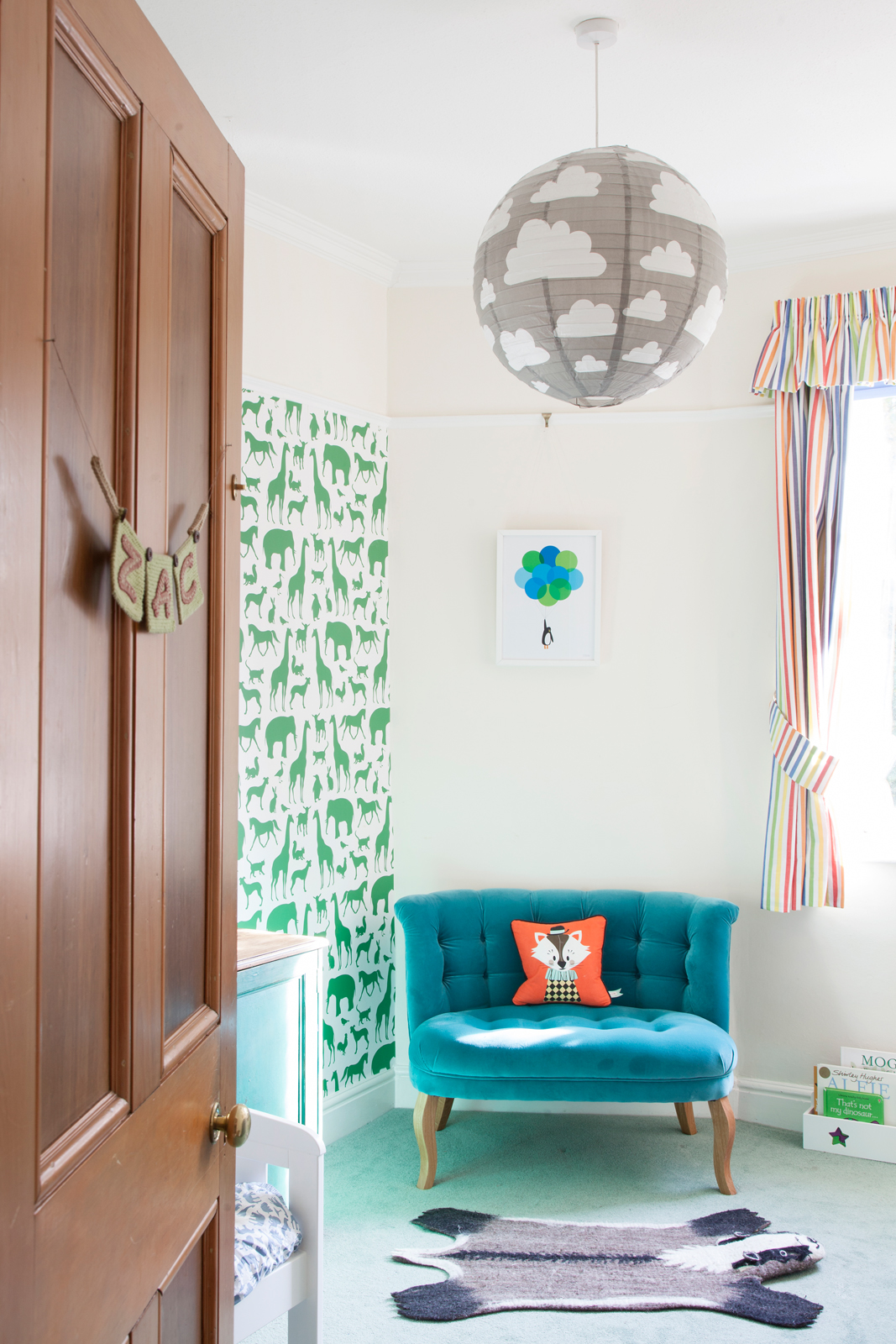
The Woods wallpaper making a kid's room cool/Photo: Pinterest
Much as we'd all love to have a room in the house which is exclusively dedicated to being a posh spare room (in this dream scenario, the room would be forever filled with flowers freshly picked from the garden, and the crisp Frette bedlinen would be free from inexplicable stains), the reality is that rooms often have more than one purpose. Such as the kids-room-as-spare-room situ, in which little Johnny gets turfed out of his pit and onto some cushions on his unimpressed sister's floor.
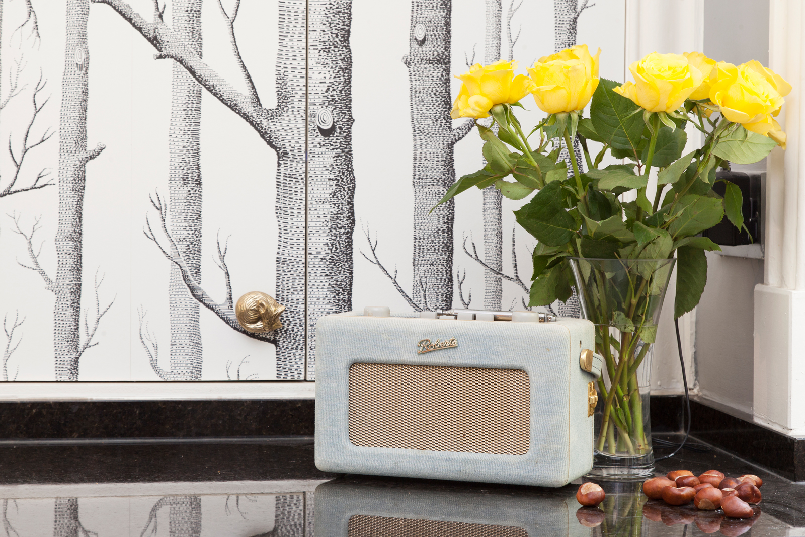
If you need to repurpose a kid's bedroom or playroom as a guest room, I have four words for you. Well, three words and a symbol: Cole & Son's Woods. I'm talking here about the brilliant tree-patterned wallpaper that looks just as good in a kid's room as it does in a playroom, guestroom, study or even kitchen. And I should know, as our house has had it in all of these rooms (the kid's room/playroom/guestroom/study was one room). It's such a classic, you never get bored of it, it's playful yet sophisticated, and it comes in a range of colours. And I swear I'm not on Cole & Son commission.
You can't see the boiler for the trees: Cole & Son Woods wallpaper hiding the boiler in The Pink House's kitchen/Photo: Susie Lowe
5) No kiddie art
I know, I know. This one's harsh. And not exactly encouraging the old 'creativity'. Or wallowing in maternal instinct. But let's get real here: under-5 artwork is RUBBISH. No really, it is. And if you're serious about making your children disappear, I'm afraid the little darlings' scribblings will have to go. All right, I admit it, I do have my kids' crummy efforts at creativity blu-tacked up in my kitchen. But I want to make it clear: this does not make my kitchen look better. They are only there because I am WEAK and SENTIMENTAL. I have also ensured that all artwork displayed adheres to the following criteria:
- Only blue, green and orange allowed (colour scheme)
- Works which includes embellishment such as glitter and pom-poms are rated higher than art without: I like glitter and pom-poms
- Art-directed by me where possible, e.g. 'oh that's lovely darling, but why don't you add some arms? And maybe a splash of pink glitter?'
And if all else fails, there's always...
6) Boarding school (them) OR The pub (you)
Mine's a large Rioja. Cheers!

